Last week I showed how to create a funnel plot in SAS. A funnel plot enables you to compare the mean values (or rates, or proportions) of many groups to some other value. The group means are often compared to the overall mean, but they could also be compared to a value that is mandated by a regulatory agency.
A colleague at SAS mentioned that several SAS procedures automatically produce statistical graphs that are similar to the funnel plot. This blog post compares the funnel plot to the output from these procedures. Because my original post used a continuous response, I will concentrate on the analysis of means plots.
The main idea of Spiegelhalter's paper on funnel plots is to create a scatter plot that has control limits "in close analogy to standard Shewhart charts." (Spiegelhalter 2004, p. 1185). It therefore makes sense to compare funnel plots with a plot created by the ANOM procedure in SAS/QC software. This article also examines output from the GLM procedure in SAS/STAT software. (You can use other SAS procedures, such as LOGISTIC, GENMOD, and GLIMMIX, to create funnel-like plots for proportions.)
The example used here is the same as for the previous article: Clark Andersen's data on the temperature of car roofs on a 71 degree (F) day.
The ANOM Procedure
Analysis of means (ANOM) is a statistical method for simultaneously comparing group means with the overall mean at a specified significance level. The control limits (often called decision limits for the ANOM plot) are adjusted for the fact that multiple group means are being compared with the overall mean. You can create an ANOM chart with the ANOM procedure in SAS/QC software as follows:
ods graphics on; proc anom data=CarTemps; xchart Temperature*Color; label Temperature = 'Mean Temperature (F)'; label Color = 'Car Color'; run; |
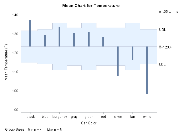
The information displayed in ANOM chart (at left; click to enlarge) is similar to the funnel plot in that they both show deviation from the overall mean. (See the documentation for the XCHART statement in PROC ANOM.)
PROC ANOM also supports funnel-like charts for proportions (see the PCHART statement) and the rates (see the UCHART statement).
Although PROC ANOM produces the ANOM plot automatically, I think that the funnel plot improves on the ANOM plot produced by PROC ANOM in two ways. First, the funnel plot explicitly presents one of the sources of the variation among groups, namely the sample size, whereas the ANOM plot does not. Second, the ANOM plot orders the categories in alphabetical order (black, burgundy, ..., white), whereas the funnel plot orders them according to sample size.
The GLM Procedure
An analysis of means plot is also available from the GLM procedure. The GLM procedure can order the groups by sample size (see the ORDER= option) . You can use the GLM procedure for comparing group means, but you need to use a different procedure if you want to compare rates or proportions, or if you want to compare them to a quantity other than the overall mean.
It is straightforward to analyze the data with the LSMEANS statement of the GLM procedure. (IF you are unfamiliar with the LSMEANS statement, see the recent SAS Global Forum paper on the LSMEANS and the LSMESTIMATE statements.) PROC GLM automatically adjusts the control limits for multiplicity (see the documentation of the ADJUST= option).
ods graphics on; proc glm data=CarTemps order=freq; class Color; model Temperature = Color; lsmeans Color / pdiff=anom adjust=nelson; run; |
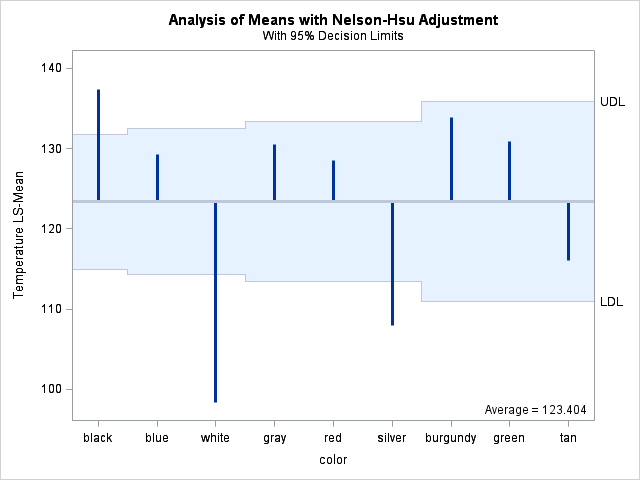
This plot is almost equivalent to the funnel plot. The main differences are that the groups are shown in decreasing order (instead of increasing) and the X axis does not explicitly show the sample size. For small examples such as the current data, this is not an issue, since there is room for all nine categories. However, the funnel plot easily handles hundreds or thousands of categories, whereas the ANOM plot would be unable to handle such a crowded axis.
Conclusions
For a small number of groups, the ANOM and GLM procedures can automatically produce funnel-like plots. They also automatically adjust the decision limits to account for multiple comparisons.
The funnel plot is a useful display for comparing the mean scores of hundreds of groups, and it explicitly shows the sample size, which is a source of variability. A drawback of the funnel plot is that you need to compute the control limits yourself, including (preferably) adjusting the limits for multiple comparisons. Next week I'll show how to compute these adjusted limits.

3 Comments
This is a very useful decription of these comparison plots. I like that PROC GLM sorts the categories. I was not familiar with the PROC ANOM and it is good that also it can do proportions and rates.
Pingback: Readers’ choice 2011: The DO Loop’s 10 most popular posts - The DO Loop
Pingback: Funnel plots for proportions - The DO Loop