Last week the Flowing Data blog published an excellent visualization of the flight patterns of major US airlines.
On Friday, I sent the link to Robert Allison, my partner in the 2009 ASA Data Expo, which explored airline data. Robert had written a SAS program for the Expo that plots line segments for the flight routes between US cities (see Figure 8 of our joint work), and on Monday he modified his SAS program to mimic to the Flowing Data graphs.
Here's one example of his efforts (click to enlarge):
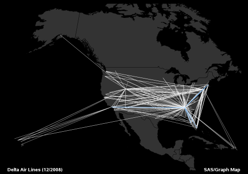
He used line segments to display the flight patterns because I don't have the time right now to implement a great circle algorithm in SAS/IML. Sorry, Robert! (Because I can call R packages from SAS/IML software, I could also generate the great arcs by using the same R package that Flowing Data uses.)
Visit Robert's visualization gallery to see the other plots.
High-flying graphics, indeed!

1 Comment
Pingback: Calling R from SAS/IML software - The DO Loop