In a previous blog post, I showed how you can use simulation to construct confidence intervals for ranks. This idea (from a paper by E. Marshall and D. Spiegelhalter), enables you to display a graph that compares the performance of several institutions, where "institutions" can mean schools, companies, airlines, or any set of similar groups.
A more recent paper (Spiegelhalter, 2004) recommends doing away with individual confidence intervals altogether. Instead, Spiegelhalter recommends plotting the means of each group versus "an interpretable measure of its precision" and overlaying "control limits" similar to those found on a Shewhart control chart.
This article shows how to create a funnel plot in SAS. You can download the data and the SAS program used in this analysis.
Spiegelhalter lays out four steps for creating the funnel plot that displays the mean of a continuous response for multiple groups (see Appendix A.3.1):
- Compute the mean of each category.
- Compute the overall mean, y and standard deviation, s.
- Compute control limits y ± zα * s / sqrt(n) where zα is the α quantile of the normal distribution and n varies between the number of observations in the smallest group and the number in the largest group.
- Plot the mean of each category against the sample size and overlay the control limits.
The Temperature of Car Roofs in a Parking Lot
The data for this example are from an experiment by Clark Andersen in which he measured the temperature of car roofs in a parking lot. He observed that black and burgundy cars had the hottest roofs, whereas white and silver cars were cooler to touch.
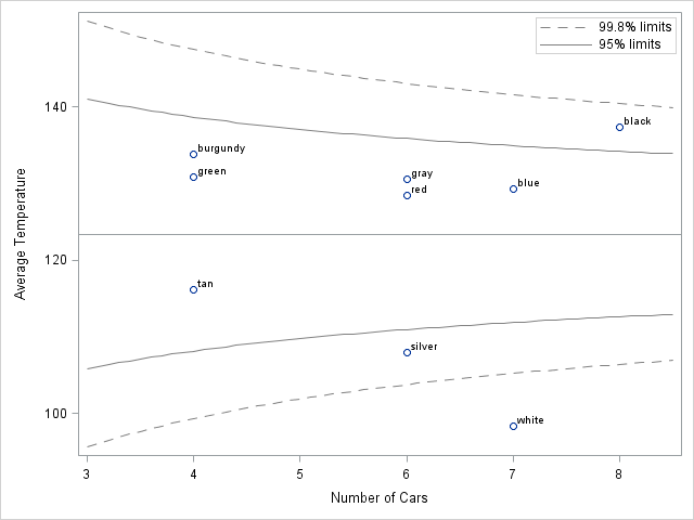
Andersen measured the roof temperatures of 52 cars on a mild (71 degree F) day. The cars were of nine colors and 4–8 measurements were recorded for each color. You could rank the car colors by the mean temperature of the roof (remember to include confidence intervals!) but an alternative display is to plot the mean temperature for each car color versus the number of cars with that color. You can then overlay funnel-shaped "control limits" on the chart.
The funnel plot is shown below. (Click to enlarge.) The remainder of this post shows how to create the graph.
Computing the Mean of Each Category
The following statements read the data into SAS/IML vectors:
proc iml;
use CarTemps;
   read all var {Color Temperature};
close CarTemps; |
You can use the UNIQUE/LOC technique to compute the sample size and mean temperature for each color category. The following technique is described in Section 3.3.5 of Statistical Programming with SAS/IML Software:
/** for each car color, compute the mean and
    standard error of the mean **/
u = unique(Color); /** unique colors **/
p = ncol(u); /** how many colors? **/
mean = j(p,1); sem = j(p,1); n = j(p,1);
do i = 1 to p;
   idx = loc(Color=u[i]);
   n[i] = ncol(idx);
   T = Temperature[idx];
   mean[i] = mean(T); /** mean temp of category **/
   sem[i] = sqrt(var(T)/n[i]); /** stderr **/
end; |
The following table summarizes the data by ranking the mean temperatures for each color. Although the standard errors are not used in the funnel plot, they are included here so that you can see that many of the confidence intervals overlap. You could use the SGPLOT procedure to display these means along with 95% confidence intervals, but that is not shown here.
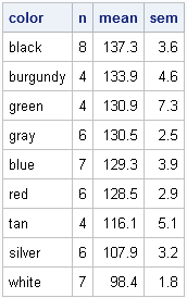
Those car roofs get pretty hot! Are the black cars much hotter than the average? What about the burgundy cars? Notice that the sample means of the burgundy and green cars are based on only four observations, so the uncertainty in those estimates are greater than for cars with more measurements. The funnel plot displays both the mean temperature and the precision in a single graph.
Computing the Overall Mean and Standard Deviation
The funnel plot compares the group means to the overall mean. The following statements compute the overall mean and standard deviation of the data, ignoring colors:
/** compute overall mean and variance **/ y = Temperature[:]; s = sqrt(var(Temperature)); print y s[label="StdDev"]; |
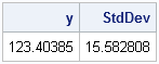
The overall mean temperature is 123 degrees F, with a standard deviation of 16 degrees. The VAR function is available in SAS/IML 9.22. If you are using an earlier version of SAS/IML, you can use the VAR module from my book.
Computing Control Limits
A funnel plot is effective because it explicitly reveals a source of variability for the means, namely the different sample sizes. The following statements compute the control limits for these data:
/** confidence limits for a range of sample sizes **/
n = T( do(3, 8.5, 0.1) );
p = {0.001 0.025 0.975 0.999}; /** lower/upper limits **/
z = quantile("normal", p);
/** compute 56 x 4 matrix that contains confidence limits
    for n = 3 to 8.5 by 0.1 **/
limits = y + s / sqrt(n) * z; |
Notice that the limits variable is a matrix. The expression s/sqrt(n) is a column vector with 56 rows, whereas the row vector z contains four z-scores. Therefore the (outer) product is a 56x4 matrix. The values in this matrix are used to overlay control limits on a plot of mean versus the sample size.
Creating a Funnel Plot
After writing the SAS/IML computations to a data set (not shown here), you can use PROC SGPLOT to display the mean temperature for each car color and use the BAND statement to overlay 95% and 99.8% control limits.
title "Temperatures of Car Roofs"; title2 "71 Degrees in the Shade"; proc sgplot data=All; scatter x=N y=Mean /datalabel=Color; refline 123.4 / axis=y; band x=N lower=L95 upper=U95 / nofill; band x=N lower=L998 upper=U998 / nofill; xaxis label="Number of Cars"; yaxis label="Average Temperature"; run; |
The funnel plot indicates that black cars are hotter than average. Silver and white cars are cooler than average. More precisely, the plot shows that the mean temperature of the black cars exceeds the 95% prediction limits, which indicates that the mean is greater than would be expected by random variation from the overall mean. Similarly, the mean temperature of the silver cars is lower than the 95% prediction limits. The mean temperature of the white cars is even more extreme: it is beyond the 99.8% prediction limits.
Conclusions
The funnel plot is a simple way to compare group means to the overall average. The funnel-shaped curves are readily explainable to a non-statistician and the plot enables you to compare different groups without having to rank them. The eye is naturally drawn to observations that are outside the funnel curves, which is good because these observations often warrant special investigation.
More advantages and some limitations are described in Spiegelhalter's paper. He also shows how to construct the control limits for funnel plots for proportions, ratios of proportions, odd ratios, and other situations.
Two criticisms of my presentation come to mind. The first is that I've illustrated the funnel plot by using groups that have a small number of observations. In order to make the control limits look like funnels, I used a "continuous" value of n, even though there is no such thing as a group with 4.5 or 5.8 observations! Spiegelhalter's main application is displaying the mean mortality rates of hospitals that deal with hundreds or thousands of patients, so the criticism does not apply to his examples.
The second criticism is that I have not adjusted the control limits for multiple comparisons. I am doing nine comparisons of individual means to the overall mean, but the limits are based on the assumption that I'm making a single comparison. Spiegelhalter notes (p. 1196) that "the only allowance for multiple comparisons is the use of small p-values for the control limits. These could be chosen based on some formal criterion such as Bonferroni..., but we suggest that this is best carried out separately." Following Spiegelhalter's suggestion, I leave that adjustment for another blog post.

7 Comments
Great post and use of SGPLOT. Also, I'll note that this topic is another popular one among middle-school science projects. As a volunteer judge at the science fair for several years, I've seen many "what color car gets the hottest?" projects.
Just for once, I'd love to see the data lead to a conclusion other than black. And if I see a funnel plot as part of any of the displays next year, I'll make sure that the student has cited your blog.
I attempted to run the IML portion of the code on 9.1.3 but it is failing. I don't use IML so the log is a little difficult for me to understand.The log reads
ERROR: Not enough arguments for function VAR.
You need to uncomment the definition of the VAR module.
The beginning comment is on Line 57; the ending comment is on Line 67.
Pingback: Comparing funnel plots to an Analysis of Means plot - The DO Loop
Pingback: How to compute decision limits for multiple comparisons - The DO Loop
Pingback: Funnel plots for proportions - The DO Loop
Pingback: Readers’ choice 2011: The DO Loop’s 10 most popular posts - The DO Loop