All Posts


Los usuarios empresariales dependen de la disponibilidad de los datos, que estos sean confiables y que estén fácilmente disponibles cuando se necesita. Sin embargo, con datos dispersos en sistemas dispares y volúmenes de datos que aumentan rápidamente, la integración de estos no es una tarea fácil. Ante tal escenario,


Is this menopause? Maybe you've noticed some changes. Perhaps it’s the occasional hot flushed feeling that erupts like a volcano or maybe it's the irregular periods when you’ve always been like clockwork. Although menopause is often thought of as a singular event, it isn’t unless you are undergoing chemotherapy that


Helmut Plinke explains why modernizing your data management is essential to supporting your analytics platform.


A SAS customer asked how to use SAS to conduct a Z test for the equality of two proportions. He was directed to the SAS Usage Note "Testing the equality of two or more proportions from independent samples." The note says to "specify the CHISQ option in the TABLES statement


최근 금융, 통신, 자동차, 공공, 리테일, 교육 등 모든 산업을 관통하고 있는 한 단어가 있습니다. 바로 4차 산업혁명인데요. 빅데이터, 사물인터넷(IoT), 인공지능(머신러닝), 로봇 등 첨단 ICT 기술의 융합으로 완성되는 4차 산업혁명은 미래 산업의 필수 성장 동력으로 자리잡았습니다. 그 중에서도 특히 제조업은 이른바 ‘인더스트리 4.0’의 촉발과 함께 그 새로운 혁명의 시작을 알렸는데요.

Tomorrow is Independence Day, a federal holiday in the United States. Flags are displayed everywhere, especially in Washington, D.C., where I live. So let's have a little Fun with Flags! The current U.S. flag has 50 stars, one per state, with five rows of six stars interleaved with four rows


When I arrived for a training course with the name, "Powerful storytelling for tech," I was surprised to discover that most of the attendees worked in sales, rather than the marketing and communications crowd I'd been expecting. They were all there to learn how best to engage prospects – how


みなさま、こんにちは。 さて突然ですが、フーリエ変換ってご存知ですか? おそらく物理学や経済学で波形データを分析したことのある方には馴染みがあるでしょうが、フーリエ変換は波形データを扱う手法です。 フーリエ変換では周期的な波形を、sin波やcos波の重ね合わせで説明しようというものです。 たとえば以下のような波形データは、どの時間にどのくらいの強さの波が流れているかを表現しています。 これをフーリエ変換することで、周波数と振幅で表すことができるようになります。 ↓ フーリエ変換! ↓ 従来のSAS製品では波形データでフーリエ変換をする機能を提供していなかったのですが、SAS ViyaのSAS Forcastingという製品を使うことで、フーリエ変換を実施することができるようになりました。 SAS Viyaでできるのは短時間フーリエ変換(Short time Fourier transform)です。 今回はSAS Viyaでフーリエ変換を実施してみたいと思います。プログラミング言語はPythonを使用します。 まずは前準備として、必要なライブラリをインポートし、CAS sessionを作成します。 CAS sessionはSAS Viyaでデータ分析を行うCASというエンジンへ認証し、接続するものです。 # CAS sessionの用意 import swat host = "localhost" port = 5570 user = "user" password = "p@ssw0rd" mysession = swat.CAS(host, port, user, password) #

If you spend a lot of time in SAS Enterprise Guide (as I do), you probably get to know its features pretty well. But we don't always take the time to explore as we should, so there might be a few golden nuggets of editor knowledge that have escaped you


Los servicios financieros se mueven hoy al ritmo de los clientes, es decir, van a todas partes, están siempre conectados y se enfrentan a los desafíos de un mundo sin fronteras. Como también sucede en otras industrias, las entidades financieras se benefician de los nuevos escenarios móviles pero saben que


My colleague, Lisa, and I were comparing notes the other day. Both of us starting working in our teens (14 and 15 respectively) during the academic year as well as the summers. I worked at Sears in the drapery and bedspread department. I’ll never forget my first boss—Mr. Arnold. He

The Kettlebell (KB) clean is a multi-joint movement that incorporates a squat, a pull, and shoulder rotation. You will work to maximize momentum generated in the lower body to use your upper body while challenging core stability. This exercise requires a little coordination and precision, so take your time learning
Students in introductory statistics courses often use summary statistics (such as sample size, mean, and standard deviation) to test hypotheses and to compute confidence intervals. Did you know that you can provide summary statistics (rather than raw data) to PROC TTEST in SAS and obtain hypothesis tests and confidence intervals?
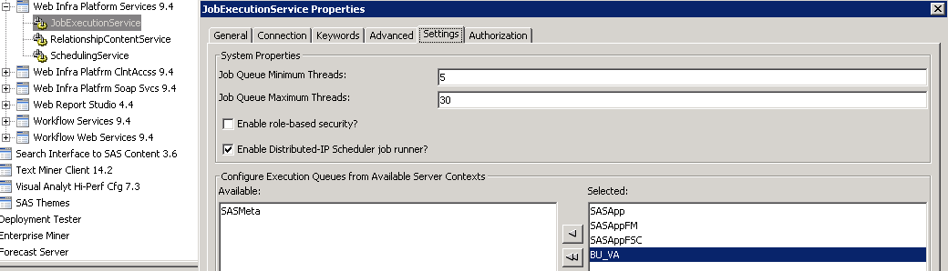
As a technical consultant for SAS, I have the privilege of meeting with SAS customers, learning more about how they use our software, and then helping them solve their problems. Recently, a client of mine was having trouble finding a way to implement the use of multiple application servers in
We live in exciting times. Our relationships with machines, objects and things are quickly changing. Since mankind lived in caves, we have pushed our will into passive tools with our hands and our voices. Our mice and our keyboards do exactly as we tell them to, and devices like the