All Posts
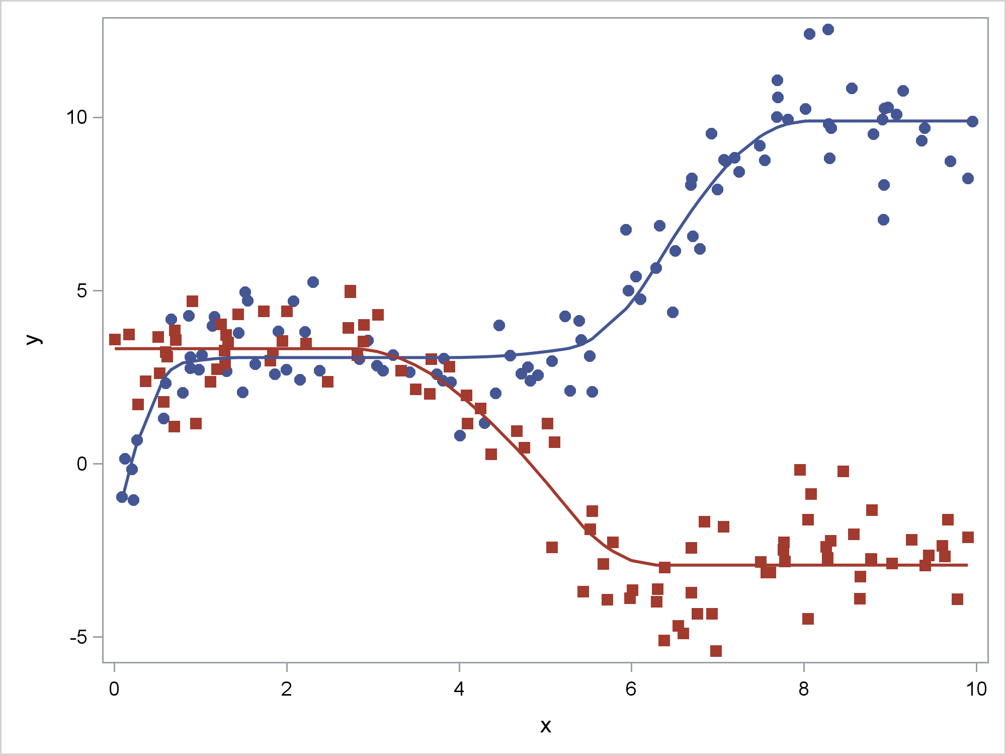

This post shows how to use PROC SGPLOT together with PROC TRANSREG to fit monotonically increasing or decreasing functions through a scatter plot.


Student Ambassadors 先週、ワシントンDCで開催されたAnalytics Experience 2017には、筑波大学の学生3名が参加し、ポスター発表を行いました。学生による参加レポートは直近のブログ記事でも紹介しています。[レポート1] [レポート2] [レポート3] このように、SASでは、ビジネスやアカデミアのユーザーが一堂に会するグローバルイベントで、学生が自身の分析・研究・提案を発表する機会を提供しています。ビジネスやアナリティクスの専門家からのフィードバックを得ることで、自身のアイデアを深めると同時に、SASネットワークを広げることができます。特に、SASの最大のカンファレンスであるSAS Global Forumでは、SASソフトウェアを活用した研究発表を行う学生の中から「学生大使」 (Student Ambassadors) を任命し、他の参加者に紹介するとともに、SAS Global Forumに無料で招待しています(旅費や宿泊代もサポートされます!)。Student Ambassador Programの詳細については、こちらをご覧ください。 次回のSAS Global Forum 2018は米国コロラド州デンバーにて2018年4月8日から11日まで開催されます。今回は24名のStudent Ambassadors が選ばれる予定です。 応募方法: 投稿ページからSAS Global Forumにabstractを投稿し、submission numberを取得 応募ページからStudent Ambassadorsに応募 詳細はこちらをご覧ください。 締切は10月12日です。まずはabstractを投稿しましょう! 投稿・論文作成にあたり、SASの分析 環境や発表準備のご支援が必要な場合は、弊社でサポートいたします。Abstractを投稿された場合および、ご質問・ご要望などは下記のメールアドレスまでご連絡ください。 JPNAcademicTeam@sas.com 前回のAmbassadorの発表内容については、こちらから検索して参考にしてください。 なお、選ばれた一部の投稿は、Model Assisted Statistics and Applications (MASA): An International Journal Special Issue, IOS Press に論文を掲載することができます。トピックは、アナリティクス、ビジネス・インテリジェンスまたはビジネス・アナリティクスである必要があります。
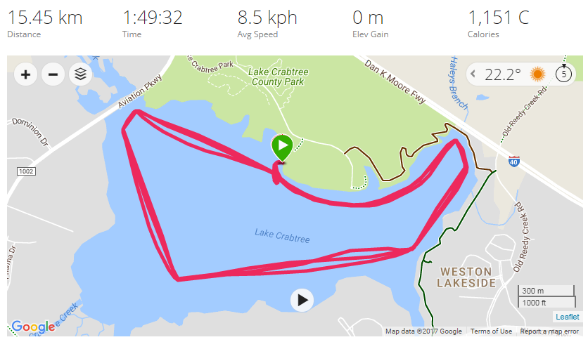

I recently paddled in a boat race, and was wondering how I did compared to all the other paddlers. And being a Graph Guy, I decided I should find a cool way to graph the data ... Here's some background information ... There's a great organization called Bridge II Sports


분석이 매 순간, 데이터가 존재하는 모든 곳에 적용된다면 어떤 일들이 가능해질까요? 오늘날 우리는 데이터가 사회와 경제를 움직이는 ‘데이터 이코노미’ 시대에 살고 있습니다. IDC는 오는 2025년 전 세계 데이터 양이 현재의 10배에 달하는 163제타바이트(ZB)에 이를 것으로 전망했는데요. 그러나 데이터는 그 자체만으로 유용하지 않습니다. 모든 데이터는 대기 시간과 유효 기간의 속성을 지니기


One of the best parts of my job is hearing about all the cool ways people are using data for good. Increasingly, many of these stories are related to the Internet of Things, including: Smart pills that help patients stick to their treatment regimens. These ingestible sensors can monitor patients’

If you’re in the field of analytics, you’ve undoubtedly heard about SAS Viya. Designed for all analytic professionals, regardless of skills or experience, SAS Viya seamlessly handles big, complex, diverse data. It also supports any programming language, allowing analysts to choose the tool that makes them most productive. Recently a colleague
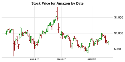

In the previous article on Getting Started with Vertical HighLow Plot, I described how we can use the HighLow plot to display the stock price by date. The HighLow plot is specifically designed for such use cases as shown below. The data is downloaded from the Nasdaq web site, and


Depending on who you speak with you will get varying definitions and opinions regarding demand sensing and shaping from sensing short-range replenishment based on sales orders to manual blending of point-of-sales (POS) data and shipments. Most companies think that they are sensing demand when in fact they are
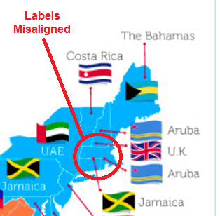
Orbitz recently published a map showing the most popular international travel destination for each of the 50 US states. It was an interesting map ... but of course, me being the Graph Guy, I had to pick it apart and create my own version. Follow along, and explore this interesting


Many of us struggle with getting enough good quality sleep. I have a 9 month old daughter, so I am well aware of the struggles and the consequences of not getting enough sleep. Winding down from the day is one of the top reasons why it takes many of us
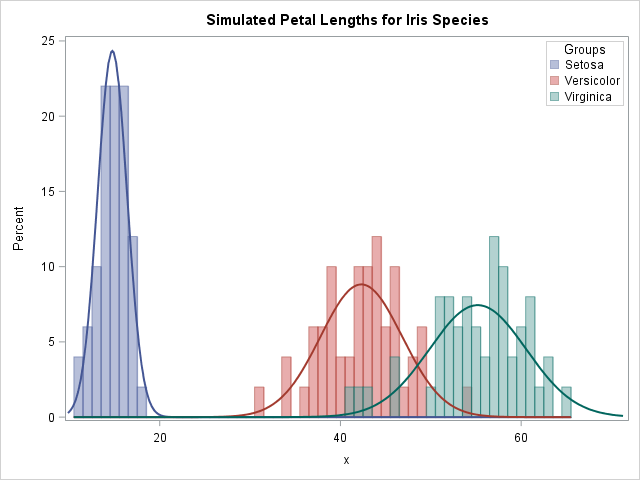

In a large simulation study, it can be convenient to have a "control file" that contains the parameters for the study. My recent article about how to simulate multivariate normal clusters demonstrates a simple example of this technique. The simulation in that article uses an input data set that contains


El banco DBS reduce un 80% las salidas de efectivo y mejora la eficiencia del proceso 33%. El banco tenía más de 4 millones de consumidores en Singapur, lo más importante para ellos era que el cliente tuviera una gran experiencia en el banco, comparado a los demás, dijo David


Es una realidad. Según IDC el mercado mundial de Big Data Analytics está creciendo a un ritmo de 23,1 % cada año y llegará a casi 50 mil millones de dólares en el 2019. En la región latinoamericana la cultura analítica ya ha permeado de manera importante industrias como la


Last month I vowed to take time off from watching TV. I worried I was wasting time that could be spent in better ways. I entered that commitment with optimism for what I could achieve during the time off. As it turned out instead, my body was waiting to teach me
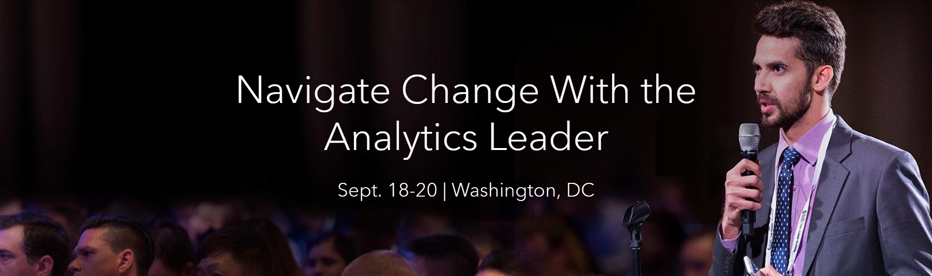
링컨 기념관과 워싱턴 기념비부터 스미소니언 박물관까지, 워싱턴 DC는 미국의 역사를 관통하는 세계적인 랜드마크인데요. 지난 9월 18일부터 20일, 이 유서 깊은 도시에서 미래 데이터와 분석 혁신에 대한 뜨거운 논의가 펼쳐졌습니다. 바로 전 세계 수천여 명의 분석 전문가, 산업별 리더, 세계적인 석학, 기업 경영진 및 실무진들이 한자리에 모인 'SAS 애널리틱스 익스피리언스(Analytics Experience)