All Posts


Imaginar que a través de un comando de voz pudiera analizar escenarios de negocio y predecir rendimientos, o tomar cualquier acción de negocio, ya no son ideas futuristas e irreales. El hecho de que, en los últimos dos años, los ejecutivos de las 500 empresas de Fortune tengan inquietud sobre
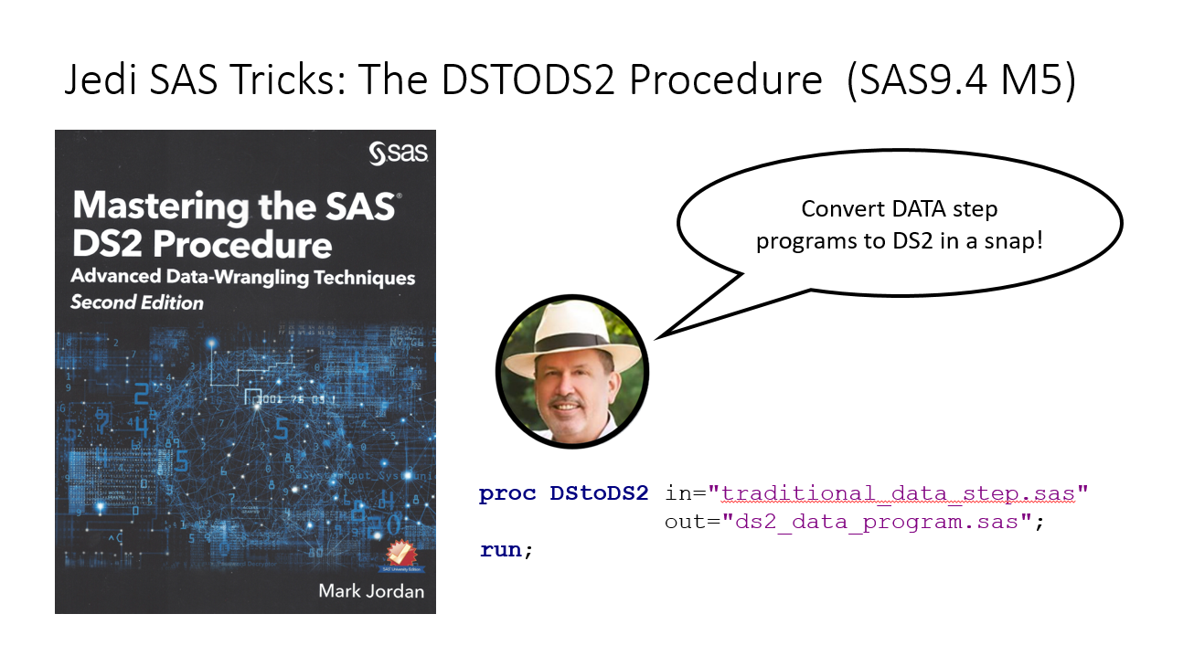

You have the infrastructure, and you know that DATA step would run so much better in DS2, but it’s complicated and you don’t know how to get started. Well, if you have SAS 9.4M5, rejoice! The DStoDS2 procedure is here, and it’s a humdinger! (No, Chris, not a Hemedinger… ;-) It's
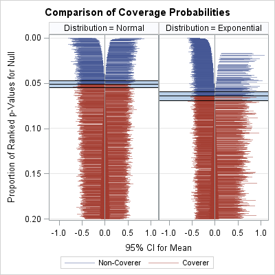

Simulation studies are used for many purposes, one of which is to examine how distributional assumptions affect the coverage probability of a confidence interval. This article describes the "zipper plot," which enables you to compare the coverage probability of a confidence interval when the data do or do not follow


We all have different learning styles. Some learn best by seeing and doing; others by listening to lectures in a traditional classroom; still others simply by diving in and asking questions along the way. Traditional face-to-face classroom instruction, real-time classes over the Internet, or self-paced instruction with exercises, SAS Education
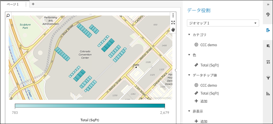

みなさんご存知の通り、SAS Visual AnalyticsはセルフサービスBI&Analyticsツールで、ビジネスユーザー自身で簡単にレポートやダッシュボードを作成することができます。その際、標準で備わっている数多くのチャートオブジェクトを使用することができますが、お客様要件によっては、標準のチャートタイプだけでは表現できないものもあります。それに答えるためにSAS Visual Analytics 8.2(以下VA)には大きく2つの機能が用意されています。 データドリブンコンテンツ 地図上のカスタム境界線描画 1番目の「データドリブンコンテンツ」とは、サードパーティのビジュアライゼーション・ライブラリ(D3.js, C3, Google Chart Toolsなど)と連携することで、チャートタイプやビジュアルのバリエーションを大幅に拡張可能な機能ですが、 今回は、2番目の「地図上のカスタム境界線描画」機能に関してご紹介します。 VAに標準搭載のチャートオブジェクトには地図描画のための「ジオマップ」オブジェクトが含まれています。この機能を活用することで、例えば、地図上で隕石落下地点と被害の度合いを分析(図1.参照)したり、都道府県別の売上や店舗別の顧客数などをビジュアライズし、分析(図2.参照)することができます。 図1.隕石落下地点と被害の度合い分析ダッシュボード 図2.店舗別の売上と利益をバブルのサイズと色で表示 地図描画のタイプとしては、図1の「座標」、図2の「バブル」以外に「領域」を選択可能です。 「座標」とは、地図上の該当ポイントに円形や星形などのアイコンを表示するものです。 そして、「領域」では、基本的に地図上の国の境界線や、その一つ下のレベルである州や都道府県の境界線領域を描画します。例えばアメリカの州や日本の都道府県の領域を指定した値に基づき色分けして表示するものです。(図3.参照) 図3.都道府県ごとの売上分析 さらに、地図上に表示するこの「領域」をカスタムで描画することが可能で、これを「カスタム境界線(領域)」描画機能と呼んでいます。 この機能を活用することで、例えば、特定施設内の人や物の動線を描画したり、家屋ごとのソーラー発電量を実際の地図上に描画することなども可能になります。 その基本的な手順を、アメリカにあるコロラド・コンベンション・センター(以下CCC)内のミーティングフロアにある各種の会議室領域の描画を例に、以下に示します。 図4. VAレポート上に表示された完成版(部屋ごとの面積などを色分けして描画することができます) CCCのフロアレイアウト画像を入手し、市販ツールあるいはオープンソース製品を使用し、Esri shapeファイルを作成 Esri ShapeファイルをVA環境にインポート インポートしたデータに基づきカスタム境界線(領域)をレポート上に描画 1. CCCのフロアレイアウト画像を入手し、市販ツールあるいはオープンソース製品を使用し、Esri Shapeファイルを作成 この例では市販のEsri Desktopツールを使用し、CCCのサイトから入手したフロアレイアウトの画像をEsri地図上に重ね(図5.参照)、部屋の輪郭をなぞって描き(図6.参照)、結果をEsri Shapeファイルとして保存(図7.参照)します。(詳細に関しては、使用するツールのマニュアルを御覧ください。) 図5. Esri地図上のCCCのある地点の上に、CCCのフロアレイアウト画像を重ねる 図6. 部屋の輪郭をなぞって描く(描いた領域ごとにIDを設定しておきます。この例ではRoomID) 図7. 結果をEsri Shapeファイルとして保存 2. Esri ShapeファイルをVA環境にインポート VA環境に実装されているマクロ%SHPIMPRTを使用し、Esri ShapeファイルをSAS Datasetに変換(以降Shapeデータ)し、VA環境(インメモリー)にロードします。 詳細は、以下サポートサイトにあるSAS Viya管理者(Administration)マニュアルを御覧ください。 https://support.sas.com/documentation/onlinedoc/viya/index.html
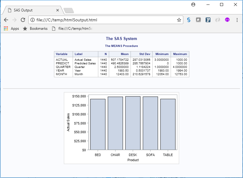

Generating HTML output might be something that you do daily. After all, HTML is now the default format for Display Manager SAS output, and it is one of the available formats for SAS® Enterprise Guide®. In addition, SAS® Studio generates HTML 5.0 output as a default. The many faces of


Desde hace algunos años, principalmente en Estados Unidos, los datos de los electores empezaron a ser utilizados por los partidos políticos para enviar mensajes claros y directos de acuerdo a los perfiles de los votantes, incluso para muchos esta técnica garantizó la elección de Obama y Trump como presidentes; sin
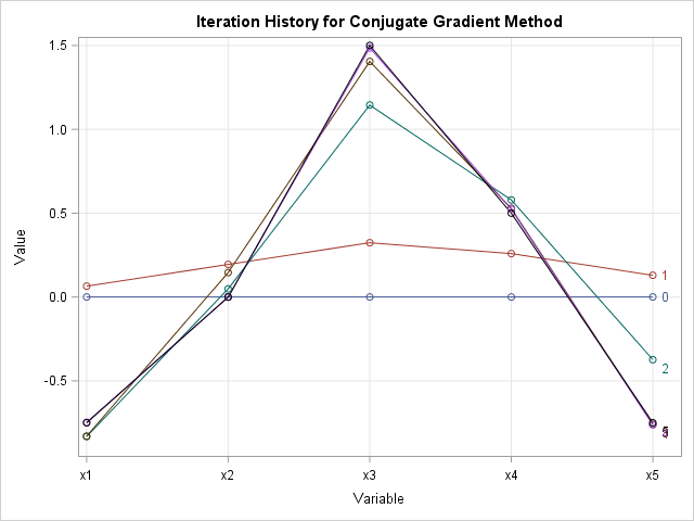
I often claim that the "natural syntax" of the SAS/IML language makes it easy to implement an algorithm or statistical formula as it appears in a textbook or journal. The other day I had an opportunity to test the truth of that statement. A SAS programmer wanted to implement the


Jim Harris says streaming data analytics can drive better decisions and faster adaptation to changing conditions.


El 25 de mayo de 2018 entrará en vigor el Reglamento General de Protección de Datos (GDPR, por sus siglas en inglés). ¿Su objetivo? Robustecer la protección de los datos personales de la gente que vive en los países que conforman la Unión Europea (UE). Si bien regional, los efectos

La analítica se está tomando el mundo del deporte, un claro ejemplo de ello es el fútbol, los principales equipos a nivel mundial han incorporado soluciones para medirlo casi todo, desde los jugadores hasta los fanáticos. El uso de software para analizar los datos en el fútbol es una herramienta


올 초 애플이 미국 빅데이터 컨설팅 스타트업인 ‘실리콘 밸리 데이터 사이언스(Silicon Valley Data Science)’에서 창업자를 포함한 수십 명의 직원을 영입하며 화제를 모았습니다. 이전에는 인공지능(AI) 기반 데이터 분석 플랫폼 업체 ‘래티스(Lattice)’를 인수하고 하둡의 공동 창시자인 마이크 카파렐라를 스카웃하기도 했습니다. 구글 역시 60만 명의 데이터 과학자가 활동하는 호주 멜버른 기반의 스타트업인 ‘캐글(Kaggle)’을


As I write this we are halfway through teaching our first Powerful Tools for Caregiving class. It has been an exciting time of learning and growth for all of us. Each time I work with caregivers, I am reminded of a common theme – the delicate dance of trying to

About once a month I see a question on the SAS Support Communities that involves what I like to call "computations with combinations." A typical question asks how to find k values (from a set of p values) that maximize or minimize some function, such as "I have 5 variables,

This is a continuation of my previous blog post on SAS Data Studio and the Code transform. In this post, I will review some additional examples of using the Code transform in a SAS Data Studio data plan to help you prepare your data for analytic reports and/or models. Create