Simulation studies are used for many purposes, one of which is to examine how distributional assumptions affect the coverage probability of a confidence interval. This article describes the "zipper plot," which enables you to compare the coverage probability of a confidence interval when the data do or do not follow certain distributional assumptions.
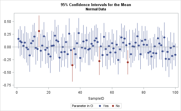
I saw the zipper plot in a tutorial about how to design, implement, and report the results of simulation studies (Morris, White, Crowther, 2017). An example of a zipper plot is shown to the right. The main difference between the zipper plot and the usual plot of confidence intervals is that the zipper plot sorts the intervals by their associated p-values, which causes the graph to look like a garment's zipper. The zipper plot in this blog post is slightly different from the one that is presented in Morris et al. (2017, p. 22), as discussed at the end of this article.
Coverage probabilities for confidence intervals
A formulas for a confidence interval (CI) is based on an assumption about the distribution of the parameter estimates on a simple random sample. For example, the two-sided 95% confidence interval for the mean of normally distributed data has upper and lower limits given by the formula
x̄ ± t* s / sqrt(n)
where x̄ is the sample mean, s is the sample standard deviation, n is the sample size, and
t*
is the 97.5th percentile of the t distribution with n – 1 degrees of freedom.
You can confirm that the formula is a 95% CI by simulating many N(0,1) samples and computing the CI for each sample. About 95% of the samples should contain the population mean, which is 0.
The central limit theorem indicates that the formula is asymptotically valid for sufficiently large samples nonnormal data. However, for small nonnormal samples, the true coverage probability of those intervals might be different from 95%. Again, you can estimate the coverage probability by simulating many samples, constructing the intervals, and counting how many time the mean of the distribution is inside the confidence interval. A previous article shows how to use simulation to estimate the coverage probability of this formula.
Zipper plots and simulation studies of confidence intervals
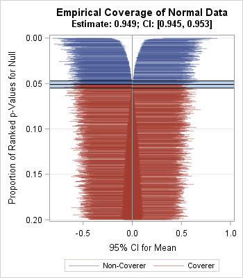
The graph to the right shows the zipper plot applied to the results of the two simulations in the previous article. The zipper plot on the left visualizes the estimate of the coverage probability 10,000 for normal samples of size n = 50. (The graph at the top of this article provides more detail.) The Monte Carlo estimate of the coverage probability of the CIs is 0.949, which is extremely close to the true coverage of 0.95. The Monte Carlo 95% confidence interval, shown by a blue band, is [0.945, 0.953], which includes 0.95. You can see that the width of the confidence intervals does not seem to depend on the sample mean: the samples whose means are "too low" tend to produce intervals that are about the same length as the intervals for the samples whose means are "too high."
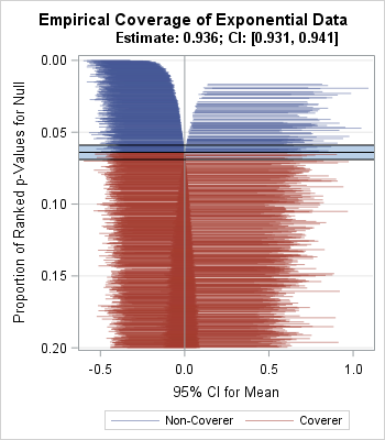
The zipper plot on the right is for 10,000 random samples of size n = 50 that are drawn from an exponential distribution with mean 0 and unit scale parameter. (The graph at this link provides more detail.) The Monte Carlo estimate of the coverage probability is 0.9360. The Monte Carlo 95% confidence interval, shown by a blue band, is [0.931, 0.941] and does not include 0.95. Notice that the left side of the "zipper" tends to contain intervals that are shorter than those on the right side. This indicates that samples whose means are "too low" tend to produce shorter confidence intervals than the samples whose means are "too high."
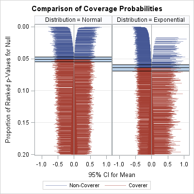
The zipper plot enables you to compare the results of two simulations that generate data from different distributions. The zipper plot enables you to visualize the fact that the nominal 95% CIs do, in fact, have empirical coverage of about 95% for normal data, whereas the intervals have about 93.6% empirical coverage for the exponential data.
If you want to experiment with the zipper plot or use it for your own simulation studies in SAS, you can download the SAS program that generates the graphs in this article.
Differences from the "zip plot" of Morris et al.
There are some minor differences between the zipper plot in this article and the graph in Morris et al. (2017, p. 22).
- Morris et al., use the term "zip plot." However, statisticians use "ZIP" for the zero-inflated Poisson distribution, so I prefer the term "zipper plot."
- Morris et al. bin the p-values into 100 centiles and graph the CIs against the centiles. This has the advantage of being able to plot the CI's from thousands or millions of simulations in a graph that uses only a few hundred vertical pixels. In contrast, I plot the CI's for each fractional rank, which is the rank divided by the number of simulations. In the SAS program, I indicate how to compute and use the centiles. [EDIT 10JUL2018: Morris wrote to say that they do not bin the p-values. They use the same fractional ranks that I do. Thanks for the clarification!]
- Morris et al. plot all the centiles. Consequently, the interesting portion of the graph occupies only about 5-10% of the total graph area. In contrast, I display only the CIs whose fractional rank is less than some cutoff value, which is 0.2 in this article. Thus my zipper plots are a "zoomed in" version of the ones that appear in Morris et al. In the SAS program, you can set the FractionMaxDisplay macro variable to 1.0 to show all the centiles.

3 Comments
Hi Rick,
'Morris' out of 'Morris, White and Crowther' here.
Great post and great job on the plots – thanks! I stumbled across it while revising the draft paper and your comments are really helpful.
Here are a couple of notes from me:
1. I googled 'zipper' and discovered that it is American for 'zip'. So while the term would bring clarity for Americans, it would alienate other English speakers, so I plan to stick with zip (having rarely/never seen people plot zero-inflated poisson models).
2. My graphs use the same fractional ranks as yours – I didn't bin the centiles (zoom in really tight on the pdf).
3. This really works! I suppose people can make sensible decisions about what proportion they want but I really like how your graphs focus in on the action, and I am going to include a comment about this in the revision.
All the best, Tim
Hi Tim,
It's really great to hear from you and to get your opinions. Thank you for the comments, especially the clarification about centiles. I hope to write a future post that describes your ADMEP methodology and to demonstrate how to use SAS to implement the example in Section 7 (proportional hazards simulation) in your paper. I think it is important to spread the word about ADMEP to practicing statisticians as well as researchers. Best wishes!
Hi Rick
Great ideas! I had just been wondering about creating repositories for the same simulation study in different languages. I have done Stata, and R is almost finished, so parallel Sas code for the same example is an excellent idea.
A quick note on ADMEP: The current news is that, at the suggestion of a reviewer, we are changing the order of elements to ADEMP. Of course this makes sense – in (for example) a clinical trial, we would first define estimands then think about the machinery for estimating them (granted simulations studies are often motivated by a method rather than by estimands). It seems obvious that this would help to think about methods in simulation studies. Nice when peer-review works!
Look forward to reading your posts, Tim