All Posts


Los usuarios de los servicios bancarios han reducido sus visitas a las sucursales y están optando por utilizar los canales digitales que tienen a su disposición para realizar operaciones financieras (transferencias, hacer compra de productos, pago de servicios, solicitar préstamos e invertir su dinero). La digitalización ha aportado agilidad, rapidez
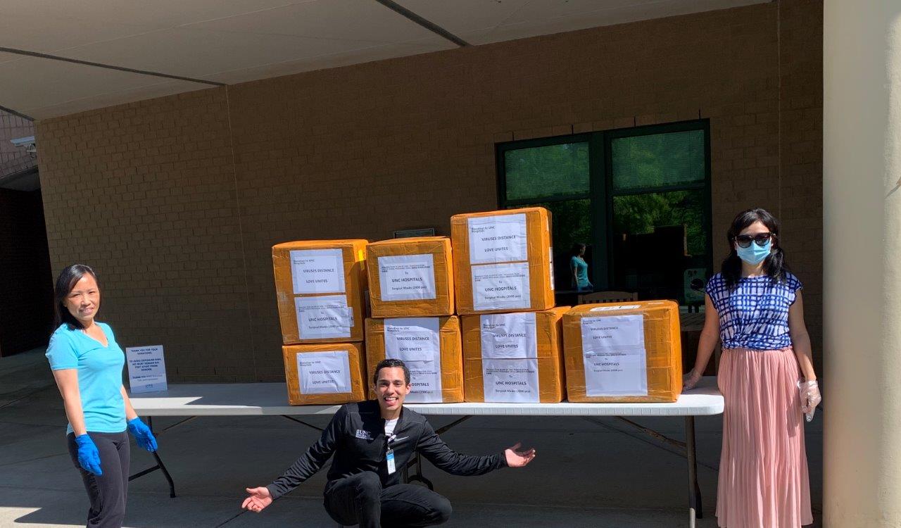

Written by Allison Hines and Kara Roberts During this global pandemic, we’ve seen SAS employees band together, while staying apart. We know that there’s strength in numbers, and amazing things happen when we all bring our unique skills and abilities to the table. We’re proud of the creative ways our employees are giving back, like making masks and preparing food for their communities. Keep reading
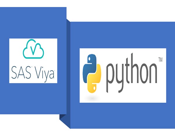

With increasing interest in Continuous Integration/Continuous Delivery (CI/CD), many SAS Users want to know what can be done for Visual Analytics reports. In this article, I will explain how to use Python and SAS Viya REST APIs to extract a report from a SAS Viya environment and import it into another environment.

Many of us are currently working from home and getting adjusted to this new way of working. If you’re an employee working on the shop floor of a manufacturing facility, however, working from home is not an option. Among the many hard decisions manufacturing leaders have had to make during
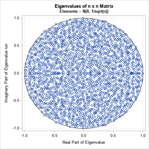

I've previously written about how to generate points that are uniformly distributed in the unit disk. A seemingly unrelated topic is the distribution of eigenvalues (in the complex plane) of various kinds of random matrices. However, I recently learned that these topics are somewhat related! A mathematical result called the


この記事はSAS Institute Japanが翻訳および編集したもので、もともとはLucy Kosturkoによって執筆されました。元記事はこちらです(英語)。 あなたは今まで、実際に現地に行かなくても熱帯雨林を助けることは出来ないかと考えたことはありますか?考えたことがないでしょうか。 でも今がチャンスです。地球をまもるための活動もバーチャルで実施することがでる時代です。私たちの熱帯雨林プロジェクトでは、人工知能(AI)について少しずつ学びながら熱帯雨林を保護する機会を、家で過ごしている児童・生徒の皆さんに提供します(もちろん、大人の方にもご協力いただけます!)。こちらがご自宅でもできる学習ステップガイドです。 このガイドは4つのステップに分かれています: Step1: AIが人類のためにどのような役割を担うのか理解しよう Step2: 熱帯雨林のためにどのようにAIを活用するか見てみよう Step3: 画像の分類に力を貸してください Step4: さらにAIを用いて解決できる他の問題を見つけよう Step 1: AIが人類のためにどのような役割を担うのか理解しよう 私たちは、電気によって生み出された力やインターネットを通じて形成された世界全体の繋がりから、人類の歴史や人々の生活・労働上での技術の転換を知ることができます。AIはそれらの技術の最先端に過ぎません。いわゆるスマート家電から電気自動車まで、AIは私たちが考えていた働き方・運転の仕方・学習など多くのことを変化させてきました。 AIは人間と機械の長所をつなぎ合わせます。コンピュータの処理速度と高い継続性に人間の知性を組み合わせることで、それぞれだけでは実現できないものを作り上げることができます。AIを用いると、私たちは人間にとっては危険なこと(危険な環境の探索など)をコンピュータに実行させるようにトレーニングすることや、監視カメラの管理など人間が継続し続けることが難しい作業をコンピュータに任せることができます。これらは、ルールを設定することが容易な直感的な問題ではなく、未知で予測不可能な状況が溢れている問題です。プログラマーはコンピュータが必要とするルールを開発するのが困難なので、AIを使用して命令を開発します。 例として、複数選択と記述で答える質問がある学生の課題を採点するために開発されたコンピュータプログラムについて考えてみましょう。 複数選択式の質問には4つの選択肢がありますが、その中で正解は1つです。プログラマーは、その学生の回答が正解かどうかを評価する従来のコードを作成します。そのルールは簡単で、「Q:生徒の回答は正解と一致しますか」「A:はい、または、いいえ」です。 では、記述式の質問はどうでしょう?記述の正解は1つではありません。その記述が正しいかどうかを判断するルールも存在しないかもしれません。「記述は何文字以上必要か」「段落の数はいくつか」「必要な単語・用いてはならない単語はあるか」など、記述を適切に採点するためのルールを作成する方法はなく、そのルールは様々な判断と細かい評価が影響してきます。 この場合、プログラマーは従来のコードの代わりにAIを使用します。この問題を解決するために、プログラマーはまず評価の高い記述と低い記述のサンプルを集めます。そのサンプルは多い方が望ましいです。そのサンプルに機械学習アルゴリズムを用いて、コンピュータが優れた記述の基準を識別できるようにします。コンピュータにあらかじめ指示すべきルールはわかりませんが、そのルールが有効かどうかを判断することが出来ます。別のサンプルを用意して、先ほど作成したルールを適応したときに評価の高い記述と低い記述に分類されているかどうかを確認することで、ルールの基準をテストできます。 森林破壊など、世界規模の問題に取り組む際も同様の手法を適用することが出来るのです。 Step 2: 熱帯雨林のためにどのようにAIを活用するか見てみよう SASはIIASAと提携し、AIの専門知識と科学システム分析を統合して、地球を見るための新しい「目」を作りました。この提携によって、惑星映像から森林破壊の領域を自動的に検出できるようになります。コンピュータは何百万もの衛星画像を調べることにより、森林破壊の影響を受けた熱帯雨林の範囲を科学者に警告します。これにより、400万㎢を超える熱帯雨林を短期間で調査し、衛星画像が更新されるたびに調査を繰り返すことが出来ます。


SAS Covid-19 Taskforce bietet kostenlose Handlungsempfehlungen für Unternehmen. Was sagen Ihnen die vorhandene Daten für jetzt und für die Zeit danach?


If you’re in state government, you're well aware of the unprecedented challenges that come with off-the-charts unemployment numbers due to COVID-19. Crashing websites at state unemployment insurance offices and multi-hour phone hold times for the millions of people who've lost their income due to the pandemic are only the most


While each of us are working hard to create our new and temporary routine, it’s important to find ways to keep our energy, passion, and creative juices flowing! Hear from our energy expert, Senior Learning and Development Specialist, Brian Germano, on how to maintain energy and productivity while working from


Modelos de machine learning estão cada dia mais em alta no mercado de trabalho. Mas o que são esses modelos? Por que eles ganharam tanto destaque? Por que todos querem usar? Gosto de dizer que modelos de machine learning são modelos estatísticos acrescidos de poder computacional, e que as empresas
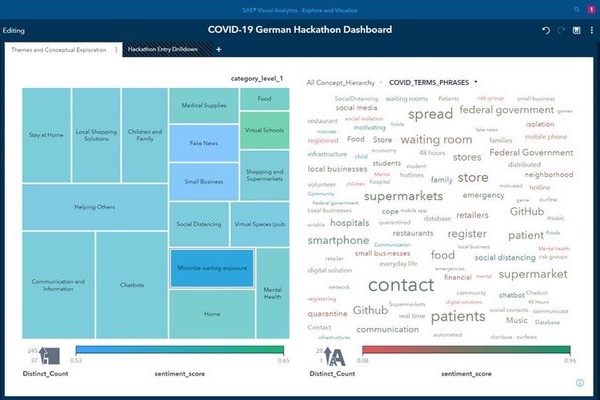

At the end of March, the German government sponsored a hackathon called #WirVsVirus. The aim was to bring Germany’s collective coding expertise to bear on some of the many problems surrounding COVID-19. In total, more than 27,000 coders joined the challenge, working from home, and programming for 48 hours from

SAS' Leonid Batkhan differentiates between SAS macro and programming languages, defines two types of SAS macros and much more.


Nancy Rausch shares 4 examples of the role data management techniques play in responding to COVID-19.


Our food choices not only impact our health, they also have far-reaching impacts on our environment, economy and politics. Dining with the planet in mind can be a daunting task. Do what you can and remember that every small change adds up to big differences! Start with something simple like
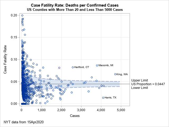
A previous article describes the funnel plot (Spiegelhalter, 2005), which can identify samples that have rates or proportions that are much different than expected. The funnel plot is a scatter plot that plots the sample proportion of some quantity against the size of the sample. The variance of the sample