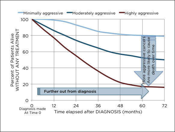
Search Results: sgplot (958)

Data Visualization
Sanjay Matange 0
Margin Plots

Last week a user wanted to view the distribution of data using a Box Plot.  The issue was the presence of a lot of "bad" data.  I got to thinking of ways such data can be visualized.  I also discussed the matter with our resident expert Rick Wicklin who pointed

Rick Wicklin 0
Binary heart in SAS

The xkcd comic often makes me think and laugh. The comic features physics, math, and statistics among its topics. Many years ago, the comic showed a "binary heart": a grid of binary (0/1) numbers with the certain numbers colored red so that they formed a heart. Some years later, I

Data Visualization
Sanjay Matange 0
Cancer Deaths Averted

Significant progress in reduction of Cancer mortality is shown in a graph that I noticed recently on the Cancer Network web site.  This graph showed the actual and projected cancer mortality by year for males.  The graph is shown on the right. The graph plots the projected and actual numbers

Data Visualization
Sanjay Matange 0
Displaying Unicode Symbols in Legend

Including special Unicode symbols into the graph is getting more popular.  In general, SG procedures support Unicode strings in places where these strings are coded into the syntax such as TITLE, FOOTNOTE.  These support Unicode characters and also the  special {SUP} and {SUB} commands.  This is because these statements are rendered

Data Visualization
Sanjay Matange 0
Marker Symbols

There has been much discussion on the SAS Communities page on usage of different symbols in a graph.  The solutioin can vary based on the SAS release.  New features have been added at SAS 9.4 releases to SG Procedures and GTL that make this very easy.  With SAS 9.4M1, almost any combination is

Data Visualization
Sanjay Matange 0
Custom Labels

Over the Christmas Holidays I saw an graph of agricultural exports to Russia in 2013.  The part that caught my eye was the upper part of the graph, showing the breakdown of the trade with Russia as a horizontal stacked bar with custom labels. The value for each region / country

Rick Wicklin 0
Popular posts from The DO Loop in 2014

I published 118 blog posts in 2014. This article presents my most popular posts from 2014 and late 2013. 2014 will always be a special year for me because it was the year that the SAS University Edition was launched. The University Edition means that SAS/IML is available to all

Data Visualization
Sanjay Matange 0
Graph Table

A common scenario is where we have a table of multiple measures over time. Here we have a simple example of Frequency and Response by Day.  The Response is a linear function of the Frequency, as shown in the table on the left below. The  shape of the data is

Data Visualization
Sanjay Matange 0
Fun with Bar Charts

As Sheldon Cooper would say, this is the first episode of "Fun with Charts".  I did not find a cool term like "Vexillology" and "Cartography" is taken by map making, so let us go with "Chartology". Yesterday, I saw a couple of interesting bar charts as shown on the right.  I thought

Data Visualization
Sanjay Matange 0
Clinical Graphs

This week I had the opportunity to present a 1/2 day seminar on creating clinical graphs using the SG procedures during an In-House SAS Users' group meeting.  I have presented this seminar quite a few times now, and I always learn something. The audience was very receptive, with some people

Data Visualization
Sanjay Matange 0
Axis Thresholds

Have you ever wondered why sometimes a SGPLOT or GTL graph has markers drawn beyond the extreme tick and value on an axis and sometimes not?  And, if you prefer your graphs to always have tick values on the axis that cover the whole range of data, how can you

Data Visualization
Sanjay Matange 0
Bar with Statistics

One of the key benefits of using a horizontal bar chart is the ability to display statistics for each bar.  This is a popular feature for the HBAR statement with the SAS/GRAPH GCHART procedure.  So, let us review the options available to us to create such graphs using SGPLOT. The

Rick Wicklin 0
Does this kurtosis make my tail look fat?

What is kurtosis? What does negative or positive kurtosis mean, and why should you care? How do you compute kurtosis in SAS software? It is not clear from the definition of kurtosis what (if anything) kurtosis tells us about the shape of a distribution, or why kurtosis is relevant to

Data Visualization
Sanjay Matange 0
Report from MWSUG 2014

The Mid-West SAS Users' Group conference in Chicago was a great success, with over 400 attendees and great weather.  The conference hotel was in downtown with nice view of the river and a stroll down "Magnificent Mile".  The city does a great job with the flower beds down Michigan Ave., along

Data Visualization
Sanjay Matange 0
CandleStick Chart

A HighLow plot is very popular in the financial industry, often used to track the periodic movement of a stock or some instrument or commodity.  The CandleStick Chart is one specific type of high low plot, purportedly originating in Japan for tracking of financial instruments in the rice trade. Creating a

Rick Wicklin 0
Designing a quantile bin plot

While at JSM 2014 in Boston, a statistician asked me whether it was possible to create a "customized bin plot" in SAS. When I asked for more information, she told me that she has a large data set. She wants to visualize the data, but a scatter plot is not

Data Visualization
Sanjay Matange 0
Splines

Many users of SGPLOT and GTL know how to mix and match various plot statements to create graphs, sometimes in ways not originally intended.  You are also aware that you can go a step beyond, and use these systems to create completely non-standard graphs such as the Spiral Plot, the Polar

1 22 23 24 25 26 32