The SGPLOT procedures includes features to add annotations to your graph in many different ways. Annotations provide you a flexible way to add features to your graph that are not available through the standard plot statements.
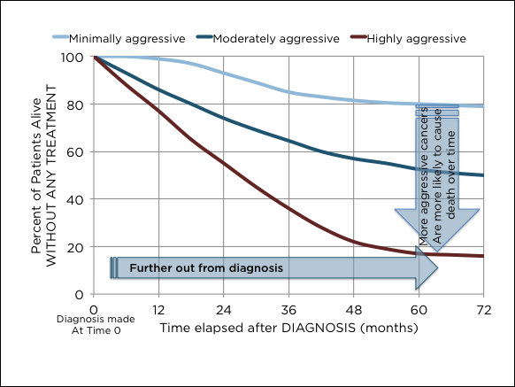 Recently, I saw this graph on the web that caught my attention. Clearly, this looks like a good candidate to use Annotate to create the arrows that explain the behavior of cancers with different severity of aggressiveness.
SAS 9.4M2 release of SGPLOT procedures also includes the POLYGON plot that can handle many such tasks. The Polygon plot is a unique statement that behaves like annotation where it will draw for you any figure you define as a polygon on the graph. The plot statement can be interleaved with other basic plot statements and can negotiate the coordinate space with the graph axes.
 Here, I created the same graph using the Series plot and the Polygon plots of the SGPLOT procedure. The survival percentages over time for patients with different category of cancers are displayed using a Series plot with a Group role.
The arrows with the text explaining the behavior of the cancers are drawn using the Polygon plot using a "Id" role.
In this case, I have defined the data for the curves as Alive * Time by Severity. Then, I created another data set "Arrows" to define the two arrows using (x, y) coordinates for each vertex by "Id". There are two arrows with ID=1 and 2. A label is also defined for each polygon.
Now, I use the Series statement to draw the three curves, and the Polygon statement to draw the polygons. Note the long Y axis label is automatically split.
proc sgplot data=both; series x=time y=alive / group=severity smoothconnect lineattrs=(thickness=4) nomissinggroup name='a'; polygon id=id x=x y=y / fill outline label=label labelpos=center nomissinggroup splitjustify=center fillattrs=(color=lightblue transparency=0.5) labelattrs=(size=8) splitchar=','; xaxis grid values=(0 to 72 by 12) offsetmin=0 offsetmax=0; yaxis grid values=(0 to 1.0 by 0.2) offsetmin=0 offsetmax=0.01; keylegend 'a' / title='' position=top linelength=20 noborder; run; |
The Polygon plot also displays the polygon label in many different ways. Here it is displayed at the center of the polygon bounding box, using "," as the split character to wrap the long label within the body of the arrow. The text has a horizontal orientation, and thus easier to read. Rotated text can also be displayed if necessary.
 Often, it may be preferred to display the labels for each curve in the plot itself, thus eliminating the need for a legend. This is often leads to a graph that is easier to decode as it is no longer necessary to look back and forth between the curves and a legend. The curves are labeled where the eye is already.
Reducing eye movement necessary to decode the information in the graph leads to a more "effective" graph.
The answer to the question in the title then is: "No, it is the Polygon Plot".
Full SAS 9.4M2 Code: Prognosis


6 Comments
Very nice. I noticed the dataset named BOTH. Which reminded me that sometimes I wonder if it would be easier to overly plots if it were be possible to specify two (or more) separate datasets for one PROC SGPLOT step? I guess instead of combining two datasets and plotting it, the syntax might allow DATA= on the SERIES statement or whatever. Is that a crazy idea?
Not crazy at all. We have debated that for a while, but stayed with the standard procedure format of having one data set for the procedure.
We hope to do something about this in a future release where the procedure could support multiple data sets. The data set may have to be specified on the plot statement. All roles for a statement still need to come from one data set. There could be a problem for SGPANEL which has class variables in addition to plot variables that have to be common across all data sets.
I am not a fan of interpreting the graph within the graph itself. I think the graph should present the data, and interpretation should be done in a caption or in the text. The horizontal arrow merely repeats the X axis label, and is useless. I'd suggest omitting the POLYGON statement altogether. The caption or text for the graph would say: "The line plot shows the survival curves for cancer patients who do not receive treatment. For each month in the study, patients with more agressive cancers were less likely to survive."
Edward Tufte wrote that good graphs should maximise the "data ink" and reduce "chart junk". Like you, I prefer clean graphs with a sentence or two of English prose underneath to interpret. However, some like complexity and it is good to see that SAS provides for their wishes.
Apart from simplifying, I think the graph could be improved by using colours which suggest a scale for the three cancer types. They do not need to be very different as the lines are well separated. Maybe use darker or more saturated colour as aggressiveness increases?
I agree with both you and Rick on "a better way to make such a graph". Here my motivation was to show different ways to annotate in SGPLOT.
I see it as a nice illustration of what you can do with the POLYGON statement.
But I do agree that the plot as such might have been at least as effective without it.
I would like to address the issue of moving the legend to the plot. It certainly creates a more easily readable plot - in this case.
But I am usually in the business of creating code that is run more or less automatically on regular intervals, or for a large number of groups. And then there always will be cases where the labels run into each other.
Unless there is an easy solution to make sure that will not occur I tend to stick with separate legends outside the plot area.