Sankey Diagrams have found increasing favor for visualization of data. This visualization tool has been around for a long time, traditionally used to visualize the flow of energy, or materials. .
Now to be sure, GTL does have a statement design for a Sankey Diagram which was implemented only in Flex for use in interactive visualization cases. The GTL Sankey Diagram statement was not implemented for use in MVA visualization cases due to lack of demand.
However, recently a SAS user asked about creating such graphs using SAS MVA graphics tools. With SAS 9.4 there are sufficient tools in place to create such a diagram using custom coding without use of annotation. In SAS 9.4M3, more tools are available that makes this task easier. I have outlined the process below.
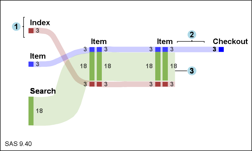 The diagram created using the SAS 9.4 SGPLOT procedure is shown on the right. Click on the diagram to see bigger view. Since no SANKEY statement is available in SGPLOT, such a diagram requires custom coding. However, no annotation is required. The program uses the following statements:
- Series with SmoothConnect for the curves.
- Highlow plots nodes and link values.
- Scatter plot with MarkerChar for node labels.
- Series plot to draw the brackets.
- Scatter plot with MarkerChar for labels 1,2,3.
A custom data set has to be created to draw the different parts of the diagram as shown in the attached program link at the bottom.
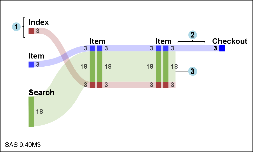 The diagram shown on the right uses the new SPLINE statement to be released soon with SAS 9.4M3. This makes the process a little easier, as the spline is a smooth curve that does not need to pass through each of the vertex points. The SAS 9.4M3 SGPLOT also supports varying line thickness for series and spline statements.
Clearly the data is hand-built for this particular diagram. I believe this process can be converted to a macro to create a Sankey Diagram from a node-link data set with the appropriate information. Things will get more interesting as the diagram includes links splits or merges at various nodes.
SAS 9.4 SGPLOT Code: Sankey_940


11 Comments
The Sankey diagram is interesting and could be useful to digital analysts showing web behavior.
The code is straight forward, yet I lack a clear understanding of what you are trying to show in the example. What do your x and y variables represent?
You are right. Sankey Diagrams are used now often to analyse web traffic, including how a customer steps through the process of buying an item on a web site. Some customers come from a direct link from other pages, other through a search result. The number of people are shown for each transaction (links), before and after a specific web page (nodes) in the process. Some transactions proceed to completion of the transaction to the "Checkout" node, while many are dropped prior to checkout. This can be useful to identify customer behavior. If a lot of customers leave at a specific node (web page), that can indicate some issue in the page.
This particular flow was provided by a users wanting to create a diagram like this using server side graph procedure. The data and the appearance of the diagram came from the user. My objective here is to show how such a diagram can be made using the SGPLOT procedure. As shown in the link to "Sankey Diagrams" these come in many flavors for many applications.
What a coincidence. I just happened to be finishing a PharmaSUG paper about adding Sankey-style overlays to longitudinal bar charts (link). I'll have to see what I can borrow from the above post to improve my own code. Thanks!
The code provided uses a Series plot with SmoothConnect available in SAS 9.4 or SAS 9.3. The upcoming SAS 9.4M3 release will include a Spline statement that makes drawing these curved links much easier. Your paper looks very interesting. Looking forward to the details under the covers at PharmaSUG. 🙂
I would like to repeat the question in the first comment - what are your X and Y? Any tips on what you've done and how anyone can implement this code for their own use?
This was an attempt to create a diagram similar to what a user wanted. The goal was to show the statements that can be used to create the diagram, and what the data needs to look like for this to work.
OK, this comment is as vague and unhelpful as the previous ones. thanks
Hi, I am trying to get a sankey graph but I have some difficult,
The program works well but I need to get a value from th variable thikness
tip=(thickness);
but tip=(variable) does not give us the value on the graph, how can I get the value please?
Thanks.
proc sgplot data=youcef._all_1 noautolegend;
%*---------- plotting statements ----------;
/* &band;
&highlow; */
/* %if &percents = yes %then &scatter;; */
band x=xt01 lower=yblow01 upper=ybhigh01 / x2axis transparency=0.5 fill fillattrs=(color=CX0000CD) tip=(thickness);
band x=xt02 lower=yblow02 upper=ybhigh02 / x2axis transparency=0.5 fill fillattrs=(color=CX0000CD) tip=(thickness);
band x=xt03 lower=yblow03 upper=ybhigh03 / x2axis transparency=0.5 fill fillattrs=(color=CX0000CD) tip=(thickness);
band x=xt04 lower=yblow04 upper=ybhigh04 / x2axis transparency=0.5 fill fillattrs=(color=CX8A2BE2) tip=(thickness);
band x=xt05 lower=yblow05 upper=ybhigh05 / x2axis transparency=0.5 fill fillattrs=(color=CX8A2BE2) tip=(thickness) ;
band x=xt06 lower=yblow06 upper=ybhigh06 / x2axis transparency=0.5 fill fillattrs=(color=CX8A2BE2) tip=(thickness);
band x=xt07 lower=yblow07 upper=ybhigh07 / x2axis transparency=0.5 fill fillattrs=(color=CX0000CD) tip=(thickness);
band x=xt08 lower=yblow08 upper=ybhigh08 / x2axis transparency=0.5 fill fillattrs=(color=CX0000CD) tip=(thickness);
band x=xt09 lower=yblow09 upper=ybhigh09 / x2axis transparency=0.5 fill fillattrs=(color=CX0000CD) tip=(thickness);
band x=xt10 lower=yblow10 upper=ybhigh10 / x2axis transparency=0.5 fill fillattrs=(color=CX8A2BE2) tip=(thickness);
band x=xt11 lower=yblow11 upper=ybhigh11 / x2axis transparency=0.5 fill fillattrs=(color=CX8A2BE2) tip=(thickness) ;
band x=xt12 lower=yblow12 upper=ybhigh12 / x2axis transparency=0.5 fill fillattrs=(color=CX8A2BE2) tip=(thickness);
band x=xt13 lower=yblow13 upper=ybhigh13 / x2axis transparency=0.5 fill fillattrs=(color=CXDAA520) tip=(thickness);
band x=xt14 lower=yblow14 upper=ybhigh14 / x2axis transparency=0.5 fill fillattrs=(color=CX0000CD) tip=(thickness);
band x=xt15 lower=yblow15 upper=ybhigh15 / x2axis transparency=0.5 fill fillattrs=(color=CX0000CD) tip=(thickness);
band x=xt16 lower=yblow16 upper=ybhigh16 / x2axis transparency=0.5 fill fillattrs=(color=CX0000CD) tip=(thickness);
band x=xt17 lower=yblow17 upper=ybhigh17 / x2axis transparency=0.5 fill fillattrs=(color=CX8A2BE2) tip=(thickness);
band x=xt18 lower=yblow18 upper=ybhigh18 / x2axis transparency=0.5 fill fillattrs=(color=CX8A2BE2) tip=(thickness);
band x=xt19 lower=yblow19 upper=ybhigh19 / x2axis transparency=0.5 fill fillattrs=(color=CX8A2BE2) tip=(thickness) ;
band x=xt20 lower=yblow20 upper=ybhigh20 / x2axis transparency=0.5 fill fillattrs=(color=CXDAA520) tip=(thickness) ;
highlow x=xb01 low=lowb01 high=highb01 / type=bar barwidth=0.25 fillattrs=(color=CX0000CD) name='CX0000CD' legendlabel='Soli' ;
highlow x=xb02 low=lowb02 high=highb02 / type=bar barwidth=0.25 fillattrs=(color=CX8A2BE2) name='CX8A2BE2' legendlabel='Appel' ;
highlow x=xb03 low=lowb03 high=highb03 / type=bar barwidth=0.25 fillattrs=(color=CXDAA520) name='CXDAA520' legendlabel='Pas de contact' ;
highlow x=xb04 low=lowb04 high=highb04 / type=bar barwidth=0.25 fillattrs=(color=CX0000CD) name='CX0000CD' legendlabel='Soli' ;
highlow x=xb05 low=lowb05 high=highb05 / type=bar barwidth=0.25 fillattrs=(color=CX8A2BE2) name='CX8A2BE2' legendlabel='Appel' ;
highlow x=xb06 low=lowb06 high=highb06 / type=bar barwidth=0.25 fillattrs=(color=CXDAA520) name='CXDAA520' legendlabel='Pas de contact' ;
highlow x=xb07 low=lowb07 high=highb07 / type=bar barwidth=0.25 fillattrs=(color=CX0000CD) name='CX0000CD' legendlabel='Soli' ;
highlow x=xb08 low=lowb08 high=highb08 / type=bar barwidth=0.25 fillattrs=(color=CX8A2BE2) name='CX8A2BE2' legendlabel='Appel' ;
highlow x=xb09 low=lowb09 high=highb09 / type=bar barwidth=0.25 fillattrs=(color=CXDAA520) name='CXDAA520' legendlabel='Pas de contact' ;
highlow x=xb10 low=lowb10 high=highb10 / type=bar barwidth=0.25 fillattrs=(color=CX0000CD) name='CX0000CD' legendlabel='Soli' ;
highlow x=xb11 low=lowb11 high=highb11 / type=bar barwidth=0.25 fillattrs=(color=CX8A2BE2) name='CX8A2BE2' legendlabel='Appel' ;
highlow x=xb12 low=lowb12 high=highb12 / type=bar barwidth=0.25 fillattrs=(color=CXDAA520) name='CXDAA520' legendlabel='Pas de contact' ;
scatter x=xb01 y=meanb01 / x2axis markerchar=textb01 ;
scatter x=xb02 y=meanb02 / x2axis markerchar=textb02 ;
scatter x=xb04 y=meanb04 / x2axis markerchar=textb04 ;
scatter x=xb05 y=meanb05 / x2axis markerchar=textb05 ;
scatter x=xb06 y=meanb06 / x2axis markerchar=textb06 ;
scatter x=xb07 y=meanb07 / x2axis markerchar=textb07 ;
scatter x=xb08 y=meanb08 / x2axis markerchar=textb08 ;
scatter x=xb09 y=meanb09 / x2axis markerchar=textb09 ;
scatter x=xb10 y=meanb10 / x2axis markerchar=textb10 ;
scatter x=xb11 y=meanb11 / x2axis markerchar=textb11 ;
scatter x=xb12 y=meanb12 / x2axis markerchar=textb12 ;
%*---------- axis and legend statements ----------;
x2axis display=(nolabel noticks) min=1 max=4 integer offsetmin=0.05 offsetmax=0.05
tickvalueformat=xfmt.;
xaxis display=none type=discrete offsetmin=0.05 offsetmax=0.05
tickvalueformat=xfmt. ;
yaxis offsetmin=0.02 offsetmax=0.02 label="percent" grid ;
keylegend %macro test; %do i = 1 %to 3; "&&color&i" %end;%mend test; %test / title="" ;
run;
Hi Sanjay,
Sankey diagram is very useful for tracking the trajectory of the event, even a cohort of customers .... however, currently I am facing an issue, sankey disgram can deal with drop off earlier case, but how to deal with entry later cases?
for example, there are 5 steps for my event ( ie. step 1 to 5, entry at step 1 and ended at step 5), a part of the cohort can finish at step 4, and a part of the cohort can enter from step 2 or step 3, how should my dataset structured for the late entry situations?
Hi Xiaoping. My example does not use a spedific "Sankey" statement that will do the work for you based on node and link data. This "Sankey" diagram is uses basic plots like series and highlow to create a diagram. In this case, the data is totally computed by user. So, you would have to compute those values to make the diagram you are wanting.
Thank you for providing a code for sankey diagram! I'm new to SAS and I spent one week to figure out how to do it but when I followed the steps of your code I created the sankey diagram in just one day!