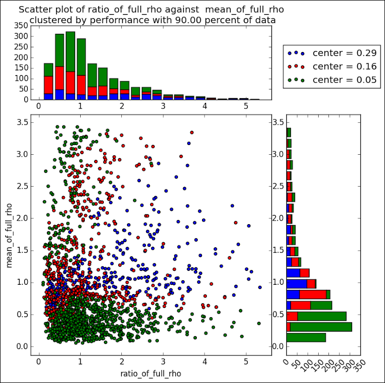
 Last week a user expressed the need to create a graph like the one shown on the right using SAS. This seems eminently doable using GTL and I thought I would undertake making this graph using SAS 9.3.
The source data required to create this graph is only the X-Y information in the scatter plot. Not having access to the original data in this graph, I simulated some data using random functions in three DO loop, one each for the three groups, in a DATA STEP. The groups are 'A', 'B' and 'C', in place of the values like 'Center = 0.29' and so on. See the full program in the link at the bottom.
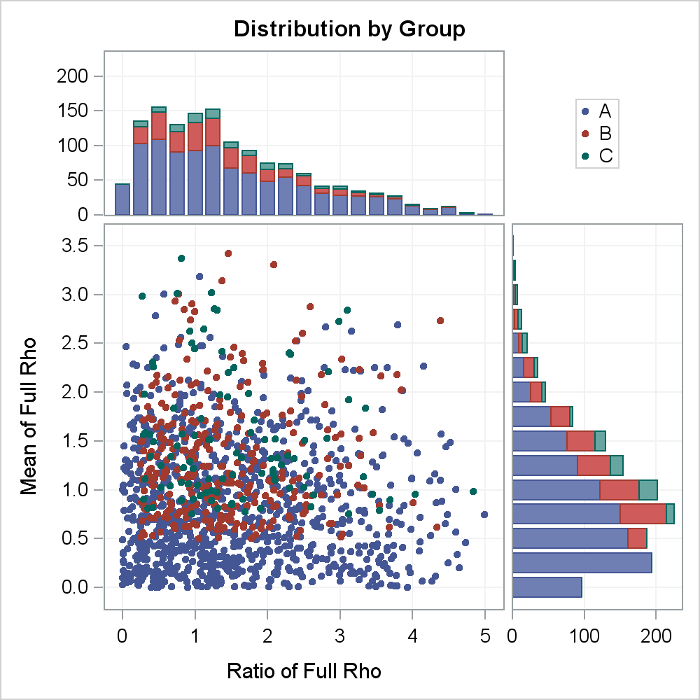
The graph on the right can be constructed as a LATTICE of four cells with the following contents.
- The cell on the bottom left is a regular X-Y scatter plot by group.
- The cell at the top left is a stacked vertical histogram of counts for the x-bins by group.
- The cell at the bottom right a stacked horizontal histogram of counts for the y-bins by group.
- The cell at the top right contains the legend.
SAS 9.3 SGPLOT or GTL does not have a statement to draw a stacked histogram by group. So, we have to find another way to do this. We will us the HighLowPlot plot statement, which shows the group segments where we place them, and also supports a numeric x axis. We now have to build the data set appropriate for the plot.
The good new is that we can leverage the SGPLOT Histogram statement to generate the bins and counts we need for X and BY=group as follows:
ods _all_ close; ods output sgplot=xa; proc sgplot data=scatter(where=(x le 5)); by grp; histogram x / scale=count binstart=0 binwidth=0.25; run; |
 This program will bin the data by X, with BinStart and BinWidth set as needed. The output is written the the 'XA' data set. The SGPLOT generates the required bins and count columns using variable names that are based on the original variables. You can turned off all destinations, so no graph is actually created but the data set is written out. You can view the data set to find these new variables.
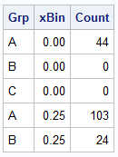
After this step I cleaned up this data set to create a data set of the xBins and the Counts by Group. A snippet of the data set is shown on the right.
data xBins; set xa(where=(Bin_X_Scale_count_Binstart_0___Y ne .)); drop x; rename Bin_X_Scale_count_Binstart_0___Y=count Bin_X_Scale_count_Binstart_0___X=xBin; run; proc sort data=xBins out=xBinsByBin; by xBin; run; |
 Now we have the bins and the counts by group. We need to stack the values so we can use the HighLowPlot to draw the stacked bins. The data step shown below does just that, but creating the Low and High values for each group in a bin as stacked on the previous value.
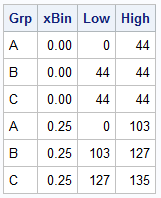
The final data set is shown on the right. We can plot it using the HighLow plot statement in SGPLOT to create just the horizontal stacked Histogram, to see if we have the right data. I will save that step for later.
data HighLowX; drop count; retain Low High; set xBinsbyBin; by xBin; if first.xBin then Low=0; High=Low+Count; output; Low=High; run; |
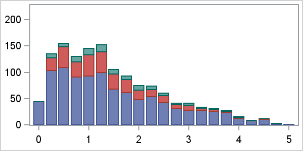
We go through the same steps above for creating the binned data for the Y axis. then, I merge the original X-Y data with the X and Y bin data sets to get the final data set ready for plotting. I can plot each graph separately form this merged data set to ensure everything is working correctly. The xBin, Low and High values are in a block of the data where other columns are missing, and so on. Here is the graph for just the horizontal stacked histogram.
The next step is to create a GTL template with a 2x2 layout of cells and common uniform axes. See the program link at the bottom for the full code. Here is the layout of the template.
proc template; define statgraph Scatter_Layout; begingraph; entrytitle 'Distribution by Group'; /*--Outermost Lattice Container--*/ layout lattice / rows=2 columns=2 rowweights=(0.3 0.7) columnweights=(0.7 0.3) columndatarange=union rowdatarange=union rowgutter=5 columngutter=5; /*--Common Row axes--*/ rowaxes; rowaxis / offsetmin=0 display=(ticks tickvalues) griddisplay=on; rowaxis / label='Mean of Full Rho' griddisplay=on linearopts=(tickvaluesequence=(start=0 increment=0.5 end=3.5)); endrowaxes; /*--Common Column axes--*/ columnaxes; columnaxis / label='Ratio of Full Rho' griddisplay=on); columnaxis / offsetmin=0 display=(ticks tickvalues) griddisplay=on); endcolumnaxes; /*--Upper Left cell with Stacked X Bins counts by group--*/ layout overlay; highlowplot x=xBin low=low high=high / group=grp type=bar; endlayout; /*--Upper Right cell with Legend--*/ layout overlay; discretelegend 'a'; endlayout; /*--Lower Left cell with SX-Y Scatter Plot--*/ layout overlay; scatterplot x=x y=y / group=grp markerattrs=(symbol=circlefilled size=5) name='a'; endlayout; /*--Lower Right cell with Stacked Y Bins counts by group--*/ layout overlay; highlowplot y=yBin low=low high=high / group=grp type=bar; endlayout; endlayout; endgraph; end; run; |
Here is the Graph. You can adjust the font sizing for the axes if needed. Click on graph for a high resolution image. Note, we are using common external Row and Column axes since these are uniform and should not be repeated.
Full SAS 9.3 code: Scatter_Layout


2 Comments
Sanjay: Thanks for yet another year of great graphics. Hope to see you in San Diego in Sept. Good new year to you.
Hi Sanjay:
Great stuff. It was really complex for me. Could yo tell me how to do a stacked histogram?
Cheers,
Greg