Last week a user wanted to view the distribution of data using a Box Plot. The issue was the presence of a lot of "bad" data. I got to thinking of ways such data can be visualized. I also discussed the matter with our resident expert Rick Wicklin who pointed me to a couple of resources including some information on visualization of missing data on the web.
First, my usual disclaimer: I am only a "Graph Guy", and not a Statistician. So, my thoughts below are mainly graphical suggestions. Please feel free to point out pros and cons of the techniques discussed below.
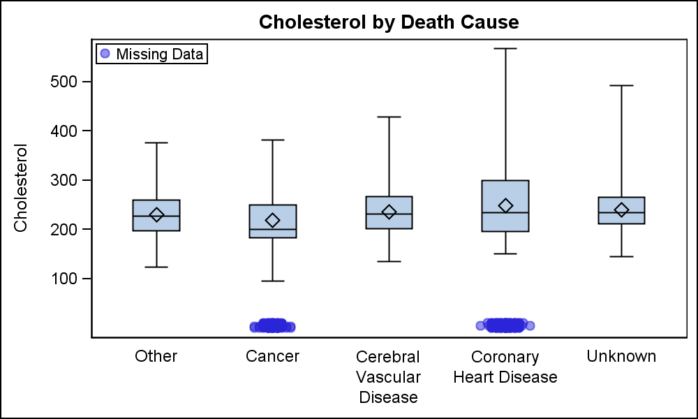 On the issue of visualizing data using Box plots, I simulated some data using sashelp.heart. by setting some data to missing, and setting those values to zero in another column. Then, I used a box plot to view the data, and overlaid a scatter plot to view the values that were set to missing. Since I put those observations in another column with a value of zero, they all show up at the bottom of the graph. You can select the appropriate value. I set the Y axis so zero is not on the axis.
SGPLOT with SAS 9.40M1 supports overlays of basic plots with a VBOX. Note how we can see that some of the "Cancer" and "Coronary Heart Disease" data is "bad", in this case, "missing".
title 'Cholesterol by Death Cause'; proc sgplot data=heart_Box noautolegend; vbox cholesterol / category=deathcause extreme; scatter x=deathcause y=chol / markerattrs=graphdata1(symbol=circlefilled) transparency=0.5 name='s' jitter jitterwidth=0.5 legendlabel='Missing Data'; keylegend 's' / location=inside position=topleft; xaxis display=(noticks nolabel); yaxis values=(100 to 500 by 100) min=0 valueshint; run; |
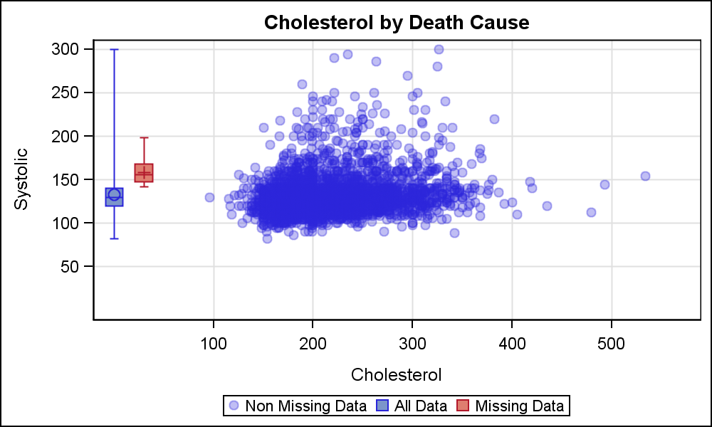 The user also made a comment on how the data was so skewed, that a box plot was not possible. That got me looking for another way to view the same data. This time, I replaced some values for Cholesterol and Systolic with missing values, copying them into other variables.
Now, I plotted Systolic by Cholesterol, which displayed the cloud of non-missing values. Then I added a box plot for all the values and a box for just the values where cholesterol was missing. The graph is shown on the right. Click on graph for a higher resolution image.
The blue box is of all the observations where cholesterol is non-missing. Red box is for observations where cholesterol is missing, but the systolic has a valid value. Once again, this is possible with SAS 9.40M1 SGPLOT. For the VBOX data, I have set the "category" values to 10 and 20. Since the axes are "Linear" by the Scatter plot, this combination is possible.
proc sgplot data=heart_2D noautolegend;
  scatter x=chol y=syst / name='s' markerattrs=graphdata1  legendlabel='Non Missing Data'
          markerattrs=graphdata1(symbol=circlefilled) transparency=0.7;
  vbox systBox / category=cholA extreme group=systgrp fill nooutliers name='b' boxwidth=1;
  keylegend 's' 'b';
  xaxis min=0 values=(100 to 500 by 100) valueshint grid label='Cholesterol';
  yaxis min=0 values=( 50 to 300 by 50) valueshint grid label='Systolic';
run;
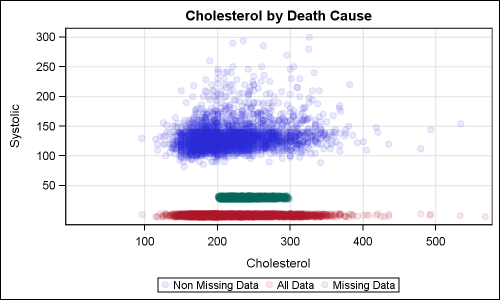 Now, this gives us some idea where all the data is, but still this may not work well if the distribution of the data is bi-modal. We can create the same graph using a scatter plot of the data instead of box.
Here, I have displayed a scatter of the non-missing data along with another scatter plot with two groups - All data and Missing Systolic data. Maybe this view can provide a better visualization of the missing data. We can certainly add insets to indicate the percentage of the missing data.
Another way may be to use a HISTOGRAM instead of the VBOX or SCATTER to view the distribution of the missing data. I will take that up in a follow-up post.
Even with SAS 9.40M1, SGPLOT will allow us only to view one distribution at a time. If we want to plot both the distribution of the Systolic for missing Cholesterol and vice-versa, we will need to use GTL. Also, if you have a SAS release prior to SAS 9.40M1, you can use GTL to create the VBOX + SCATTER overlay graphs shown above.
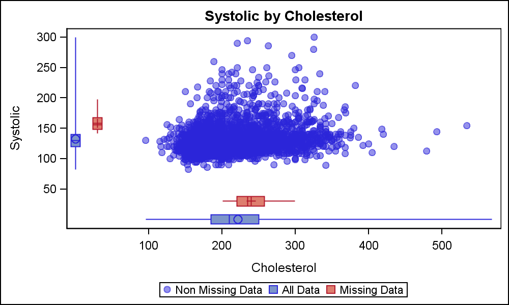 The graph with box plots of all and missing data is shown on the right. This graph is created using GTL. It uses only one LAYOUT OVERLAY, since the categorical values for the box plots is also numeric. However, we can use a LAYOUT LATTICE to create other combinations.
Full SAS9.40M1 Code: Margin_Plot


1 Comment
Pingback: Boxplot with connect - Graphically Speaking