This blog post is motivated by a post by a user on the communities page about creating a box plot with colored boxes by category and multiple connect lines.
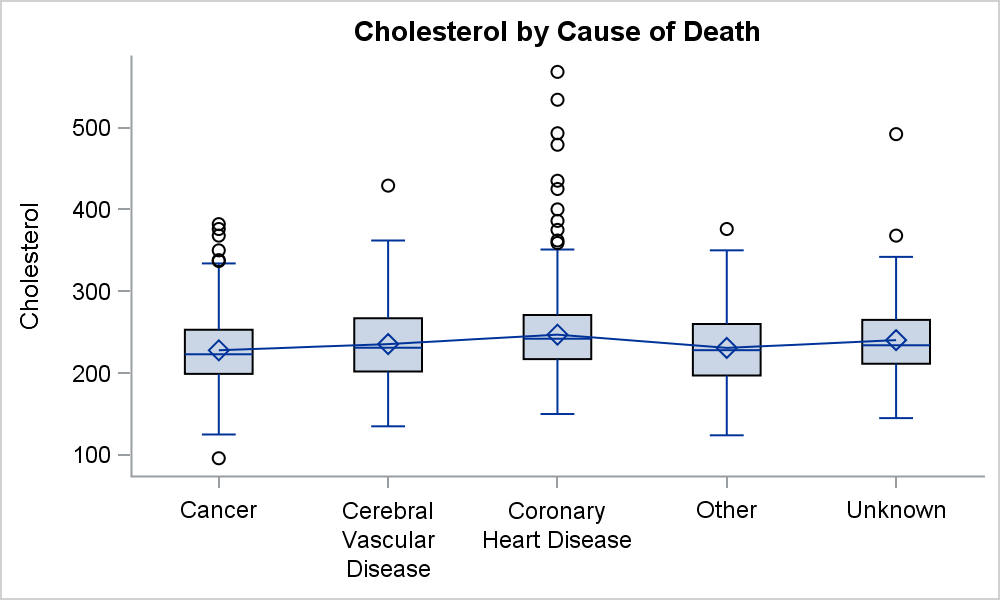 Normally, a box plot can be drawn by category, with a single connect line for one of the statistical values of the box plot, say mean or median as shown in the graph on the right. This is very straightforward, and supported by the SGPLOT procedure and GTL. The SGPLOT code for this use case is shown below. We have used the VBOX statement, with CONNECT=mean. The connect line joins the specified statistic across all the categories for a group.
title 'Cholesterol by Cause of Death';
proc sgplot data=sashelp.heart noautolegend ;
vbox cholesterol / category=deathcause connect=mean;
xaxis display=(nolabel);
run;
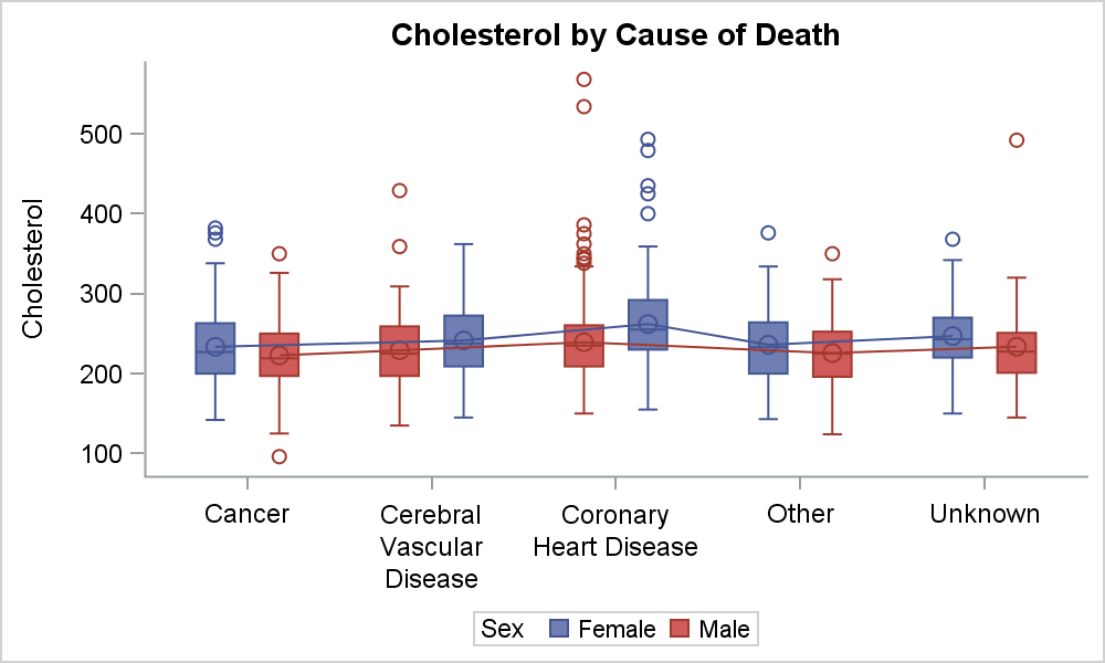 If there is more than one group, the values are connected by group as shown on the right. Here we have used GROUP=sex, resulting in a box plot with Male and Female boxes by Death Cause. The mean values of the boxes are connected by group. The boxes and connect lines are colored by sex, as shown in the legend.
The unique use case the user had was that he wants the boxes displayed by category without groups, but each box is colored by the category variable.
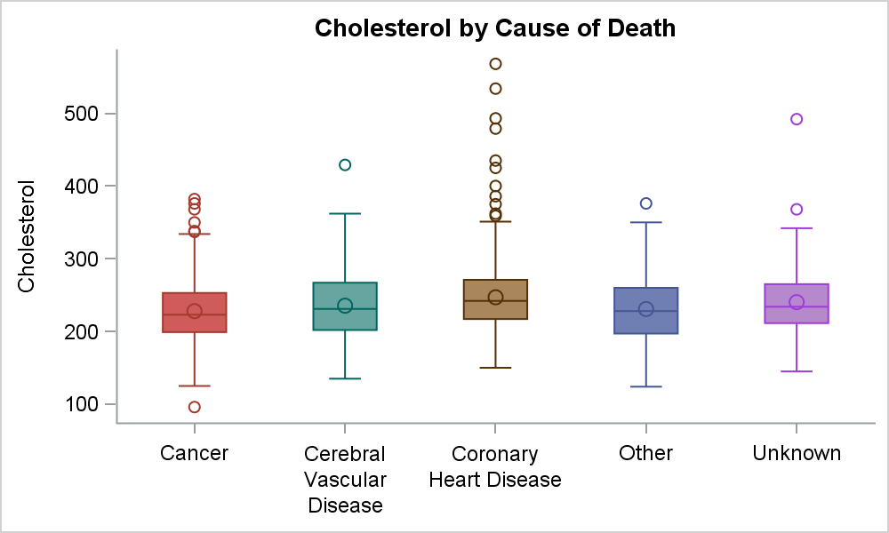 This can be achieved by setting the GROUP='category variable', resulting in a graph where the boxes are colored by the category, but really because the group role is used. In the graph on the right, we have set GROUP=DeathCause, the same variable as the CATEGORY role. This colors the boxes by category. We have used CONNECT=mean, but no connect line is shown. This is due to the fact that each of the boxes belongs to a different group, and there is only one of each. So, no connect line is possible.
title 'Cholesterol by Cause of Death';
proc sgplot data=sashelp.heart noautolegend noborder;
vbox cholesterol / category=deathcause group=deathcause connect=mean;
xaxis display=(nolabel);
run;
The user not only wants a connect line in this case, but actually wants to see the connect line for multiple statistics, say "Mean" and "Median". This is now getting beyond what the SGPLOT procedure can do with simple options. Now, we need to draw the boxes and the connect lines ourselves using either an overlay of a SERIES plot (SAS 9.4M1) or SGAnnotate (SAS 9.3 +).
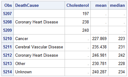 Using SAS 9.4M1, we have processed the data using the MEANS Procedure to compute the Mean and Median statistics by DeathCause. Then, we have merged this summary data into the original data, and created additional columns. The last few observations are shown on the right. The merged data contains all the original observations for Death Cause and Cholesterol, with missing "Mean" and "Median". Then, we have 5 additional observations for the Mean and Median columns with missing Cholesterol.
 We can use this data set to plot the box plot of cholesterol by Deathcause, and overlay that with two SERIES plots, one for Mean and one for Median with different line attributes.
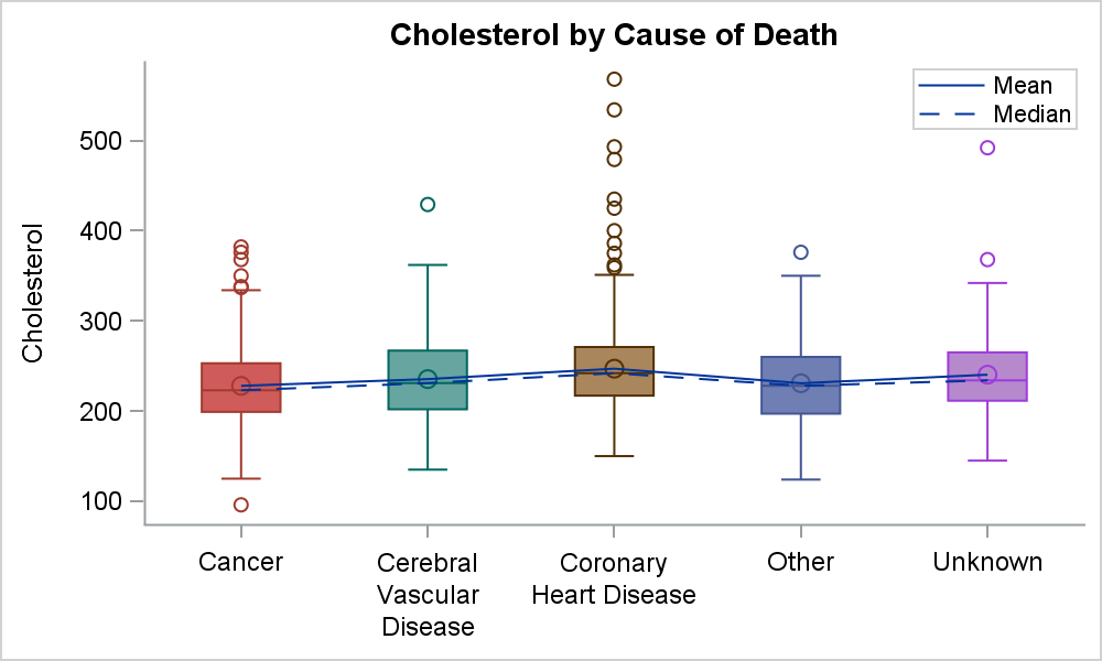
Note how the boxes are displayed colored by death cause. Additionally, we have a "connect" of the "Mean" and the "Median" values using the SERIES plot. The legend for the connect lines is displayed inside the plot area.
title 'Cholesterol by Cause of Death';
proc sgplot data=heart2 noautolegend noborder;
vbox cholesterol / category=deathcause group=deathcause;
series x=deathcause y=mean / name='mean' legendlabel='Mean';
series x=deathcause y=median / lineattrs=(pattern=dash) name='median' legendlabel='Median';
keylegend "mean" "median" / linelength=32 location=inside across=1 position=topright;
xaxis display=(nolabel);
run;
SAS 9,40M1 allows the overlaying of "Basic" plots with a VBOX statement. Prior to SAS 9.40M1, overlay of basic plots on a VBOX was disallowed. This restriction was removed for SAS 9.40M1 expressly because many users want to overlay detailed data on a box plot, such as the actual observations themselves as in the Margin Plot example.
If you have an earlier SAS 9.3 + version, you can do the same by using SGANNOTATE to draw the connect lines. See Dan's paper on SGAnnotate, or Warren's Advanced ODS Graphics Examples.
FullSAS 9.40M1 code: Box_Connect


4 Comments
Pingback: Boxplot with Connect using Annotate - Graphically Speaking
Pingback: Easy Box Plot with Multiple Connect Lines - Graphically Speaking
Pingback: [R作图]2 最拉风Box and whiskers | BJC俱乐部
Pingback: Overlay plots on a box plot in SAS: Discrete X axis - The DO Loop