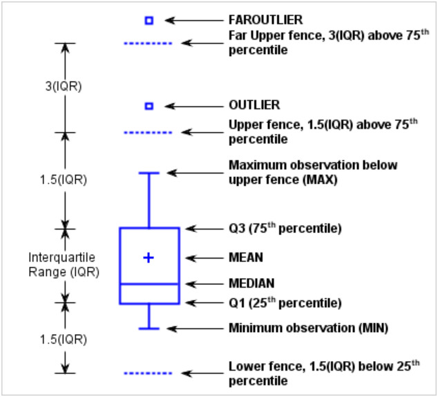
Tag: VBOX

Data Visualization
Sanjay Matange 0
Box plot legend

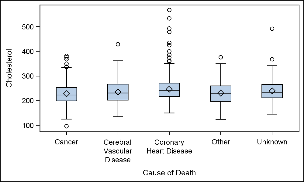
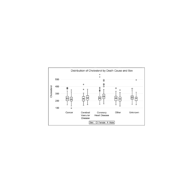
A grouped box plot created by SGPLOT VBOX / HBOX statement or GTL BOXPLOT statement will display groups within categories using group colors and puts the color swatches representing the group values in the legend.  This works well for a color graph created as shown below. title 'Distribution of Cholesterol

Data Visualization
Sanjay Matange 0
Boxplot with connect

This blog post is motivated by a post by a user on the communities page about creating a box plot with colored boxes by category and multiple connect lines. Normally, a box plot can be drawn by category, with a single connect line for one of the statistical values of

Data Visualization
Sanjay Matange 0
Margin Plots

Last week a user wanted to view the distribution of data using a Box Plot.  The issue was the presence of a lot of "bad" data.  I got to thinking of ways such data can be visualized.  I also discussed the matter with our resident expert Rick Wicklin who pointed

Data Visualization
Sanjay Matange 0
Binary Response Graph

Often we need to plot the response values for binary cases of a classifier.  The graph below is created to simulate one seen at http://www.people.vcu.edu/ web site of the shock index for subjects with or without a pulmonary embolism.  In this case, the data is simulated for illustration purposes only. There

Data Visualization
Sanjay Matange 0
Custom Box Plots

A frequent question we get from users is how to create a box plot with custom whiskers lengths.  Some want to plot the 10th and 90th percentile, while other want the 5th and 95th percentiles.  The VBOX statement in the SGPLOT  procedure does not provide for custom whiskers.  Also, unlike GTL,