Advanced ODS Graphics: Inserting a graph into a graph

You can use SG Annotation (and its GTL equivalent) to display one graph inside another.
You can use SG Annotation (and its GTL equivalent) to display one graph inside another.
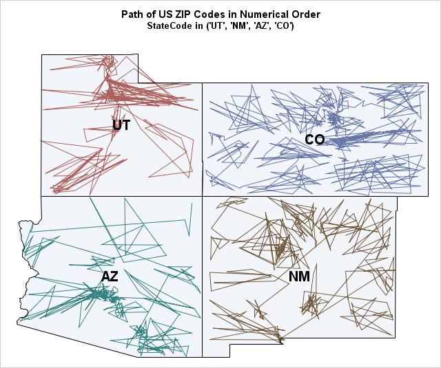
Toe bone connected to the foot bone, Foot bone connected to the leg bone, Leg bone connected to the knee bone,... — American Spiritual, "Dem Bones" Last week I read an interesting article on Robert Kosara's data visualization blog. Kosara connected the geographic centers of the US zip codes in
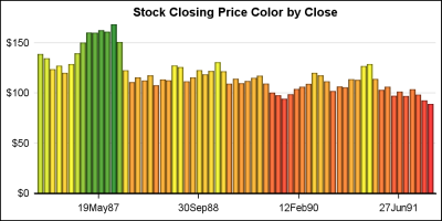
Bar charts in SGPLOT procedure have some new features that everyone may not be familiar with. In this article we will create bar charts with color response on linear axes. Normally, the VBAR statement treats the x-axis as discrete, placing each unique value by itself, equally spaced on the x-axis.

This post shows a variety of techniques including how to use PROC TEMPLATE and the SOURCE statement, PROC SGPLOT with multiple Y-axis tables, create comparable axes in two side-by-side graphs, create a broken axis, write and use a table template that wraps text, and find and display examples of certain statements in graph templates and fonts in style templates.
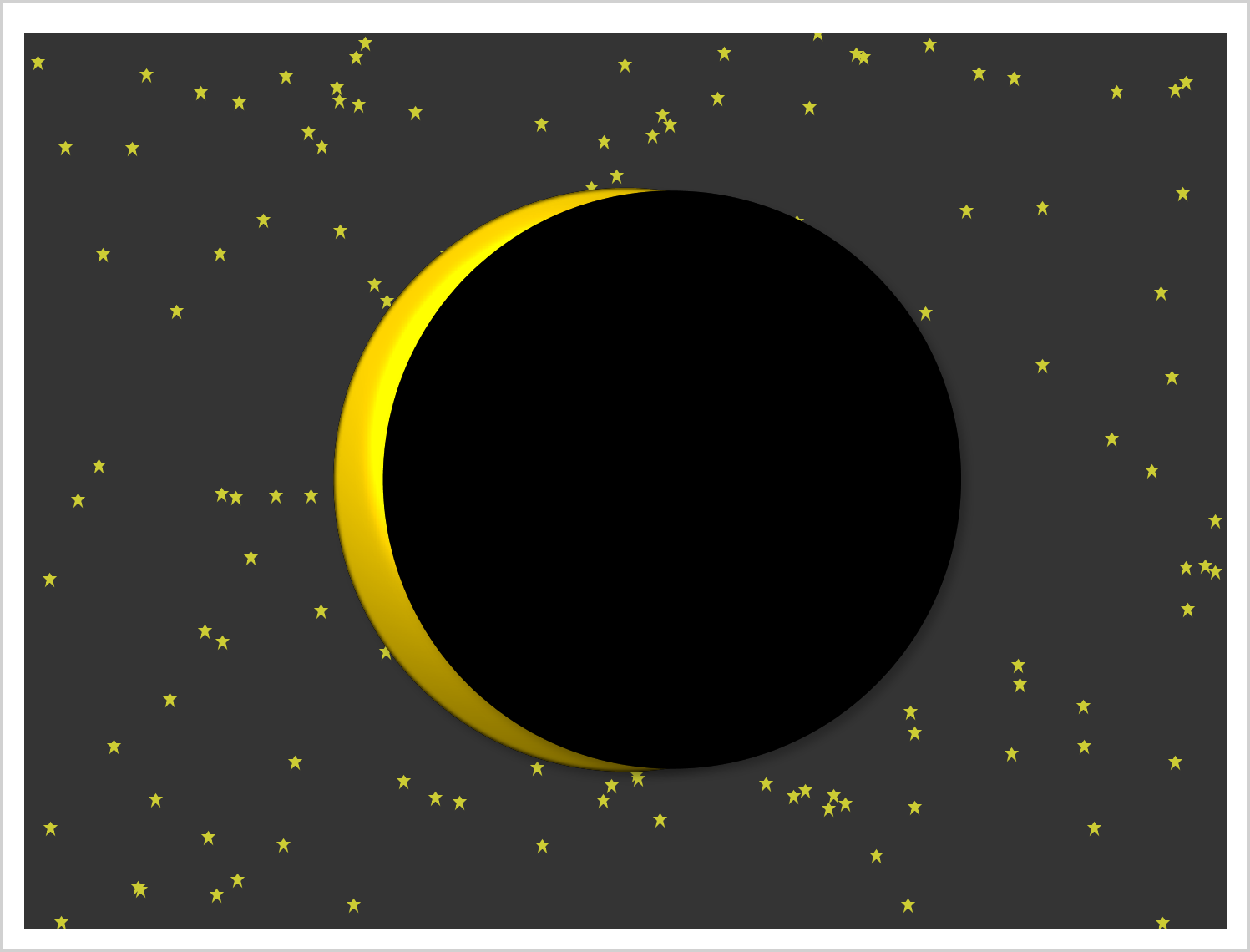
This example shows how to create two coordinated range attribute maps and use them in creating an animated gif of the eclipse.

Motivated by Ted Conway's post on creating a sequence of graphs showing the Solar Eclipse, I thought it would be fun to extend his code and create a gif animation. I used a frame count to 81, and used the printerpath feature to create the animation using SGPLOT with BY
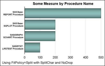
Long category values occur frequently in real world use cases. This can happen with graphs for analysis of clinical research data, and also for graphs showing survey data where the question asked may be long (even a paragraph). Managing such long categories on the x or y axis is always
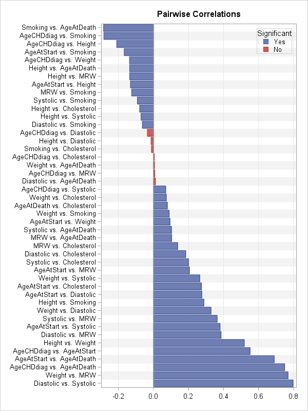
Visualizing the correlations between variables often provides insight into the relationships between variables. I've previously written about how to use a heat map to visualize a correlation matrix in SAS/IML, and Chris Hemedinger showed how to use Base SAS to visualize correlations between variables. Recently a SAS programmer asked how
A few days ago, I posted an article on displaying first N bars from a data set. This is useful when the data is sorted by descending response, and only the first few values are significant. There were a few interesting comments, including one that was regarding the treatment of
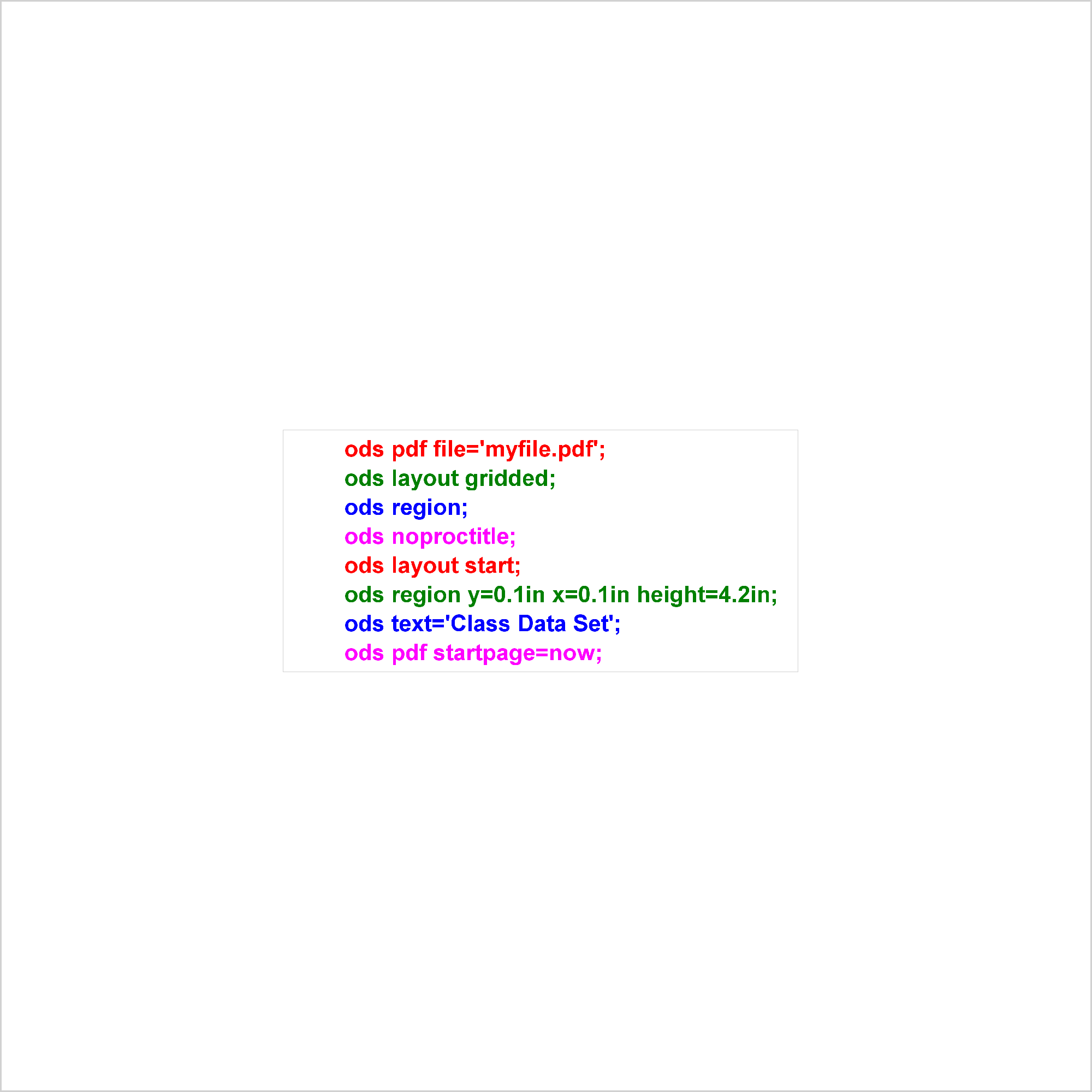
PROC SGPLOT displays titles inside the graph. If you want to display a title inside the graph and a different title outside the graph, you can use the ODS LAYOUT or the GTL. The ODS LAYOUT gives you precise control over your output and enables you to display multiple graphs and tables in each page.
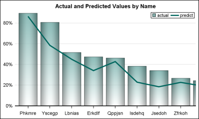
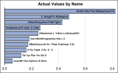
Often we have a graph with many bars (or categories) on the x or y axis. These categories may be sorted by descending response such as frequency of a % value. An example with simulated data is shown below. title 'Actual Values by Name'; proc sgplot data=bars2 noborder; vbar name /
SG annotation is a powerful technique for adding text, lines, arrows, shapes, and images to graphs. This post provides a macro that can help you when you make a mistake in writing the annotations.
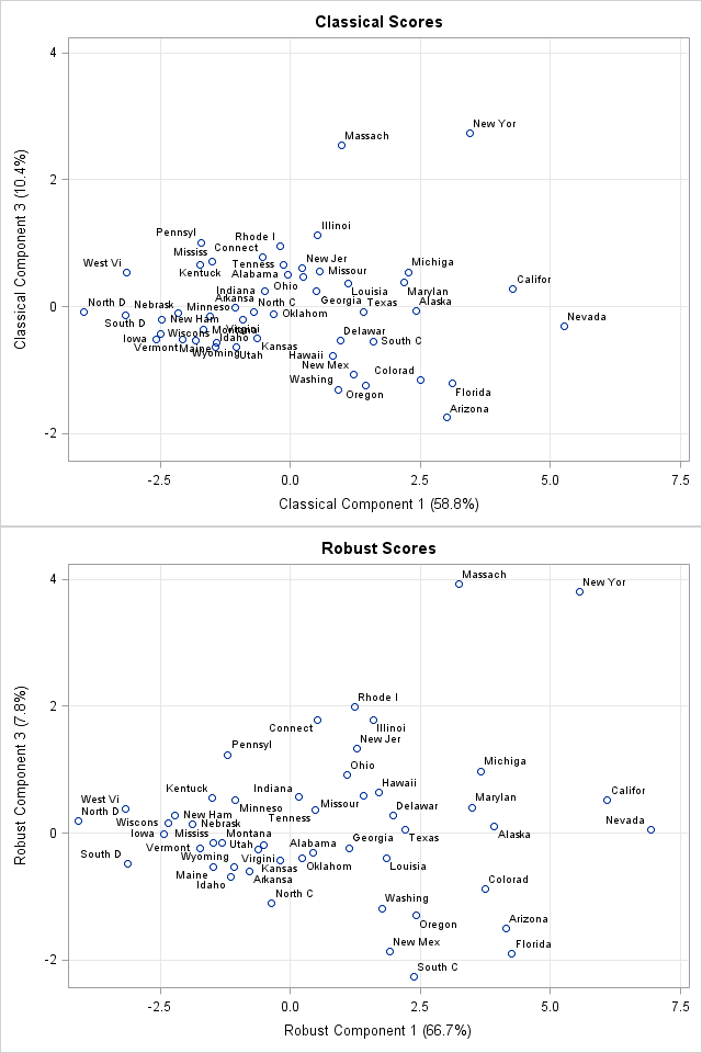
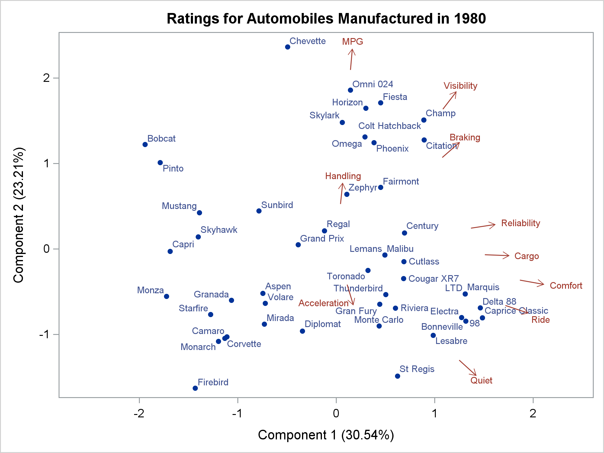
Recently, I was asked whether SAS can perform a principal component analysis (PCA) that is robust to the presence of outliers in the data. A PCA requires a data matrix, an estimate for the center of the data, and an estimate for the variance/covariance of the variables. Classically, these estimates
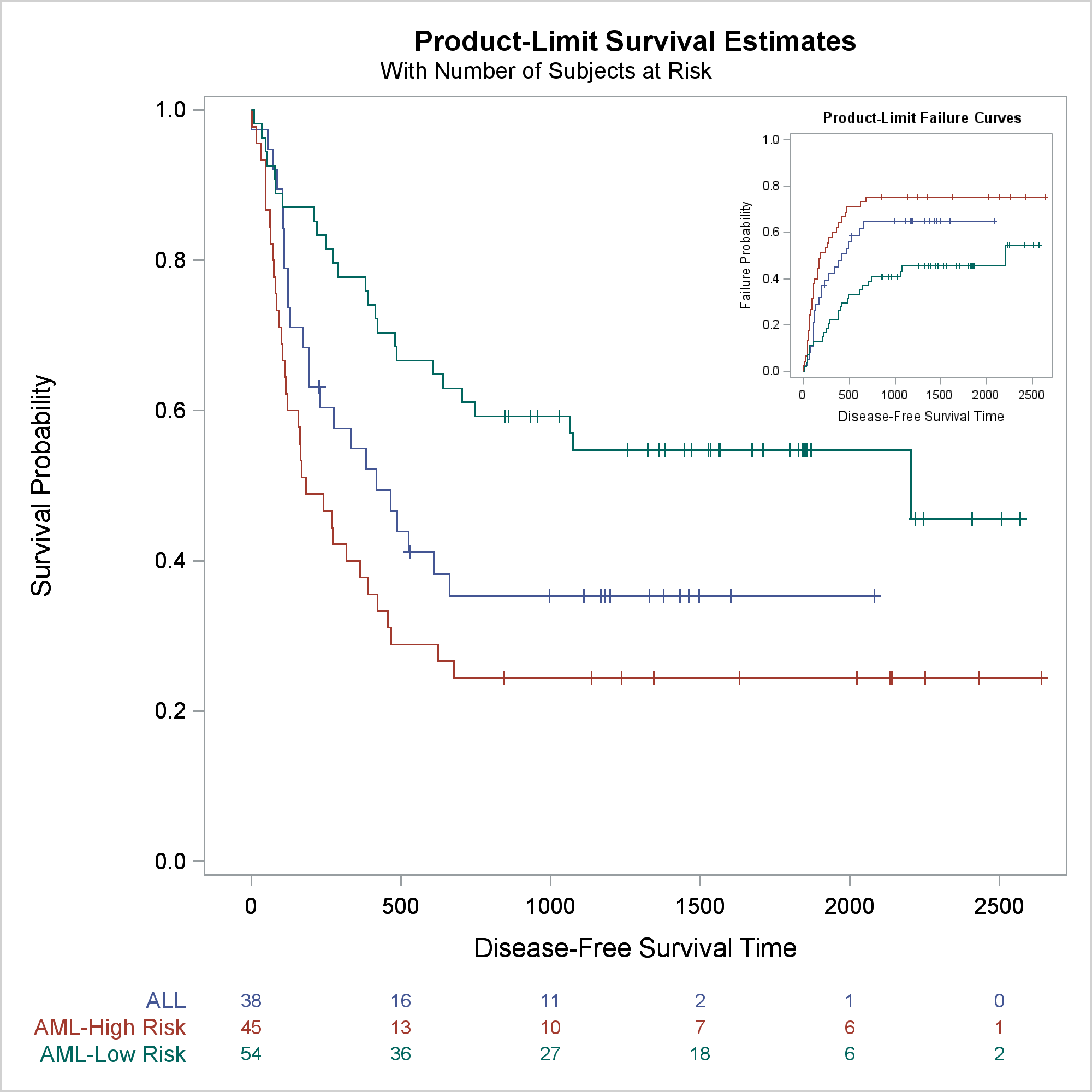
One key aspect of graphs used in the statistical or clinical research domains is the need to display numerical or textual information aligned with the data in the plot. Examples of such graphs are the Survival Plot or the Forest Plot. These graphs use the AXISTABLE statements available with SAS
In this post, I will review some of graphs from previous posts while concentrating on just the axes, grid lines, and reference lines. They might not be the most exciting parts of a graph, but there are multiple options that when properly used can turn a good graph into a great graph.
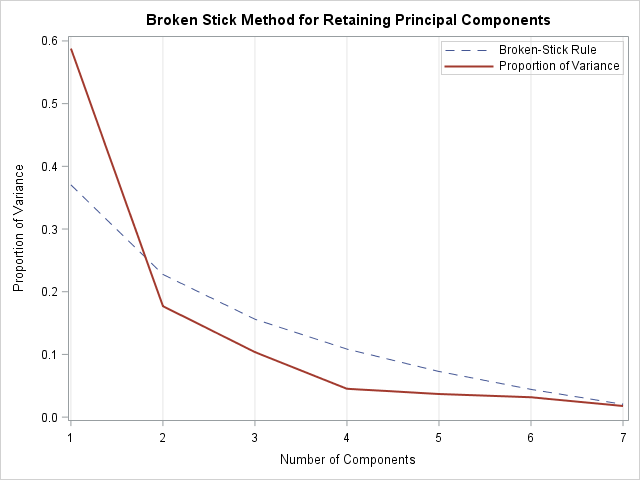
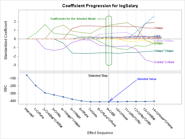
Last week I blogged about the broken-stick problem in probability, which reminded me that the broken-stick model is one of the many techniques that have been proposed for choosing the number of principal components to retain during a principal component analysis. Recall that for a principal component analysis (PCA) of
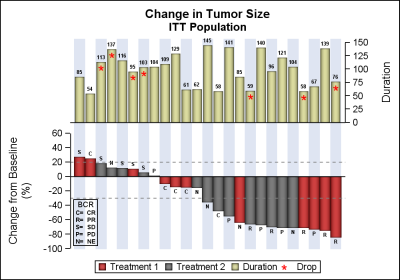
Waterfall plots have gained in popularity as a means to visualize the change in tumor size for subjects in a study. The graph displays the reduction in tumor size in ascending order with the subjects with the most reduction on the right. Each subject is represented by a bar classified by
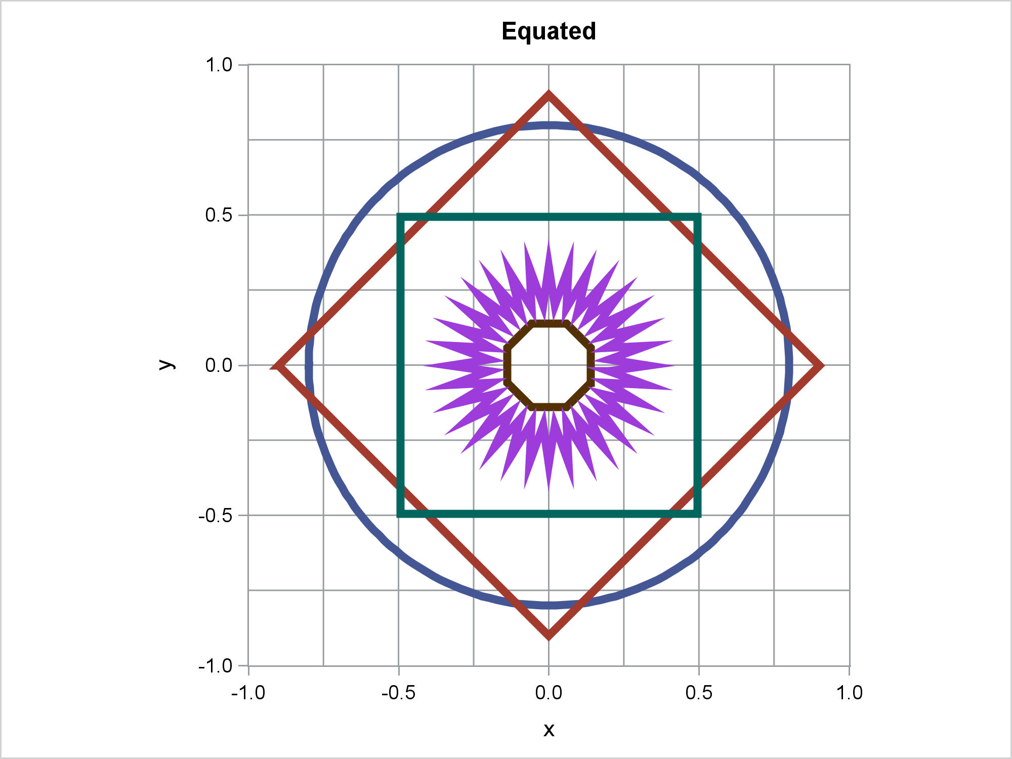
When displaying maps, geometric shapes (such as circles), or results of certain analyses, it is important to equate axes. This post illustrates options in PROC SGPLOT that enable you to equate axes.
Recently, while reading up on Wilkinson and Cleveland Dot plots, I saw this excellent article by Xan Gregg on the topic. I also saw some interesting examples of Lollipop Charts, kind of a dot plot with statistics along with a drop line, maybe more suitable for sparse data. I thought
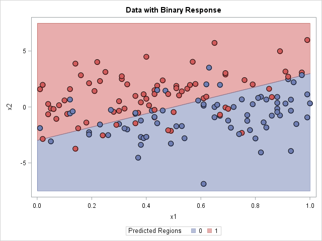
An important problem in machine learning is the "classification problem." In this supervised learning problem, you build a statistical model that predicts a set of categorical outcomes (responses) based on a set of input features (explanatory variables). You do this by training the model on data for which the outcomes
This post presents some basic aspects of ODS Graphics: enabling, selecting, and displaying graphs.
As many of the regular readers of this blog know, SGPLOT and GTL, provide extensive tools to build complex graphs by layering plot statements together. These plots work with axes, legends and attribute maps to create graphs that can scale easily to different data. There are, however, many instances where

Tomorrow is Independence Day, a federal holiday in the United States. Flags are displayed everywhere, especially in Washington, D.C., where I live. So let's have a little Fun with Flags! The current U.S. flag has 50 stars, one per state, with five rows of six stars interleaved with four rows
You can use a range attribute map to control the mapping of values in a continuous variable to colors. This post shows you how to use PROC SGPLOT to display multiple plots in the same graph and use range attribute maps.
A vector plot draws a line from one point in a graph to another point. In this post, I will show you how to create short vectors instead of vectors that emanate from the origin. I also show how to modify the positions of the vector labels.
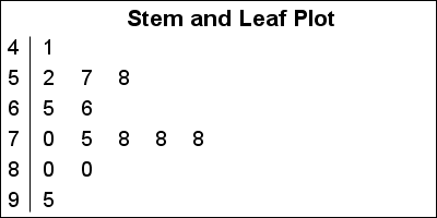
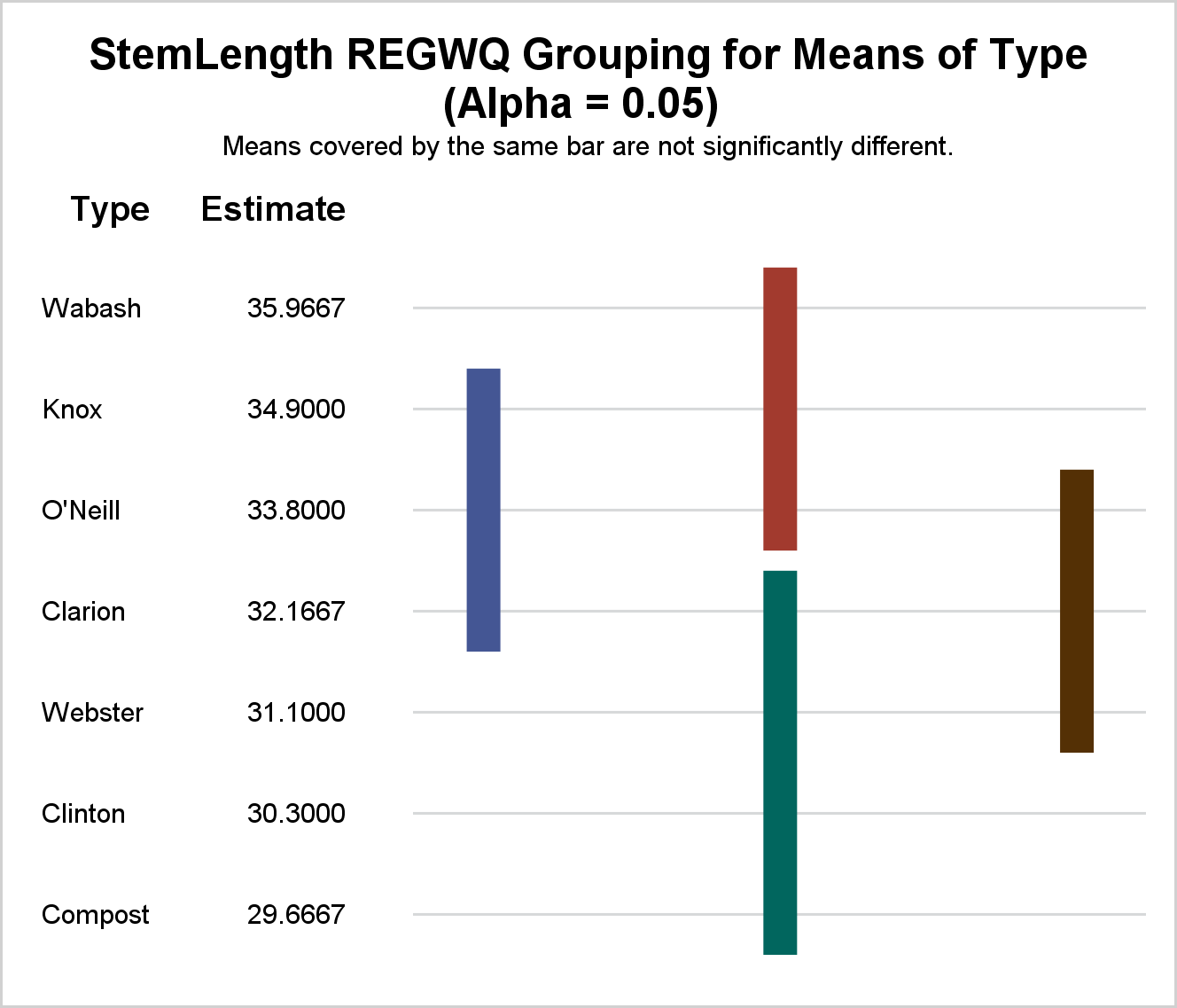
A Stem and Leaf plot is a visual that can help quickly visualize the distribution of the data. This graph was particularly useful before the advent of modern statistical graphs including the Histogram and Box Plot. One nice feature of the plot is it shows the actual values in the
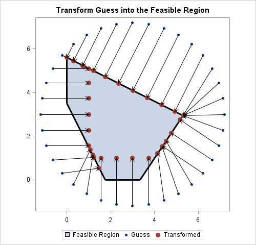
Most numerical optimization routines require that the user provides an initial guess for the solution. I have previously described a method for choosing an initial guess for an optimization, which works well for low-dimensional optimization problems. Recently a SAS programmer asked how to find an initial guess when there are
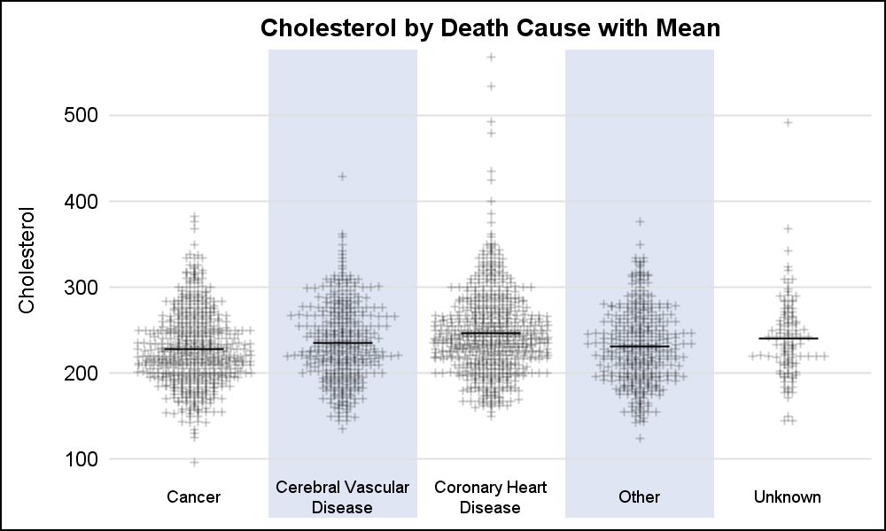
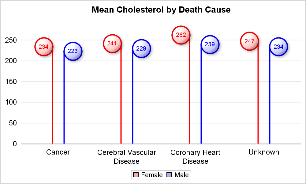
A frequently requested statistical graph is the scatter plot by with discrete categories along with mean value for each category. Searching for a "Scatter with Mean" will return a lot of requests for such a graph in SAS, Stata, R and other statistical software. Such a graph is very easy
If you toss a coin 28 times, you would not be surprised to see three heads in a row, such as ...THHHTH.... But what about eight heads in a row? Would a sequence such as THHHHHHHHTH... be a rare event? This question popped into my head last weekend as I
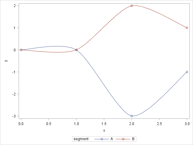
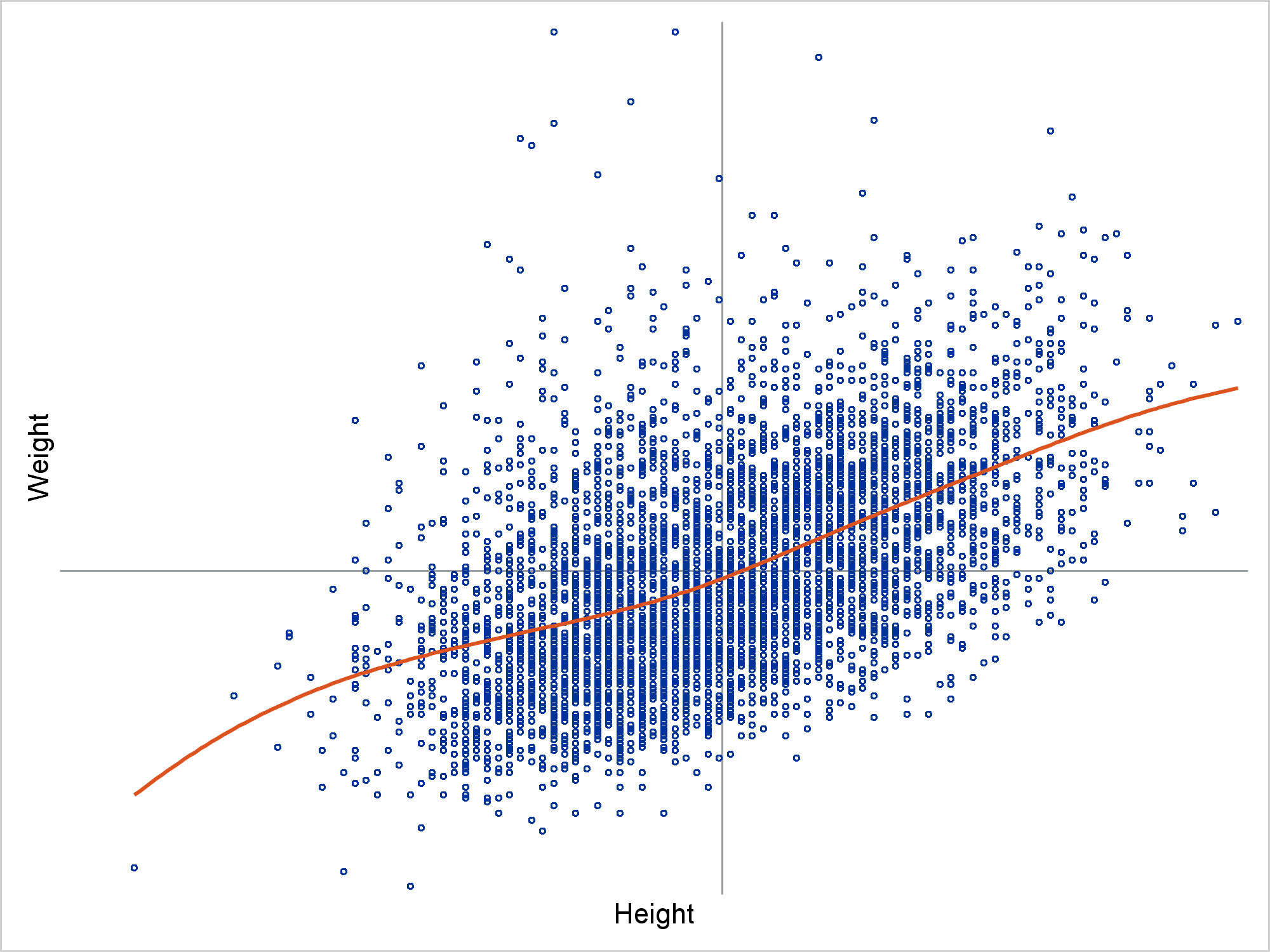
By default, when you use the SERIES statement in PROC SGPLOT to create a line plot, the observations are connected (in order) by straight line segments. However, SAS 9.4m1 introduced the SMOOTHCONNECT option which, as the name implies, uses a smooth curve to connect the observations. In Sanjay Matange's blog,

