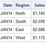
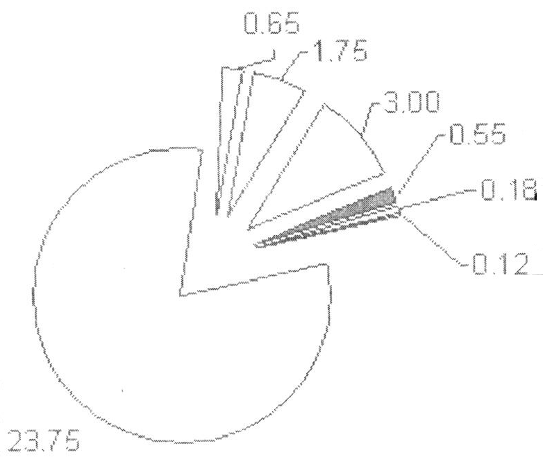
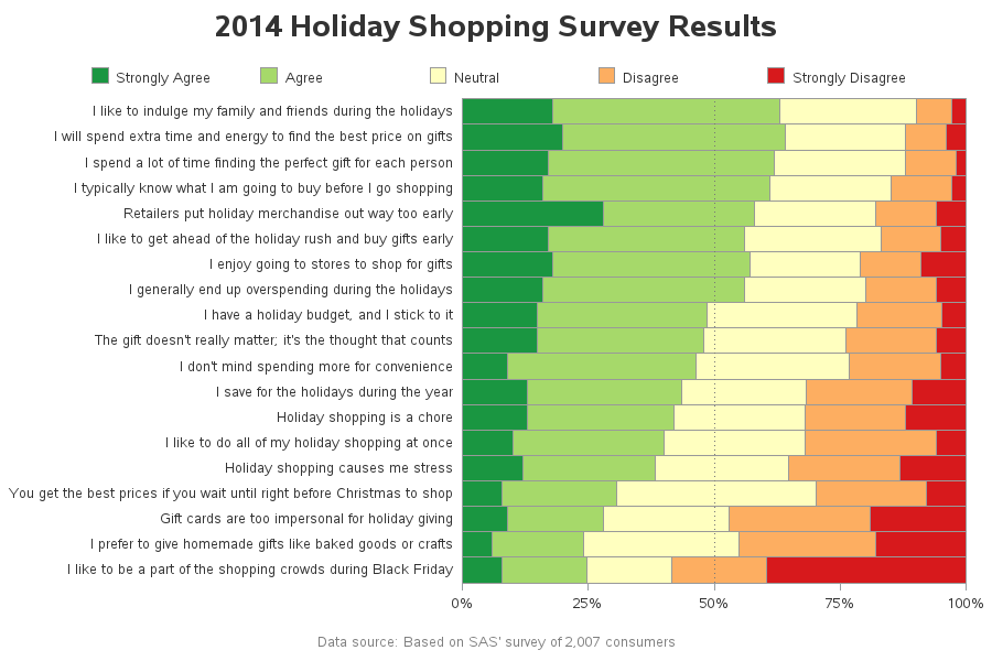
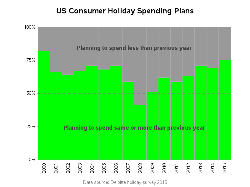
Search Results: stacked (138)

Alison Bolen 0
3D printing: yes or no?

By now, you’ve probably seen a video of a 3D printer discharging layers of plastic to create a model of a building or a plastic figurine. You may have heard stories about 3D printed guns, 3D printed airplane parts and even 3D printed body parts. While 3D printers are becoming more common, they are

Data Visualization
Sanjay Matange 0
Report from PharmaSUG 2015

PharmaSUG 2015 in Orlando was held at the Renaissance had a record breaking attendance of over 650.  Weather was great, except for a huge downpour on the evening of the last day.  All the popular presenters were in attendance including Art Carpenter, Kirk Lafler, Arthur Li and many others. Presentations

Rick Wicklin 0
Improving the NC vehicle inspection pie chart

North Carolina is a state that requires yearly inspections of motor vehicles. An inspection checks for safety features (lights, brakes, tires,....) as well as checking vehicle emissions to ensure that vehicles meet air pollution standards. I recently had a car inspected and noticed a pie chart on the inspection's summary

Rick Wicklin 0
Create a cascade chart in SAS

Sometimes different communities use the same name for different objects. To a soldier, "boots" are rugged, heavy, high-top foot coverings. To a soccer (football) player, "boots" are lightweight cleats. So it is with the term "waterfall plot." To researchers in the medical field, a "waterfall plot" is a sorted bar

Data Visualization
Sanjay Matange 0
Custom Labels

Over the Christmas Holidays I saw an graph of agricultural exports to Russia in 2013.  The part that caught my eye was the upper part of the graph, showing the breakdown of the trade with Russia as a horizontal stacked bar with custom labels. The value for each region / country

Rick Wicklin 0
Popular posts from The DO Loop in 2014

I published 118 blog posts in 2014. This article presents my most popular posts from 2014 and late 2013. 2014 will always be a special year for me because it was the year that the SAS University Edition was launched. The University Edition means that SAS/IML is available to all

Data Visualization
Sanjay Matange 0
Likert Graphs

Just this morning I received a request for a brief survey from Apple on my feedback about the new iPhone6+.  Yes, I finally got one, dead last in the family.  The survey followed the usual format, with a number of questions on what I like or dislike about it, with

Data Visualization
Sanjay Matange 0
Report from MWSUG 2014

The Mid-West SAS Users' Group conference in Chicago was a great success, with over 400 attendees and great weather.  The conference hotel was in downtown with nice view of the river and a stroll down "Magnificent Mile".  The city does a great job with the flower beds down Michigan Ave., along

Data Visualization
Sanjay Matange 0
Epidemic Curve Graph

A few weeks back I wrote an article on Grouped Timeline for creating a stacked timeline for onset of different virus.  The idea in that article was to display a stacked needle on a time axis using a HighLow plot. Such graphs are also referred to as EPI or Epidemic Curve

Data Visualization
Sanjay Matange 0
Grouped Timeline

Recently, a user posed a question on how to plot stacked frequencies on a time axis.  The data included frequencies of different viruses by week.  The data is modified to preserve confidentiality and is shown below. The user's first instinct was to use a bar chart with stacked groups.  This works for automatically computing frequencies

Data Visualization
Sanjay Matange 0
The BLOCK Plot

When you hear of a Scatter Plot or a Series Plot, you have a picture in your mind what we are talking about.  But one of the plot statements available in GTL, and soon with SGPLOT, is the BLOCK plot.  I am sure this leaves many users scratching their heads, wondering

Data Visualization
Sanjay Matange 0
G100 with SGPLOT

The GCHART procedure has a popular option called G100 to display all the subgroups in % format such that all the subgroup values add up to 100% for each group.   Each subgroup is labeled with its own % values. SGPLOT procedure does not such an option, but with a little bit of