In recent releases of SAS, you can use Output Delivery System graphics or 'ODS graphics on' to produce nice graphical output for most of the analytic procedures. These default graphs are nice, but when you want your graphs to look "a certain way" SAS also lets you create your own custom graphs!
To demonstrate, I looked through some of the SAS samples, and semi-randomly picked Example #1 for Proc MDS. If you run the example code, it uses ods graphics on and produces several default graphs. In this blog, I show you the default graphs, and then the customized versions I created using SAS/Graph...
Here is the first of three default 'dimension' plots from Proc MDS:
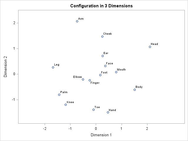
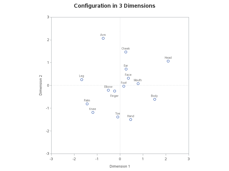
And here is my custom SAS/Graph version. I created this graph with Proc Gplot, and used the pointlabel option on the symbol statement to add the desired text for each marker. Notice that I added a dotted reference line at 0,0 and I hard-coded the length of the two axes so the graph is proportional. Also, if you click the thumbnail below to see the actual graph (with the html overlay), you will see that I added html hover-text for each of the markers. The hover-text makes it easier to explore the data, and also makes it more accessible for the visually impaired.
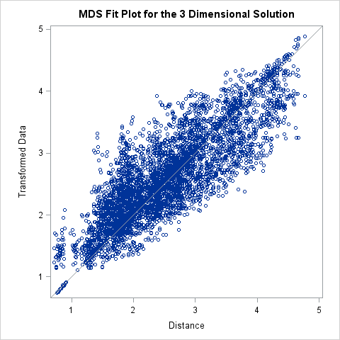
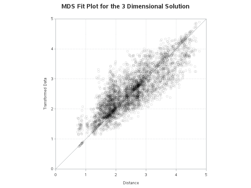
Here is the default 'Fit' plot from Proc MDS:
And here is my custom SAS/Graph gplot version. The biggest change you'll notice is that I used a transparent color for the markers (using color=A00000018 on the symbol statement), so you can more easily see where multiple markers are stacked on top of each other. I also added reference lines, which make it easier to see whether the markers are symmetrically distributed on both sides of the diagonal line.
Whether you prefer the default graphs, or the customized versions ... you've gotta love all the flexibility you can get with SAS!
Here are links to the full SAS code for the original default graphs, and my custom graphs, if you'd like to experiment with them.