A few weeks back I wrote an article on Grouped Timeline for creating a stacked timeline for onset of different virus. The idea in that article was to display a stacked needle on a time axis using a HighLow plot. Such graphs are also referred to as EPI or Epidemic Curve Graphs.
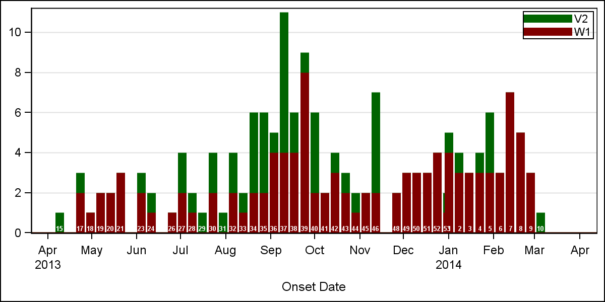 In that article, I restricted the weeks in the year for onset to 52, and plotted each value on the equivalent location on a time axis. That all works fine, but really, an year will have 53 weeks for onsets as shown in the graph on the right. Gaps are shown where the data is missing.
The problem is that a start or end week of the year may have smaller number of days. This causes the bars (with fixed width) for these weeks to be overlapped by neighboring weeks. Click on the graph to see this in the higher resolution image. You will see near "Jan 2014", the bar for week 53 of 2013 is overlapped by the bar for week 1 of 2014. This will happen if the X axis is a real time axis, and week 53 has only 1 or 2 days in it.
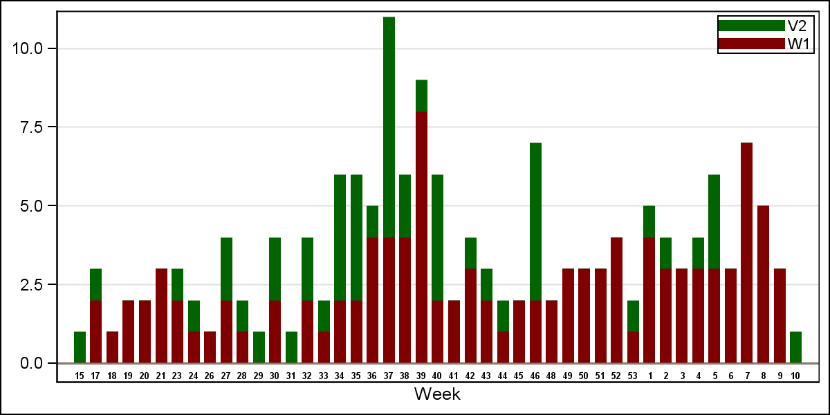 Another way to address this is to draw a BAR graph by the YearWeek variable. This variable is a combination of the year and week values so as to avoid values form the two different years from being consolidated into one bar, as shown on the right.
Such a graph is easier to make, as the bar chart already does stacked groups using GROUP=Virus. The X axis is suppressed, and the week values are shown below each bar using another overlaid bar chart. If you click on the graph for a higher resolution image, you will notice that in this case (as expected) the axis is discrete, and only the weeks that are present in the data are displayed, without gaps for the missing weeks. A bar or a gap for week 16 is not displayed in the graph.
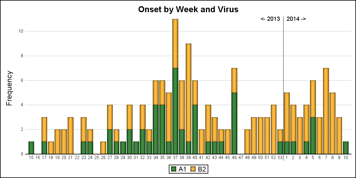
Let us see if we can get the best of both worlds. First, let us create a data set that has all weeks in the data with missing response values for the frequency. Then, we merge this with the actual data. This ensures all weeks are present in the data and are represented in the graph either with data or a gap.
 SAS 9.3 version of this graph is shown on the right. Click on the graph for a higher resolution image and you will see that all weeks are now represented, with gaps where there is no data. Week 53 and week 1 are not overlapped, and can be seen distinctly. However, it is clear that the axis is not a scaled time axis, but is discrete, so the 53 weeks will take up more space than a real year on a time axis. Also, the 53rd week may have less number of days, but has the same width as all other bars.
 The final graph is created using SAS 9.4 GTL, and I have added some labeling to indicate the year for the data. Click on the graph for a higher resolution view. I believe this should be doable with SG, but I ran into an issue with bar labels that needs investigation.
I used a reference line with scatterplot markercharacter to display the boundary between the 2013 and 2014 data.
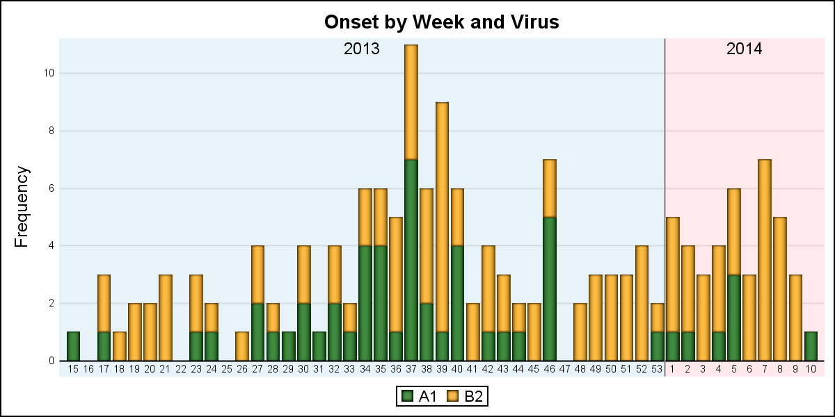 As usual with SG or GTL, there are other ways to display such demarcation as shown in the graph on the right.
SAS 9.3 program: EPI_93
SAS 9.4 program: EPI_94
Data: Test_dataset


1 Comment
I find it is easier to read the SAS graph code when camel casing of the keywords is used.
It may not be required for SAS to read it, but perceptually, it may be easier for the human.
Ex.
ImageName vs imagename
NoOutline vs nooutline
DataLabelAttrs vs datalabelattrs