Get the right information, with visual impact, to the people who need it
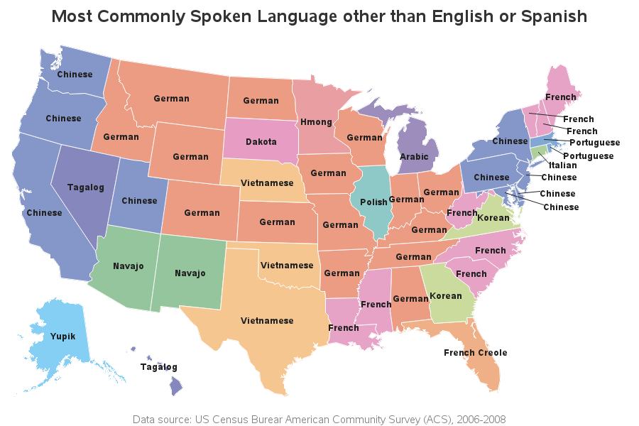
How to (mis)label a map

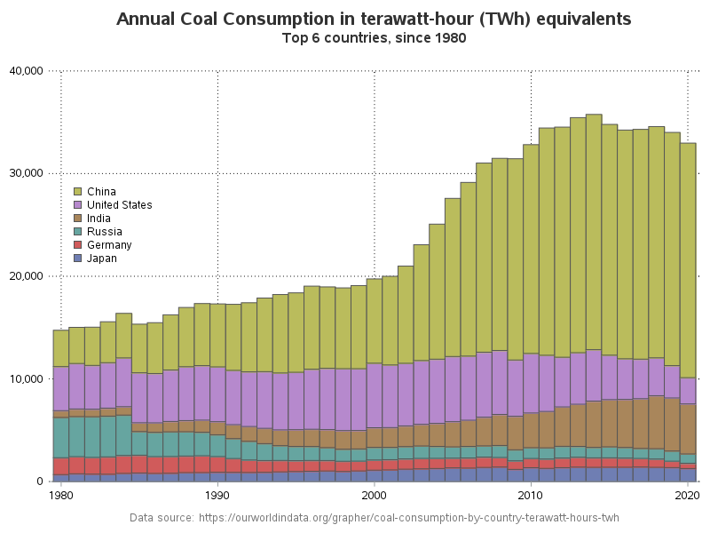
This blog post is mostly just a bunch of fun maps ... maps that are labeled (or mislabeled) in various ways, using fun/interesting data. I focus on the 'fun' part, but if you're not careful you might also learn a little about the various ways to add labels to maps