Data Visualization

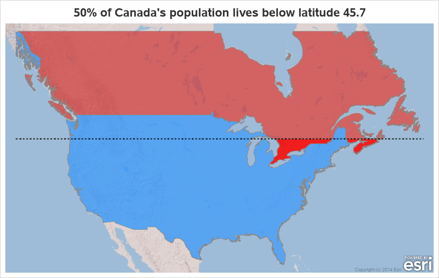
Get the right information, with visual impact, to the people who need it
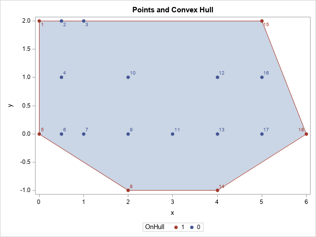
Data Visualization
Sanjay Matange 0
Layered graphs

Browsing graphs on the web, this graph caught my eye:  The Arctic Sea Ice Volume Graph.   My interest is not so much in the debate on Climate Change or Global Warming.  To me, this graph has some interesting features that can help show the benefits of plot layering to

Data Visualization
Sanjay Matange 0
Sochi Medal Graphs

The attention of the world is now on Sochi and the Winter Games.  Gold, Silver and Bronze medals are being earned by these amazing athletes, and everyone has an eye on the tally.  Andre sent me a link to TRinker's R Blog, showing a graph of the current tally.  Andre

Data Visualization
Sanjay Matange 0
Survival Plot

One of the most popular graph amongst clinical and pharmaceutical users is the Survival Plot as created from the LIFETEST Procedure.  This is one graph that users most often want to customize.  See Creating and Customizing the Kaplan-Meier Survival Plot in PROC LIFETEST - Warren F. Kuhfeld and Ying So, SAS Institute

Data Visualization
Sanjay Matange 0
More symbols, you say?

Users have often expressed the need for more marker symbols.  ODS Graphics supports over  30 scalable marker symbols, both filled and empty.  As mentioned in an earlier article, with SAS 9.4, filled markers can now have outlines and fills, and can also have special effects. Also with SAS 9.4, now you

Data Visualization
Sanjay Matange 0
Two-in-one Graphs

A large variety of graphs fall in the category of what I call a "Single-Cell" graph.  This type of graph consists of a single data region along with titles, footnotes, legends and other ancillary objects.  Legends and text entries can be included in the data area.   The data itself is displayed

Data Visualization
Sanjay Matange 0
Broken Axis

In my previous post I described the new Polygon plot statement that is included with the SAS 9.4M1 release.   So, a valid question is - what is my motivation for discussing the new features in SAS 9.4M1 when most users are at SAS 9.3 or SAS 9.2 versions?  Here are a

Data Visualization
Sanjay Matange 0
New Polygon Plot

The SAS 9.4 Maintenance 1 release is now shipping to users. This is great news for GTL and SG procedures users as this release includes some useful new features. Some of these are in direct response to your requests, and others are enhancements that we think you will come to like.

Data Visualization
Sanjay Matange 0
Survey Charts

Often we have situations where the category values on the graph have long character strings.  This is often the case when graphing survey responses to questions.  The questions may be sentences, sometimes moderately long. With SAS 9.4, GTL and SG now support the ability to display tick values split over

Data Visualization
Sanjay Matange 0
Graphs at WUSS - Part 2

Last week I covered some of the interesting graph-related papers presented at WUSS.  There were quite a few, so I broke up the report into two parts.  Here is the second installment. In the paper  Creating Graphical Patient Profiles using SAS by William Garner of Gilead Sciences, the author describes how to create

Data Visualization
Sanjay Matange 0
Graphs at WUSS - Part 1

It is always a pleasure to attend SAS user conferences, regional conferences and in-house events.  In addition to presenting papers, seminars and super demos to the attendees myself, my favorite activity is to attend presentations by users that include graphical data visualization.  These include using SG procedures, GTL, Designer or SAS/GRAPH.  This year

Data Visualization
Sanjay Matange 0
R U Graphing with SAS?

In recent conversations with many SAS users at NESUG, SESUG and WUSS, a pattern emerges on the question of creating graphs with SAS or R.  Many SAS users are aware of the new graph features in SAS that create high quality graphs with minimum fuss.  But, many have not actually used

1 46 47 48 49 50 60

Back to Top