Data Visualization

Get the right information, with visual impact, to the people who need it
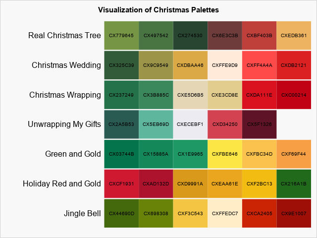
Data Visualization
Sanjay Matange 0
The HIGHLOW Plot

SG Procedures and GTL provide you with a large set of plot statements, such as BarChart, ScatterPlot, BoxPlot and more.  You can use them for the intended purpose, and all is well and good.  However, the real fun starts when you leverage a plot to do something that was not

Data Visualization
Sanjay Matange 0
Multi-Group Series Plots

The series plot is a popular way to visualize response data over a continuous axis like date with a group variable like treatment.   Here is some data I made up of a response value by date, treatment, classification and company that makes the drug.  The data is simulated as shown in the attached program

Data Visualization
Andreas Becks 0
Das ist Visual Analytics!

So und nichts anders: Datenanalyse zur Vorbereitung der Entscheidungsfindung ist ein Spezialistenthema. Das muss ausschließlich den Profis überlassen werden. Daten in den Händen unbedarfter Fachanwender – vielleicht noch ohne IT- und Statistikwissen – sind gefährlich. Wenn Sie auch dieser Meinung sind, dann lesen Sie bitte nicht weiter!

Data Visualization
Sanjay Matange 0
Labeled curves

Often, the topic of an article is motivated by a question from a user.  A satisfactory resolution of the situation is usually a good indication of a topic that may be of interest to other users.  On such question was posed to me by a user this weekend.  He wanted to display fit

Data Visualization
Sanjay Matange 0
The BLOCK Plot

When you hear of a Scatter Plot or a Series Plot, you have a picture in your mind what we are talking about.  But one of the plot statements available in GTL, and soon with SGPLOT, is the BLOCK plot.  I am sure this leaves many users scratching their heads, wondering

Data Visualization
Sanjay Matange 0
G100 with SGPLOT

The GCHART procedure has a popular option called G100 to display all the subgroups in % format such that all the subgroup values add up to 100% for each group.   Each subgroup is labeled with its own % values. SGPLOT procedure does not such an option, but with a little bit of

Data Visualization
Jennifer Marchi 0
Everyday visual analytics

Imagine you're a business analyst who just discovered a pattern or trend that could significantly help your organization. What do you do next? You share it. Using SAS® Visual Analytics, you've published your results to the Web and mobile device before, but this time you'd rather work with your findings in

Data Visualization
Sanjay Matange 0
Axes Synchronization

Often we need to plot multiple response variables on Y axes by a common variable on X axis.  When the response variables are very different in magnitudes or format, we prefer to plot the variables on separate Y (Left) and Y2 (Right) axes. Here is some sample data with three response

1 45 46 47 48 49 60

Back to Top