Get the right information, with visual impact, to the people who need it
AI 기반의 쉽고 간단한 Clinical Data 탐색 및 시각화 #2편

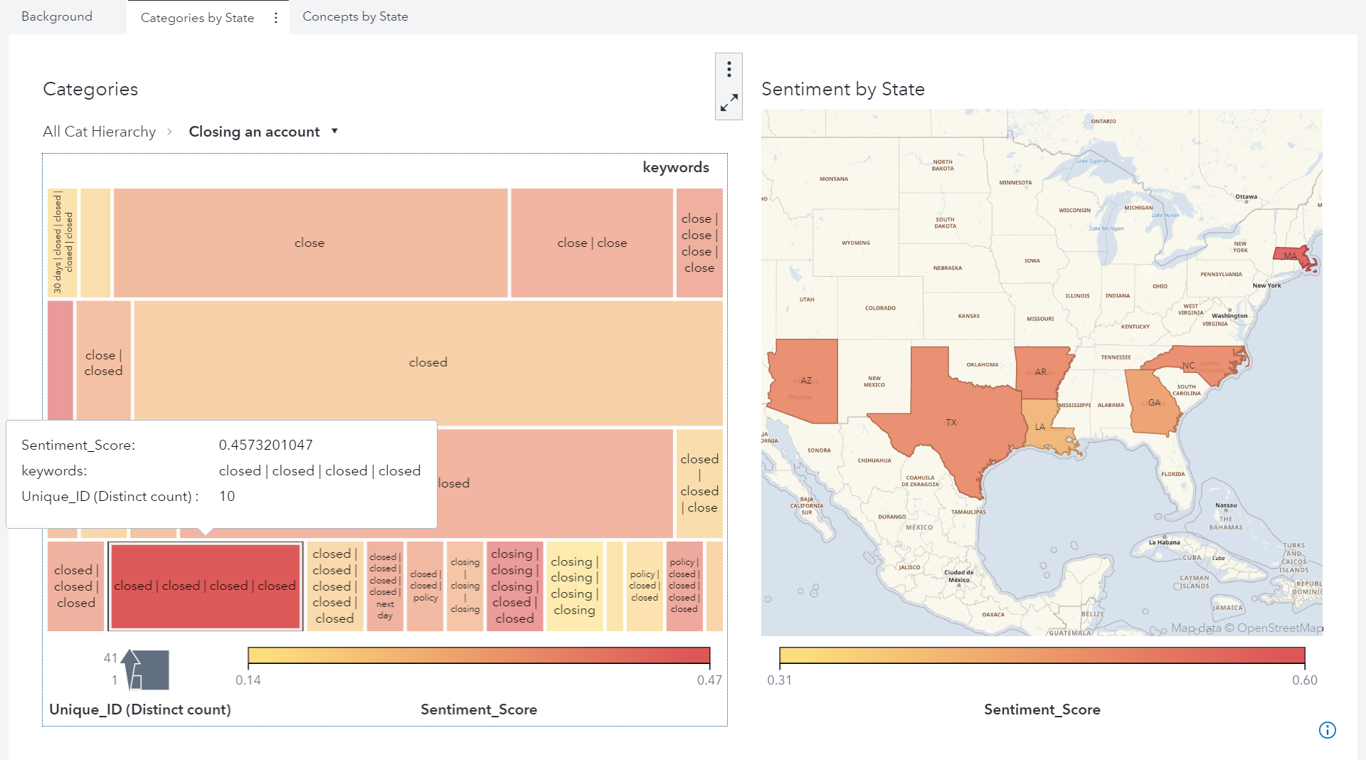
지난 블로그 포스팅 #1편에서는 임상시험 전 과정에 참여한 내.외부 모든 이해관계자가 임상시험 데이터에 쉽게 접근하여 진행 상황을 파악할 수 있도록 지원하는 SAS Visual Analytics 솔루션의 기능을 소개해 드렸습니다. 이번 포스팅에서는 이러한 AI기반의 SAS Visual Analytics 분석 솔루션을 활용하여 임상시험 SDTM 데이터의 탐색 및 시각화 리포트의 활용에 대해 알아보겠습니다. Clinical Data