Data Visualization

Get the right information, with visual impact, to the people who need it
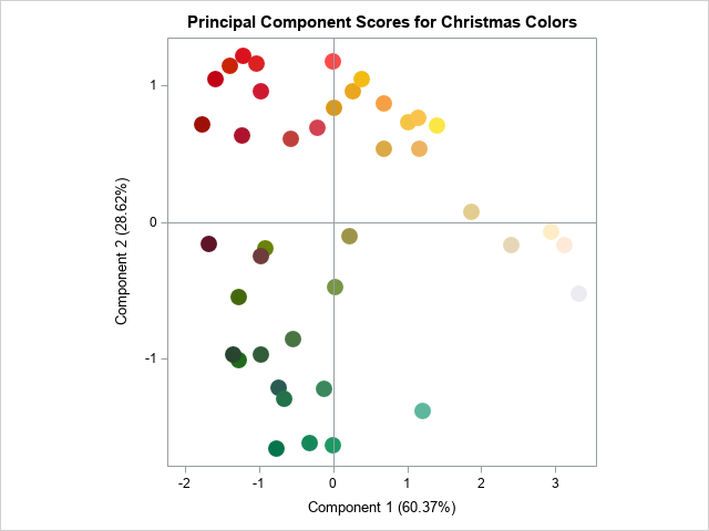
Data Visualization
Sanjay Matange 0
Overlay Bar Charts

A couple of days back, Rick Wicklin forwarded me a link to an article on the BadHessian Blog on creating a Bar Chart using six different freeware packages in R, Python and Julia.   The target bar chart was one produced by the Jetpack stat module with WordPress.  The graph is shown below. The unique feature of

Data Visualization
Sanjay Matange 0
Group order in GTL

This post could be titled something like "Everything you wanted to know about Group Order in GTL - and more."   The group ordering shows up in three different ways in your graph. Assignment of attributes (color, marker symbol) to group values. Position of group values in the graph. Display of the group

Data Visualization
Sanjay Matange 0
Spirals

Spirals are cool.  And useful.  We use them every day without thinking about it.  Every time the road turns from a straight line to a curve, we go through a transition spiral.  Spirals allow us to change curvature in a steady increasing or decreasing fashion.   Without a spiral, this

Data Visualization
Sanjay Matange 0
Proportional Euler Diagram

The topic of VENN diagrams had come up a while ago.  At that time, I thought it may be interesting to build a proportional VENN diagram.  But, reading up on VENN Diagrams, I learned that VENN diagrams represent all intersections of N sets, regardless of whether there are actually any observations in one

Data Visualization
Sanjay Matange 0
Swimmer plot

At PharmaSUG 2014 in San Diego, I had the pleasure of attending "Swimmer Plot: Tell a Graphical Story of Your Time to Response Data Using PROC SGPLOT", by Stacey Phillips.  In this paper, Stacey presented an interesting graph showing the effects of a study drug on patients' tumor size. Stacey

Data Visualization
Sanjay Matange 0
Grouped Timeline

Recently, a user posed a question on how to plot stacked frequencies on a time axis.  The data included frequencies of different viruses by week.  The data is modified to preserve confidentiality and is shown below. The user's first instinct was to use a bar chart with stacked groups.  This works for automatically computing frequencies

Data Visualization
Ian Jones 0
Trade Surveillance: Watching you watching me

“Technological innovation is no longer a choice: it is an imperative.” So said Scott O’Malia, Commissioner of the Commodity Futures Trading Commission, about trade surveillance during his keynote address at the recent SAS-sponsored New Risk in Energy 2014 conference in Houston. He was attempting, as he has before, to spur

Data Visualization
Sanjay Matange 0
Report from PharmaSUG 2014

Just getting back from PharmaSUG 2014 in San Diego.  The conference was great, both inside and outside.  The organizers ordered up some great weather for the Padres game and also for dinner on the flight deck of the Midway Carrier. Our focus here being on graphics, we were all extremely gratified by the presentations in

1 44 45 46 47 48 60

Back to Top