Time is a free resource to people yet is the most precious one. We all have 24 hours every day in our lives. We do not need to pay for getting these hours, and we do not have ways to pay for getting more than 24 hours a day. Have you ever noticed how you spend your time? Or how other people spend their time?
Certainly, there will be commonalities – for example, all people need time to sleep, to eat and many people need time to work and study. Also, for sure there are differences in how people divide their time for activities in each day. There might be some pattern of time use in different countries and different cultures. I am interested in exploring this, so I found some data from the web to explore.
What is a Time Use Survey?
Over the last 30 years, an increasing number of countries around the world have been conducting large-scale time use surveys. The Time Use Survey is designed to measure the amount of time people spend on various activities in their daily life, across a total duration of 24 hours (or 1,440 minutes). These activities, such as work, relaxing, and exercising, are classified into a set of descriptive categories, and the time on these activities are interviewed from some respondents. Then the data was recorded, calculated and edited.
I got the time use data from OECD (Organization for Economic Co-operation and Development) site, and the time use survey was conducted in more than 30 countries from 2009 to 2016. I also got the American Time Use Survey data for 2020 for my exploration. I am aware that the data quality might not be good enough for serious research, but that’s not a problem for me. I just want to explore it for fun, while practicing SAS Visual Analytics usage.
How do people around the world spend their time?
Download the excel file from OECD site, import it in SAS Visual Analytics. I will explore how people in different countries spend their time, how many minutes do they averagely spend on among the five categories (according to OECD, they put different activities into five categories).
We can easily draw a bar chart in SAS VA like below. Note: the downloaded OECD data has the time use data for American, but I eliminate it from this chart due to its total is 1,469 minutes (more than 24 hours a day). And that leads me to explore the American time use data separately.
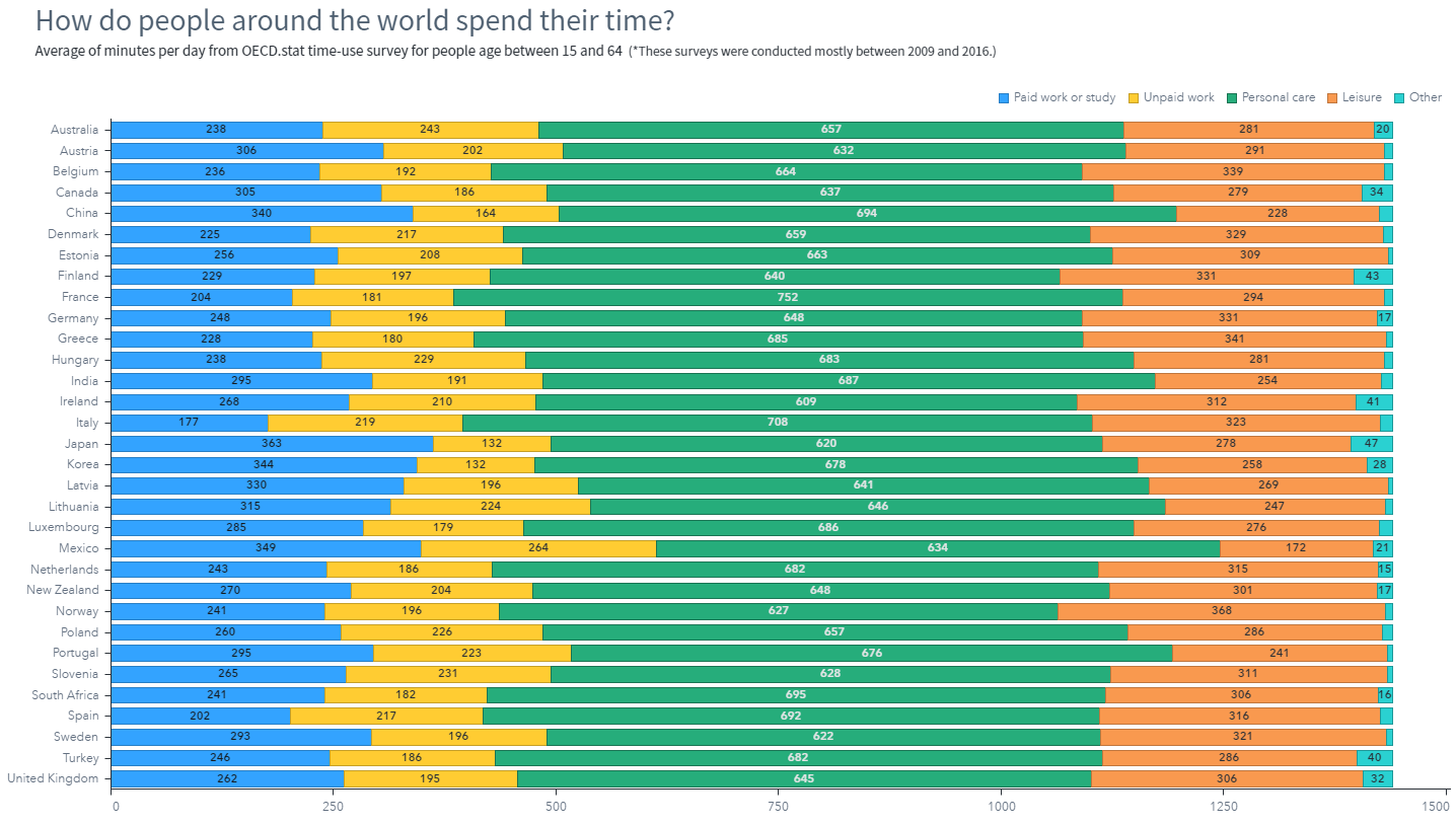
See the green bars are the longest one among the five colored bars? They represent Personal Care. It seems people across these countries pay the most time in Personal Care. Unbelievable? Check the activities in the Personal Care category: sleeping, eating, dressing, and others personal care activities. All right, people sleep about 8 hours (480 mins) every day on average, that’s about 30% of a day. It makes sense that the Personal Care category occupies the most time (about 661 mins on average) in our daily life.
Now from another perspective, let’s see the top and bottom countries where people spend time on Personal Care, as well as on paid work/study. From below charts, I guess you won’t be surprised when seeing France sits on the top one country with most Personal Care time, and Japan sits on the top one country with most time on paid work/study, while Italy is the country where people spend least time on paid work/study.
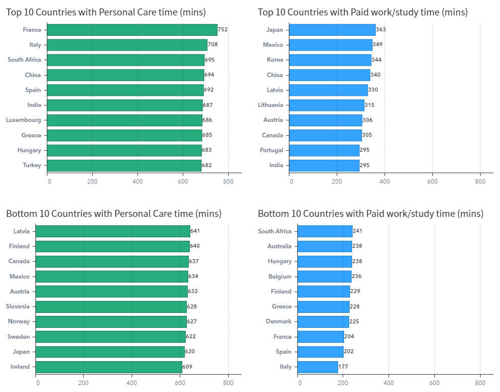
Note in above charts, I use the same scale for the X axis intentionally. This is to make sure people get direct feel on the differences between the two categories, the ‘Paid work or study’ time on the right is less than half of the ‘Personal Care’ time on the left.
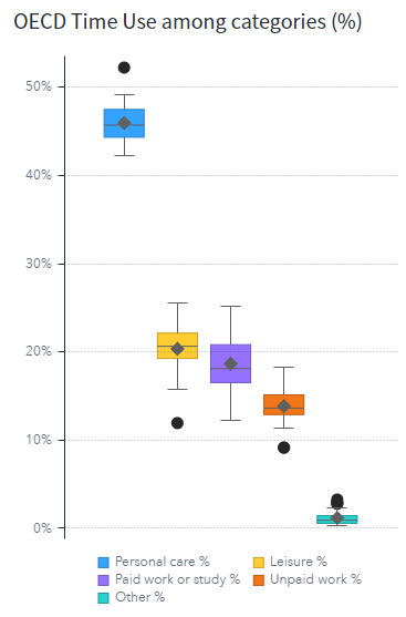
Furthermore, we can look at the distribution of these five categories across all these countries. Calculate the percentage for each major category using calculated items in VA and show them in a box plot. We see people on average spend about 46% of their time on Personal Care, about 20% on Leisure, and 19% on Paid work/study. The highest percentage in ‘Personal Care’ is about 52%, more than 12 hours every day. The least percentage is about 42%, that’s about 10 hours every day. Also notice that time on Personal Care, Leisure and Paid work/study are the top 3 categories that takes more than 85% time each day.
How do Americans spend their time?
As I mentioned, the American data from OECD is not ideal for me, so I downloaded the American Time Use Survey (ATUS) data, and using the 2020 data file for further exploration. The ATUS data was organized in different categories using different methodology than OECD data, so I must do data preparation in SAS Studio, and then explore in SAS Visual Analytics.
Prepare the data
The raw 2020 data file has 399 columns, and 8,782 rows. It contains data for the total number of minutes that each respondent spent on the 6-digit activity (per ATUS code rule). The column names with the letter "t" precedes the 6-digit codes, identify activities by their 6-digit codes. The first and second digits of the 6-digit code correspond to some tier1 code; the second and third digits correspond to some tier 2 code, etc. Each row corresponds to a unique respondent.
So my data preparation includes:
- Classify the 6-digit activities to their corresponding tier1 codes, which comes to about 18 categories.
- Calculate the means and 99% confidence interval for each of the 18 categories.
- Transpose the dataset and merge the datasets. If you are interested in how I did this, you can get the code on GitHub..
- The ATUS data set contains one column on Age, so I can make a custom category of age group in VA and divide the ages to three categories: less than 18, great than 65, and between 18 and 65. This will enable me to compare the ATUS data with the OECD data (whose ages are between 18 and 65).
Aggregate the data
ATUS contains detailed data from thousands of respondents with hundreds of columns. I need to aggregate the data for my exploration. Here are some tips when doing the aggregation for each of these hundreds of columns:
- The default aggregation for measure items in VA is Sum. We can easily change the aggregation in the data pane by clicking the ‘Edit properties’ icon and choosing other aggregation (I will use ‘Average’) in the ‘Aggregation’ dropdown list. But when I have hundreds of measure items in the ATUS data set, how can I quickly set the average aggregation for them instead of one-by-one? The tip is clicking on the first measure item, and scroll to the last item, press ‘shift’ when clicking the last item. This will select all these measure items. Right click the mouse, and from the pop-up menu, choose Aggregation > Average. This will set the aggregation to average for all the chosen items.
- I need a bunch of calculated items; each comprise lots of measure items. In SAS Visual Analytics, we can manually add each item in visual mode. But it’s too tedious to add so many measure items. The tip here is to write some SAS macro codes to generate the calculation expressions in text for me, then copy/paste the expression in text mode.
Explore the data
According to the ATUS code rule, ATUS uses different categories than OECD categories. To be able to compare the time used in major activity categories, I make the similar major activity categories like those from OECD, based on my personal understanding of the ATUS activities. Then with the bunch of calculated items, I get the time for these major activity categories. Due to methodology difference, be aware that this may lead the results to be partially inaccurate.
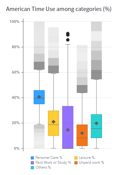
Now starts my ATUS exploration. Below charts show how people in American divide their daily time. The dataset has information on gender, so the bottom one shows the average percentage for Male and Female respectively.
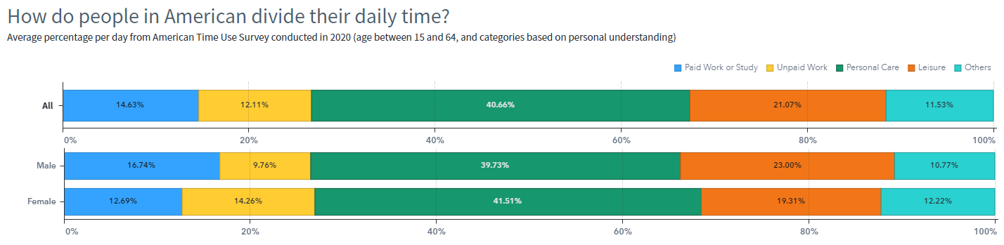
When I put the percentage data (calculated for major activities categories) in a box plot, it has lot of outliers for each category. Considering different methodology and personal classification to the major activity categories (here is the OECD code), I see some difference than the OECD box plot. Note that the ranking for top two major activity categories are Personal Care and Leisure, the same pattern as in OECD data.
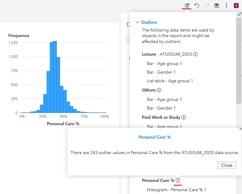
Identify the outliers
Notice those outliers in above box plot? I’d better explore more. In latest version, SAS Visual Analytics will automatically detect outliers in data items. This ‘Insights’ will list the data items in report objects that might be affected by outliers.
For example, in below screenshot, I made a histogram of the ‘Personal Care %’, which shows its distribution looks like normal. If I click the ‘Insight’ icon at top-right corner, VA will show all the data items that might be affected by outliers. If clicking the icon next to the ‘Personal Care %’ item at the bottom, a message will pop up saying that there are 243 outliers in this data item.
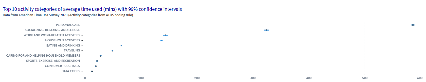
Create a custom graph
I saw lot of outliers in columns of ATUS data when exploring it, so I decide to use the mean value with confidence intervals. I created a custom graph with a scatter plot and a schedule chart. In SAS VA, assign the black dot in the custom graph to show the mean value and make the beginning and ending of each blue bar show the 99% confidence intervals.
Below is the top 10 ATUS activity categories (here are the ATUS tier 1 code categories) American people spend time on. We see the largest average time is the Personal Care, about 586 mins (nearly 10 hours) with 99% confidence intervals ranging from 583.5 to 588.4 mins.
That’s my initial exploration of Time Use Survey data, but much more can be done. For example, because ATUS data is collected on an ongoing, monthly basis, we can perform time-series analysis to identify changes in how people spend their time.
Would you like to give it a try? Visit the SAS Visual Analytics Gallery on the SAS Support Communities to see more ways you can use SAS Visual Analytics to explore data. Then sign up for a two-week free trial of SAS Visual Analytics.
EXPLORE NOW | SAS Visual Analytics GallerySTART FREE TRIAL | SAS Visual Analytics

3 Comments
Dear Cindy,
I have some questions regarding developing a tree map on SAS VA. Is it possible to reach you and contact you directly to share my questions with you?
I would like to thank you very much for your any return.
Kind regards,
Ali
Hi Ali,
You may contact me directly, I would be happy if I can be of any help. Or publish your questions here in the blog comments if you don't mind, this will make other readers benefit from the questions and answers.
In case you are not aware of it, you may also post questions on the Visual Analytics Community: https://communities.sas.com/t5/SAS-Visual-Analytics/bd-p/sas_va. There are experts, including SAS employees, are monitoring the forum and answer usage questions actively.
Regards
Cindy
Fascinating analysis. It would be interesting to know where the breaking points are. Where paid and unpaid work is high, taking away personal care and leisure time causing people to get up and run away from their desks. It's only happened to me thrice. Okay, four times, but I don't often get to use the word thrice.
Nice work,
Rob