Get the right information, with visual impact, to the people who need it
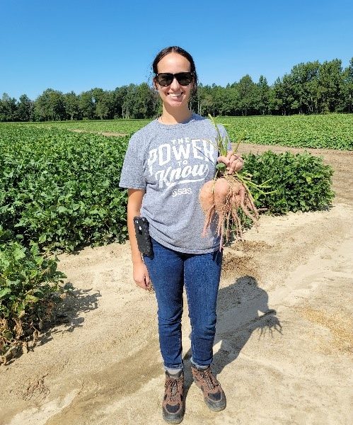
How SAS is saving the sweet potato

Have you ever thought of a sweet potato as ugly? These tuberous, root vegetables are a holiday staple, but the sweet potato industry prefers a certain size, shape and weight for them to make it to your grocery store. Many farmers even leave the potatoes deemed “ugly” in the fields,