Data Visualization

Get the right information, with visual impact, to the people who need it
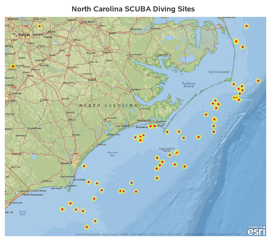
Data Visualization
Guido Oswald 0
Business Intelligence 2013 – Was Analysten erwarten und warum Visual Analytics alles kann!

Boris Evelson ist nicht irgendein Branchenkenner: Der Analyst ist vielleicht der BI Experte bei Forrester! Wie schon oft zuvor schaut er auch 2013 in die Glaskugel und trifft Voraussagen, welche Themen in diesem Jahr dominieren werden. Beim Lesen seines Artikels ist mir klar geworden, wie gut SAS® Visual Analytics den eigentlich erst noch

Data Visualization
Sanjay Matange 0
GTL Layouts

The Graph Template Language (GTL) provides you the ability to create complex graphical layouts. We have seen how to create a regular grid of cells based on one or more classification variables using the SGPANEL procedure.   Each cell contains the same type of plot.  This topic was covered in Dan's article on

Data Visualization
Sanjay Matange 0
Percent VBar

Recently a reader chimed in with a question on the Do Loop article by Rick Wicklin on how to create a bar chart with percent statistics.  Rick used SAS 9.3  and the reader wanted to do the same with SAS 9.2. For the basic (non-grouped) bar chart, the process is the

Data Visualization
Sanjay Matange 0
AE Timeline by Name

In my previous article on Adverse Event Timeline Graph, I wrote about how to create the AE timeline using SAS 9.2 code, using VECTOR plot and the MARKERCHAR option in SCATTER plot.  I  described a better way to place the labels at the lower end of the vectors. SAS 9.3 provides an easier way

Data Visualization
Sanjay Matange 0
Unicode Tick Values using GTL

Often it is desirable to use special Unicode characters for the tick value names on the axes.  However, SG procedures and GTL do not support Unicode strings in SAS data sets. With SAS 9.3, the SGPLOT procedure supports annotation which does support Unicode strings.  You can create an annotation data set

Data Visualization
Sanjay Matange 0
Naomi's Graph Makeover Contest

Naomi Robbins has posted a contest, part 1 of which is to submit alternative representations for the following graph: Clearly, usage of two pie charts to represent the share of the B2B and B2C referrals will invite many responses.  To create the graph, I took the data shown in the Pie Charts themselves, so we are using percent

Data Visualization
Sanjay Matange 0
Report from SCSUG 2012

Last week I attended my first SCSUG conference, this one in Houston.  Houston, the fourth most populous city in USA, is the world's capitol of the Oil and Gas industry.  So it was no surprise I met many attendees from local oil and gas related companies.  But, I also met many

1 51 52 53 54 55 60

Back to Top