Get the right information, with visual impact, to the people who need it
Analyzing movement and tracking data using SAS Visual Analytics

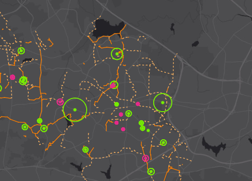
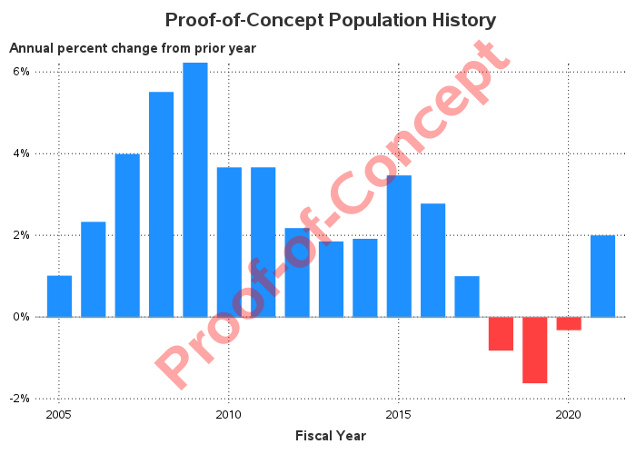
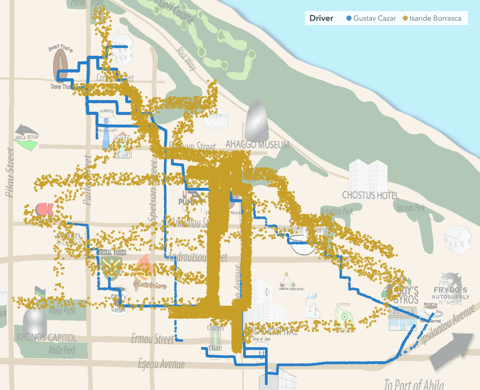
Technological advancements in connectivity and global positioning systems (GPS) have led to increased data tracking and related business use cases to analyze such movements. Whether analyzing a vehicle, an animal or a population's movements - each use case requires analyzing underlying spatial information. Global challenges such as virus outbreaks, deforestation