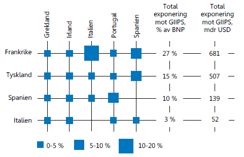
Recently, I came across an interesting graph showing Euro contries bank exposuro to GIIPS countries, as percent of GNP. Here is the graph:
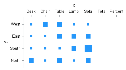
I thought I would see how far I can get in making a similar graph using SAS. I made up some data with response values for a Product x Region grid. The data looks like this:

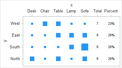
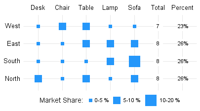
The data has a response value for each crossing or Product and Region. I summed the data for each row, and then computed the overall percentages by row. Here is the step by step process.
Step 1: For the basic graph, we will use a new SAS 9.3 feature in GTL ScatterPlot called MarkerSizeResponse. Similar to a bubble plot, one can now use a scatter plot to scale the marker by a response column. The data range in the column is mapped to values between MarkerSizeMin (7 pixels) and MarkerSizeMax (21 pixels). We map the x values to the X2 axis on top. Here is the graph and the GTL code.
SAS 9.3 Code:
proc template; define statgraph Grid_Plot_1; begingraph; layout overlay; scatterplot x=x y=y / markersizeresponse=value xaxis=x2 markerattrs=graphdata7(symbol=squarefilled); endlayout; endgraph; end; run; ods graphics / reset width=2.7in height=1.5in imagename='Grid_Plot_1'; proc sgrender data=assoc2 template=Grid_Plot_1; run; |
The data already has X values of "Total" and "Percent", with the corresponding response values missing. So, the graph is drawn with spaces reserved for these values, but without any markers. The ScatterPlot statement uses MarkerSizeResponse option to draw each marker proportional to the value.
Step 2: To draw the row totals and the percent values, we simply use additional ScatterPlot statements with the MarkerCharacter option to draw in the textual values of Total and Percent. Here is the graph and the code:
SAS 9.3 Code:
proc template; define statgraph Grid_Plot_2; begingraph; layout overlay; scatterplot x=x y=y / markersizeresponse=value xaxis=x2 markerattrs=graphdata7(symbol=squarefilled); scatterplot x=rowL y=y / markercharacter=row xaxis=x2; scatterplot x=pctL y=y / markercharacter=pct xaxis=x2; endlayout; endgraph; end; run; |
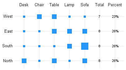
Step 3: Here, we turn off the axis tick and lines, and turn on grid lines to achieve the look in the original graph. Outer graph border is removed.
SAS 9.3 Code:
proc template; define statgraph Grid_Plot_3; begingraph; layout overlay / walldisplay=none x2axisopts=(griddisplay=on display=(tickvalues)) yaxisopts=(griddisplay=on display=(tickvalues)); scatterplot x=x y=y / markersizeresponse=value xaxis=x2 markerattrs=graphdata7(symbol=squarefilled); scatterplot x=rowL y=y / markercharacter=row xaxis=x2; scatterplot x=pctL y=y / markercharacter=pct xaxis=x2; endlayout; endgraph; end; run; |
Step 4: Finally, we add some blank space behind the text by using another scatter plot with MarkerSizeResponse=blank, where blank contains a value for the last two columns and missing for the first five. We set MarkerSizeMin=21 to draw large markers.
Also, we need to create a legend showing the three different sizes for the markers. We do this by creating three custom LegendItems called "s", "m" and "l" (for small, medium and large) and include these in the legend directly. Here is the graph and the template code:
SAS 9.3 Code:
proc template; define statgraph Grid_Plot_F; begingraph; legendItem type=marker name="s" / markerattrs=graphdata7(symbol=squarefilled size=7) label="0-5 %"; legendItem type=marker name="m" / markerattrs=graphdata7(symbol=squarefilled size=14) label="5-10 %"; legendItem type=marker name="l" / markerattrs=graphdata7(symbol=squarefilled size=21) label="10-20 %"; layout overlay / walldisplay=none x2axisopts=(griddisplay=on display=(tickvalues)) yaxisopts=(griddisplay=on display=(tickvalues)); scatterplot x=x y=y / markersizeresponse=value xaxis=x2 markerattrs=graphdata7(symbol=squarefilled); scatterplot x=x y=y / markersizeresponse=blank xaxis=x2 markersizemin=17 markerattrs=graphdata1(symbol=squarefilled color=white); scatterplot x=rowL y=y / markercharacter=row xaxis=x2; scatterplot x=pctL y=y / markercharacter=pct xaxis=x2; discretelegend 's' 'm' 'l' / title='Market Share:' border=false; endlayout; endgraph; end; run; |
Note, a SizeLegend statement is coming in a future release. Till then, one can use the LegendItem to simulate it. Also, one could use the BubblePlot to create such a graph.
Full SAS 9.3 Program: SAS93_Code


12 Comments
This is another interesting way to display a third dimension. It also continues the common thread in many of your blog posts: axis labels with a more complex structure than just text. I too have this problem: our axis labels are really small tables! You have mentioned a future command to control line breaks. Does SAS have any other plans to make it easier to display more complex axis labels?
I try to show usage of plot statements in creative ways to build unique graphs. Complex axis values and axis aligned tables are usually what separates a simple graph from an analytical, clinical graph.
Given that, we have made an extra effort to simplify these features. In SAS 9.3, you will see the following features:
- Cluster groups on discrete axes.
- Cluster groups on interval axes.
- Ease of mixing more statements.
- HighLow bar for ease of labeling events.
- Annotate with SG Procedures.
- Attribute maps.
With SAS 9.4, you will see the following features to further ease the process:
- Axis tick value splitting for X and Y axes.
- Data label and curve label splitting.
- Better tickvaluefitpolicy default for axes - SplitRotate.
- ClusterAxis to allow clustering on either X or Y axis.
- Setting of group colors, etc. in the code, in addition to styles.
- Axis aligned tables - Row and Column.
- Jittering.
- Improved data label positioning.
- Annotate with GTL - this is a big one.
Thanks that sounds good. I am on SAS/STAT 9.22. 9.4 sounds worth the hassle of migration.
I am sure you realize that SAS 9.4 is not released yet. 🙂 Likely next year.
Do you have a target date for 9.4 release yet?
Sometime next year.
just came across your blog... this graph is wonderful. I love bubble plots but this one is a great way for a cross tab of categorical variables!
Could you elaborate on what SizeLegend will do? I have been working on code using discreteattrmap and discreteattrvar to 1) create a legend sized to the values of a categorical variable 2) have the legend include all possible values of that variable, even if the individual only has a subset of those values and 3) have the sizes of the markers on the graph match the sizes of the markers on the legend. So far I have failed at this attempt; I'm hoping that SizeLegend may solve this problem. Thank you.
ps -- happy to send you code! 🙂
Size legend is planned for a NUMERIC size variable. Not categorical. But the details are not clear. One option is to show two markers, one showing the actual smallest marker, and one showing the actual size of the largest marker in the graph. Their corresponding data values will be shown. Alternatively, a legend with two markers is shown, without the marker sizes being exactly those of the smallest or largest. The "Size" variable is shown as an indication that marker size is determined by this variable. Please feel free to send you requirements.
discreteattrmap would work beautifully if the assigned sizes would map onto the variables when using the group=attrvar:
proc template;
define statgraph bubbles3;
begingraph;
entrytitle "Worried Scale ID 4 Bubbles3";
entrytitle "Bubbles Show Likelihood of Event";
discreteattrmap name="symbols1" / ignorecase=true ;
value "Very unlikely"
/ markerattrs=(color=red symbol=circlefilled size=4);
value "Quite unlikely"
/ markerattrs=(color=orange symbol=circlefilled size=8);
value "Fairly likely"
/ markerattrs=(color=yellow symbol=circlefilled size=12);
value "Very likely"
/ markerattrs=(color=green symbol=circlefilled size=16);
value "Almost certain"
/ markerattrs=(color=purple symbol=circlefilled size=20);
enddiscreteattrmap ;
discreteattrvar attrvar=grpmarkers var=likely attrmap="symbols1";
layout overlay;
scatterplot y=worried_scale x=start_date/name="scatter" group=grpmarkers;
seriesplot y=worried_scale x=start_date/break=true;
discretelegend "symbols1"/type=marker ;
endlayout;
endgraph;
end;
In this case -- for id 4 -- the range of responses are only Fairly likely, Very likely, and Almost certain. We are illustrating variability among cases by creating subject-specific graphs. I've tried several workarounds, and nothing is working. The closest I can get is by using markersizemin and markersizemax and assigning the min to the corresponding size (for this subject's graph, 12) and the corresponding max (for this subject, 20). It produces a result that is close, but is still "off." I'm happy to provide clarification if needed -- thank you!
Setting bubble size in the DiscreteAttrMap will not work. These values are ignored, including line thickness in lineattrs and size in markerattrs. This may be addressed in future releases, but needs consistent action across the board.
With SAS9.3 TS1M2, you can use the size variable to set the bubble size from data column. Then use RELATIVESCALETYPE = PROPORTIONAL option. This will ensure the mapping of data value to bubble is linear from BubbleRadiusMax to zero. BubbleRadiusMin is used as a cutoff for the smallest display size.
It's interesting -- DiscreteAttrMap and DiscreteAttrVar are beautiful for the legend -- those characteristics read in precisely -- but this is not consistent to the graph. Ah well. Thank you for your help!