At the 2012 SAS Global Forum, one of the questions from a user was about showing the original data used for the box plot. While you can use outliers in conjunction with the box features to get a feel for the data, for some situations you may need to see exactly what the data looks like, in relation to the boxes.
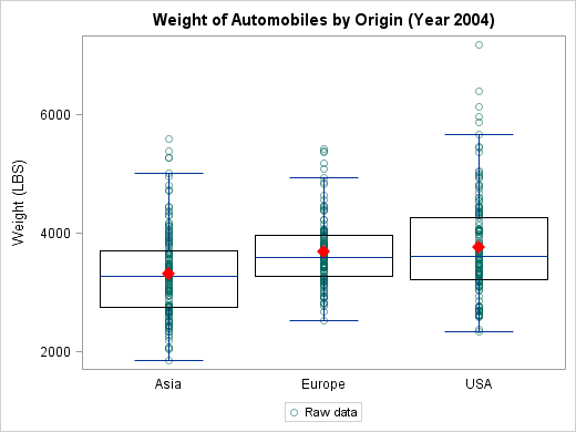
Since there could be many data points for a given categorical value, some sort of jittering would be needed to “un-clump” the points. Shown below is what you get by overlaying the raw data and the box plot without any jitter:
One solution for this problem is given in “The Graph Template Language: Beyond the SAS/GRAPH® Procedures” by J. M. Pratt. This approach uses a categorical X axis along with a numeric X2 axis that is not displayed.
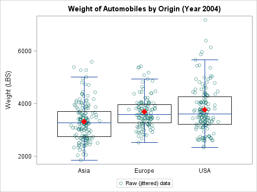
Starting with SAS 9.3, there is another way to solve this problem. We now support box plots on interval axis! Here is what this solution looks like:
The full program is available here. Here are the main points in this solution:
- Map your categories to a numeric variable.
- Turn off the display of box outliers – we will be showing all points including the outliers.
- Introduce a small displacement in the X coordinates of the scatter points to reduce collisions. Ideally, this would be a true jitter which takes the degree of collision of the points into account. Here, we make do with a simpler method of adding random noise to every X coordinate.
- Explicitly specify the X axis tick values and map them to the original category values using a format.
- Making the scatter points slightly transparent prevents the points from overpowering the box features (mean, for example). This also helps us notice any overlapping points in spite of added the random noise.
- The above output has the box overlaid on the scatter points. If you choose to overlay the scatter points on top of the box, you also need to force the X axis to be of type linear.
So when you need to explode your boxes, remember this trick!


11 Comments
While I think this is an interesting and innovative way to display a dataset, I'm uncomfortable with the the horizontal distance between the point and the wire of the boxplot. Doesn't this falsely imply that there's information related to that distance? For example, in the Asia boxplot there are several points that appear to be separated out to the right of the rest of the data. But if I understand your approach, the x axis variation was added simply to help make each individual circle more visible.
Am I missing something?
Thank you for the comment, David.
The intent, as you surmised, is to spread out the colliding points to get a 'feel' for how many data values there may be at any Y coordinate. Other approaches to this are to just use transparency to show overlap, which works to a degree, but fails when a lot of points coincide.
As I noted in the post, a true jitter which only displaces the points that overlap would be a better option. We hope to support that in some form in a future release.
It is possible that a viewer could interpret the X displacement as significant, but hopefully, a clear legend will indicate what the intent was. I did put in 'jittered' in the legend label, but perhaps it needs to be more conspicuous...
Powerful stuff Prashant. Great to see the ODS' team continued focus on responding to user requests.
I think John Tukey would be proud.
The functionality to show the individual data points along with the summary of the data that the box plot provides is very powerful. It might help a bit to downplay the data points a bit by making them semi transparent. What do you think? Can you do that?
Glad to know you liked it, John!
I cant take credit for the idea, of course! The 2012 SAS Global Forum paper I referenced in the post also does this, but our approach shows off the interval axis support for box plots!
The graph as shown has a data transparency of 0.5 (0=opaque .. 1=transparent). This can be easily dialed up or down, as the need may be.
excellent to have this. jitter points with overlaid boxplots are one of my favorite ways to display data - so clear, yet shows so much
this should've been part of SAS 9.1 or something, it's long overdue -.-
With SAS 9.4, we added support for jitter in scatter plots (SGPLOT procedure and GTL) so you don't need to change your original data!
Please see this post by Sanjay: http://blogs.sas.com/content/graphicallyspeaking/2013/07/10/make-better-graphs-with-sas-9-4/
I've used this code frequently in my work and it's been tremendously helpful so thank you very much for sharing it! I was wondering if you know of any way to label the outliers (and ONLY the outliers)? My dilemma, as I'm sure you can guess, is that I either end up with a label on EVERY point (which looks really cluttered), or I get the box plot portion of the code to generate a new data point for the outliers with the label, but these wind up clashing with the scatter plot data point for that outlier. Any idea how to label only the outliers without creating an awkward duplicate data point for them?
Interesting problem! After some discussions, we have *a* solution that has been posted as Part Deux. Hope that works for you!
Pingback: 'Unbox' Your Box Plots - part deux - Graphically Speaking
First, thank you very much for this blog of tremendous interest and for liaising with the SAS Users!
To produce a similar graph comparing different substances within two groups, I used another approach with SAS 9.3 (SAS 9.4 is not available at my working place): statements 'highlow' (to construct the boxplot) and 'scatter' (to display jittered points) within a Proc sgpanel with a layout= 'columnlattice', as option of the 'panelby' statement.
I am nearly happy with the result. My issue is that by default each box is displayed in two different colours (instead of one per box), one colour for the bottom part and another one for the upper part of the box.
Unfortunately I cannot paste the graph picture here. Do you see any solution to the issue?
Many thanks in advance.
Hmmm...
Not sure why you'd get two differently colored boxes. Do you have group= set on the highLow statement? Seeing the code snippet or the graph would help. Perhaps you can post the issue to the Communities page for SAS/GRAPH and ODS Graphics at https://communities.sas.com/t5/SAS-GRAPH-and-ODS-Graphics/bd-p/sas_graph ?