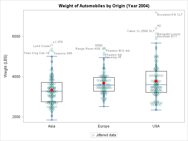
There was a recent comment on the original 'Unbox Your Box Plots', where a user wants to see the original data for the box, but only label the outliers.
As noted in the comment, labeling all the scatter markers and turning on the outlier display is not ideal. But there is a way to do this.
The basic idea:
- PROC MEANS (or PROC UNIVARIATE) to compute the Q1 and Q3 for the data
- compute the upper and lower fences
- blank out the label variable if that observation is not an outlier.
With SAS 9.4, GTL scatter plots support jitter. So we can do away with workaround using interval X axis as required in the original post. Here is the GTL output:
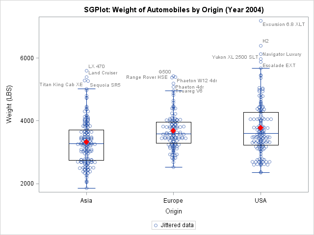
You can also do this with SGPLOT procedure (as of SAS 9.4, 1st maintenance release), with the result as shown below:
The full code for both examples is here.

2 Comments
Very helpful! One question: How do you jitter the data labels in the graph? The example codes do not achieve so.
Hi Roger,
In this post, the scatter markers have been jittered via the jitter=auto option on the scatter statement. The data labels associated with these markers are placed to avoid collision automatically by the system.
Hope that helps?