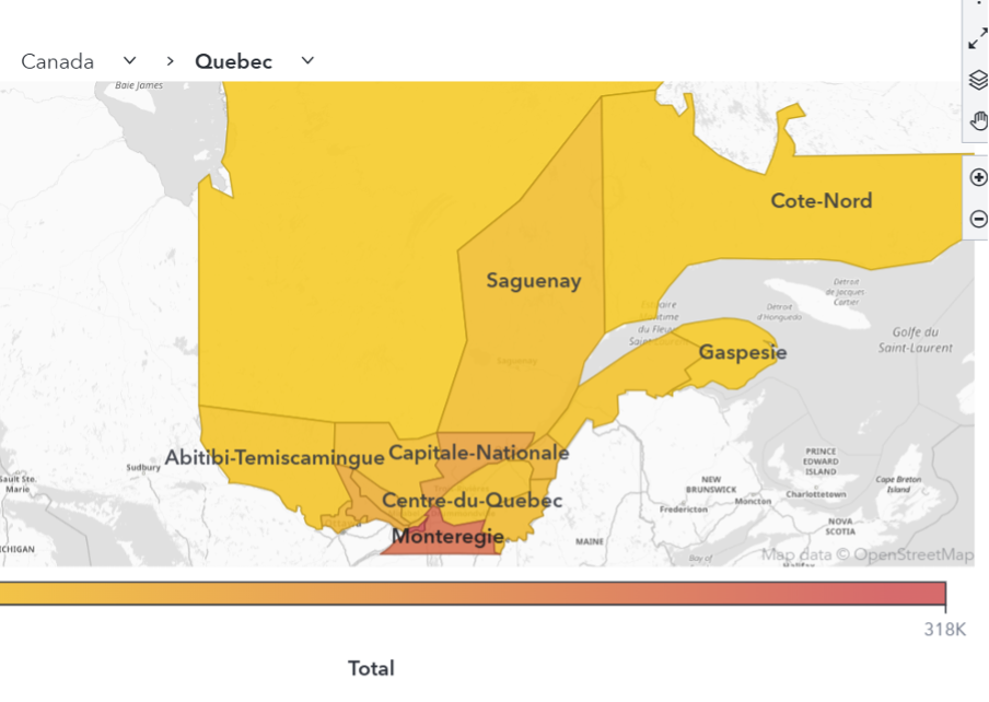
Learn how to create and visualize custom geographic regions in SAS Viya Visual Analytics, either by grouping existing map shapes or by uploading and configuring shapefiles to support regions with custom borders.

Learn how to create and visualize custom geographic regions in SAS Viya Visual Analytics, either by grouping existing map shapes or by uploading and configuring shapefiles to support regions with custom borders.

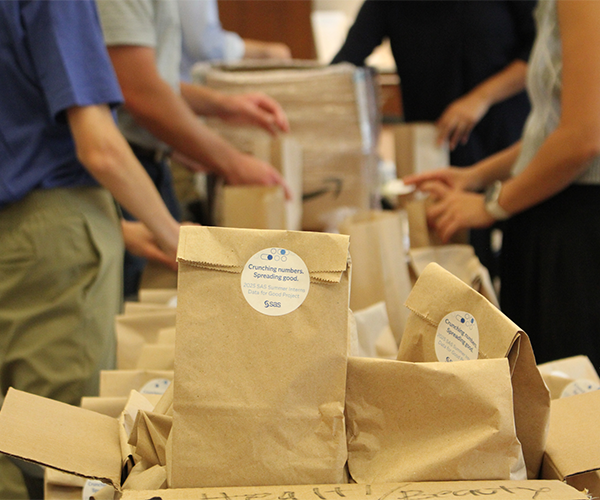
In a world where headlines often warn of automation replacing jobs and AI outpacing human creativity, it’s easy for young professionals to feel uncertain about their place in the future. But this summer, a group of SAS interns proved that technology can be a tool for good. Through a data

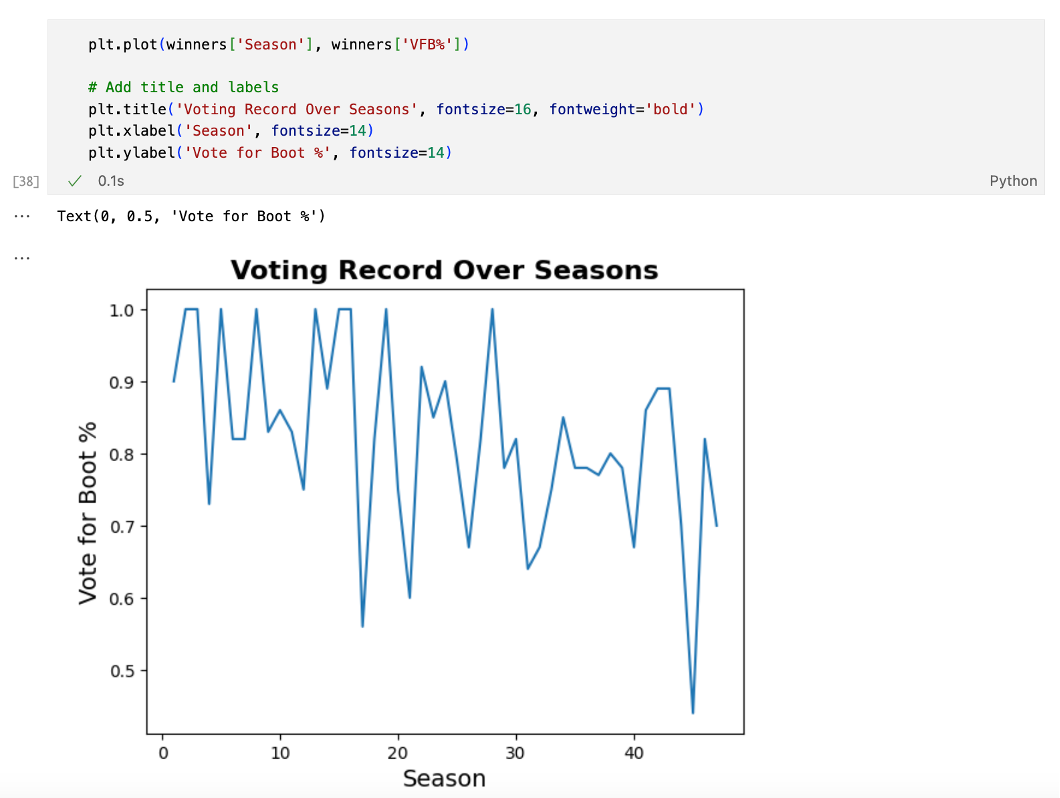
Using 47 seasons of Survivor data, this analysis explores what gameplay traits correlate with winning, applying Python and SAS Viya Workbench to build predictive models. While stats like challenge wins and voting accuracy help narrow down potential winners, the findings suggest that intangible social dynamics play the most decisive role.