These are incredibly tough times, and fortunately, everyone I know is still healthy, safe and doing everything they can to stay that way. I know I'm lucky -- the worst I've suffered so far under coronavirus stay-at-home orders is sports withdrawal. I'm trying to fill that void in my life by watching old Ronaldo highlights and analyzing some publicly available sports data! Specifically, I tried to find data related to tracking the movement of player(s) and attempted to visualize that data in SAS Visual Analytics.
Side note, there's a dearth of publicly available location data, and I truly believe that hinders the sports analytics community. Teams and leagues should do a better job of providing old data to the public. With that being said, let’s dive into some visuals! Below are visuals from three of my favorite sports: Basketball, football and soccer.
Basketball
Here's a visual of every single shot the late, great Kobe Bryant took inside of 40 feet in his career.
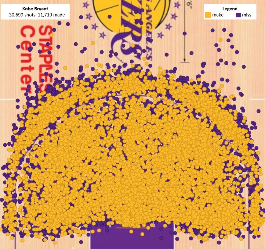
Random story – Kobe was my favorite player to watch growing up. I grew up only playing soccer, but basketball became my favorite sport to watch, in large part because of Kobe. One of the childhood memories I cherish the most is watching the Lakers play in Charlotte against the Bobcats (my favorite childhood team, lol). I was in the 7th grade, and my dad got tickets to a suite. We took a bunch of family and my best friend. That game went into triple overtime. Kobe scored 58 points, but fouled out in the third overtime. The arena played “Hit the Road Jack” as he walked to the bench, and my dad gleefully sang along. The Bobcats won. It was a perfect night.
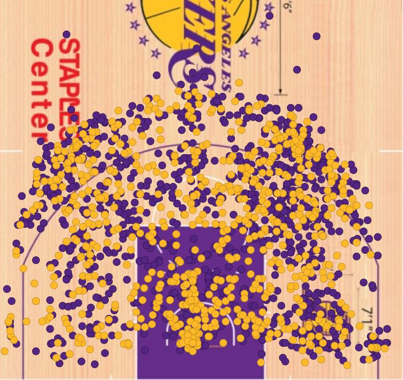
Kobe should have won the MVP the year prior. He ended up winning it in the 07-08 season. Here's his shot chart from that season:
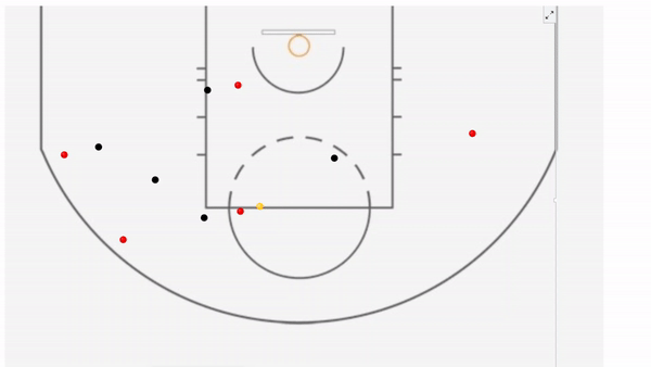
In addition to Kobe’s shots, I was able to find data on a few games that had location information plus timestamps. That allowed me to create animated visualizations. The GIF below lets us clearly see a player missing a wide-open teammate near the rim and instead passing it out to the perimeter as the shot clock expired. The red bubbles represent the offensive players, the black bubbles are defenders, and the yellow bubble is the ball.
Football
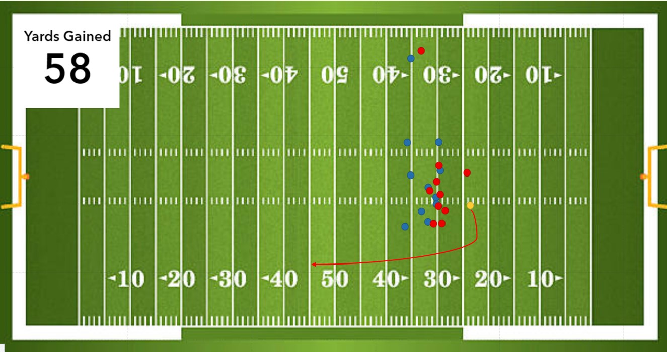
NFL data was harder to find, but I managed to find location data from a few seasons ago. The first screenshot is a freeze frame of the moment Kareem Hunt caught a pitch from Alex Smith against the Patriots in 2017 (the yellow bubble once again represents the ball). You can tell from the visualization just how much space Hunt had down the sideline. He took the ball all the way to the Patriots’ 20-yard line for a 58-yard gain.
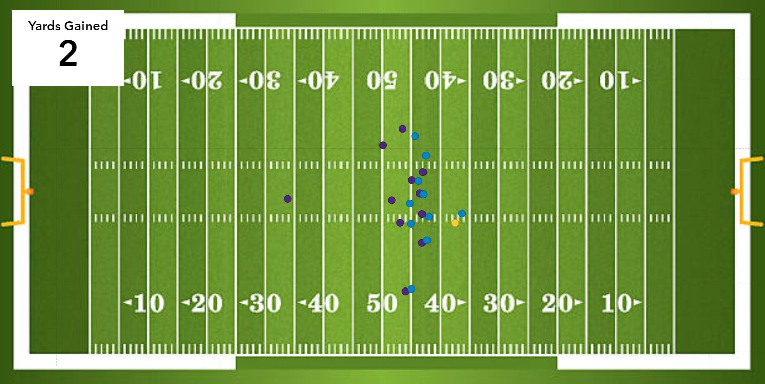
In the visual below, Jonathan Stewart’s Panther offensive line made a push against the Minnesota Viking’s defense. Nonetheless the Vikings were able to close the gaps and hold Stewart to only a 2-yard gain.
I couldn't find any location data with timestamps for American football, so I wasn't able to animate the motion of the players. I was, however, able to find part of what I was looking for with soccer.
Soccer
When it came to soccer data, there was a decent amount of location plus timestamp data available to the public, but it was mostly incomplete data. There was only location and timestamp information when a player participated in some type of event, like a pass, shot, dribble, foul, challenge, etc.
The animated visual below shows the effect of the incomplete nature of this data.
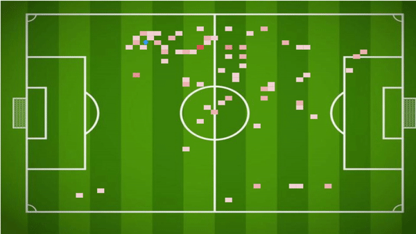
This data came from one half of a 2019 National Women's Soccer League match. The moving bubble represents Marta, the greatest female soccer player ever. The heat map element only represents the parts of the field where Marta participated in the action. As a lefty, you can see she favored that side of the field (her team was attacking the goal on the right).
Since this data only has moments where Marta participated in the action, it doesn't truly represent how she moved on the field second-by-second. With more rows of data, we would have had a fuller heat map and more accurate bubble movement to see what her true motions were like. But, as with most sports data, we have to do what we can with what’s available.
Here’s to hoping that sports organizations will allow more rich datasets to become accessible to the public. In the meantime, learn more about sports analytics -- and stay healthy and safe!

2 Comments
I remember very well the game Kobe played against the Bobcats and how happy I was when he fouled out. I feel a little guilty today for celebrating so much!!
Don't feel bad, dad