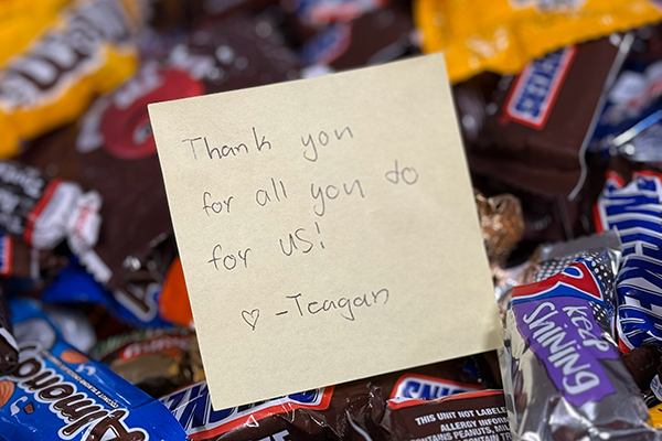
English

Data Visualization
Dan Heath 0
Area Bar Charts using SGPLOT

The SGPLOT procedure supports a wide variety of plot types that you can use directly or combine together to create more complex graphs. Even with this flexibility, there might be times you run across a graph that you cannot create using one of the standard plot types. An "area" bar

Advanced Analytics | Cloud
Lucas de Paula 0
Running CMS-HCC Risk Adjustment models with SAS Analytics Pro on Viya

The CMS-HCC Risk Adjustment models are used to reimburse Medicare Advantage plans based on the health status of the plans’ members. CMS-HCC Risk Adjustment is the practice of assigning a risk score based on demographics and diagnoses to an individual beneficiary of Medicare for the purpose of calculating an expected cost of care, relative to the average beneficiary. Accurate risk adjustment requires an accurate diagnostic profile of an individual on an annual basis, documenting diagnoses via submitted claims or within a provider's medical record.

Advanced Analytics | Analytics | Artificial Intelligence | Data Management
Olivier Penel 0
The 5 characteristics of a future-fit, data-driven organisation

Change is the only constant, and it doesn’t happen overnight. This is particularly true in the world of data analytics. As organizations are looking to become more digital, resilient and profitable, executives are going back to the whiteboard to reconsider how they’re using data and analytics to transform their business.

Advanced Analytics | Analytics | Data Management | Data Visualization
Charlie Chase 0
Misnomers regarding outliers and their usefulness in statistical modeling

Outliers provide much-needed insights into the actual relationships that influence the demand for products in the marketplace. They are particularly useful when modeling consumer behavior where abnormalities are common occurrences or unforeseen disruptions that impact consumer demand. But why do demand planners cleanse out outliers, when many are not really

Data Visualization
Dan Heath 0
Optimizing bar label placement

When creating bar charts, it is very common to display labels with the bars to make it easier to determine the bar values or to provide additional information in the chart. However, these labels can take away valuable data space, particularly if you generate a smaller-sized graph. As you see

Analytics
Lee Ann Dietz 0
Earth Day 2022 – an interview with SAS specialists about analytics and climate resilience

Leaders from businesses and governments across the world continue to show progress on a range of critical environmental topics, addressing climate resilience and taking actions to ensure a more sustainable and thriving planet. Advancements and innovations continue to open new avenues for environmental leadership – and the use of data

Advanced Analytics | Analytics | Data for Good
Josh Morgan 0
Empowering improved Medicaid policy using whole person analytics

Before I started with SAS, I worked at the San Bernardino County Department of Behavioral Health. Among many other projects, our analytics work included integrating data from multiple county departments and risk stratifying citizens in the greatest need of public services.   This led to our 1115 Whole Person Care (WPC) waiver

Advanced Analytics | Analytics | Students & Educators
Alina Luchian 0
UBB FSEGA's inspiring vision for its role in Romania’s developing economy

Babeș-Bolyai University (UBB) is the largest and highest-ranked university in Romania. Its Faculty of Economics and Business Administration (FSEGA) is the largest faculty at any university in Romania. It is also the highest-ranked institution in the country for management and business and top-ranked for economics. The faculty was founded as

Analytics | Learn SAS
Rick Wicklin 0
The McNemar test in SAS

What is McNemar's test? How do you run the McNemar test in SAS? Why might other statistical software report a value for McNemar's test that is different from the SAS value? SAS supports an exact version of the McNemar test, but when should you use it? This article answers these

Data Visualization
Diana Maris 0
Successful citizen data scientists need to know these three trends

Data visualization is a critical way for anyone to turn endless rows of data into easy-to-understand results through dynamic and understandable visuals. Whether your favorite visualization is a pie chart, a geographic map or relies on natural language, showing the insights that empower you to make more informed decisions is a better way to do data-driven business. Analyst firms say that SAS has market-leading data visualization. This helps users across the globe find insights in their data using new and exciting trends in data visualization.

1 31 32 33 34 35 328