Foundation and domain models: Going beyond the GenAI hype

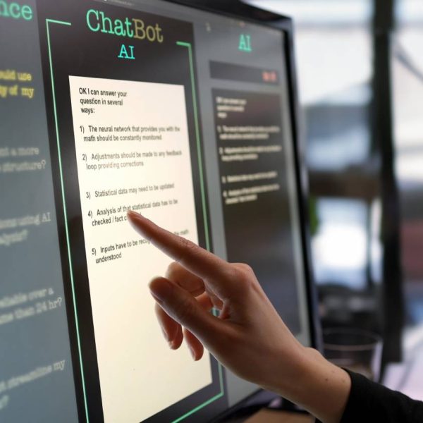
Foundation and domain models are transforming how businesses approach technology. These powerful tools are moving beyond the hype of GenAI, offering real solutions for a variety of tasks – whether generating text, creating visual content or even composing music. A new global survey of 1,600 organizations revealed critical insights into