All Posts


Since I was a teenager, I’ve had trouble sleeping. From hypnotherapy to melatonin, I've tried all kinds of lifestyle changes and strategies to get better sleep. No matter what helps, I am never immune to those nights at 3 AM where my mind won’t seem to shut off. No surprise


The UK government sector is standing on the verge of the unknown. The fallout from the COVID-19 pandemic and the economic and political outcomes of Brexit remains to be seen, but change is a certainty. Government departments will need to respond quickly and decisively. But they will have a chance
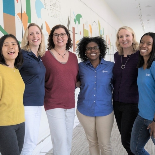

We have so much to celebrate for International Women’s Day and Women’s History Month! Scroll right to preview the many events and stories to inspire and empower.


Gespräch mit VW: Patrick van der Smagt, Direktor des Machine Learning Labs des Volkswagen Konzerns.


SAS stands for more than just installation and customizing. I discuss our #IMPACT view of 2021 with Thorsten Hagenberger.
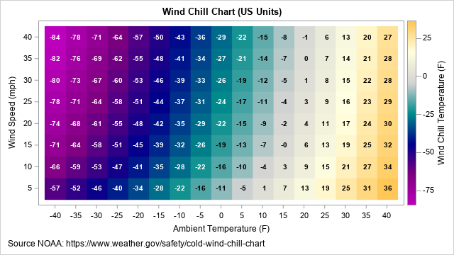

I recently wrote about a simple statistical formula that approximates the wind chill temperature, which is the cumulative effect of air temperature and wind on the human body. The formula uses two independent variables (air temperature and wind speed) to predict the wind chill temperature. This article describes how to


“Running is a lifestyle for me. It’s like brushing my teeth or taking a shower. I’m always thinking about when I can get my run in. I plan out my days so I can at least run 2 to 3 times a week.” In our final installation of Black History
Interview mit Dr. Edgar Klenske, Gründer des Start-ups GaussML.


“Si 2020 fue el año de Covid-19, 2021 será el de las vacunas”. Así lo planteó Greg Horne, Global Principal, Healthcare de SAS, cuando se completó el análisis de las Tendencias para ver con analítica en 2021. En el mismo, Greg planteaba algunas preguntas puntuales sobre cómo la analítica avanzada puede ayudar al

En la actualidad, la industria de las telecomunicaciones enfrenta uno de los mayores desafíos de su historia y al mismo tiempo una de las mejores oportunidades. Se trata de la transición a la quinta generación de las comunicaciones móviles, la tecnología 5G, la cual ya está presente en al menos 40 países,

FDA, 의약품 평가 및 연구 센터 위해 SAS 고급분석 및 AI 기술 도입 미국 식품의약국(FDA)은 SAS® Viya® 플랫폼 내 자연어 처리, 인공지능 및 머신러닝 기능 등을 기반으로 새로운 도약을 위해 SAS와 40년 파트너십을 연장하기로 했습니다. 향후 5 년간 4,990 만 달러(약 560억원)에 달하는 총괄 구매 계약(BPA)을 통해 SAS는 FDA에서 진행중인


COVID-19 is triggering a debt collection crisis for UK banks. How can collections teams control an explosion in delinquent accounts?

“The club set out to do hill training at Pilot Mountain where the guys were climbing the mountain and the ladies planned to circle the hilly countryside around the mountain. We were climbing a long hill and I was the last cyclist in the back having gotten dropped mid-hill. In
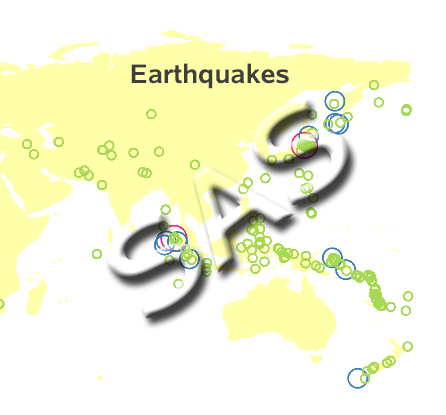

This is another in my series of blog posts where I take a deep dive into converting customized R graphs into SAS graphs. Today we'll be working on bubble maps - specifically, plotting earthquake data as bubbles on a map. R bubble map, created using geom_polygon() and geom_point() SAS bubble


The people, the energy, the quality of the content, the demos, the networking opportunities…whew, all of these things combine to make SAS Global Forum great every year. And that is no exception this year. Preparations are in full swing for an unforgettable conference. I hope you’ve seen the notifications that