Amazing things can be created when you start with small pieces and stack them together. Just ask Bryan Berg. He is the current world record holder for the tallest house of cards. This same principle can be applied to the SGPLOT and SGPANEL procedures. You can take the individual plot
Tag: ods graphics
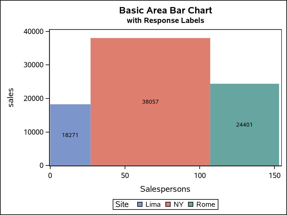
The SGPLOT procedure supports a wide variety of plot types that you can use directly or combine together to create more complex graphs. Even with this flexibility, there might be times you run across a graph that you cannot create using one of the standard plot types. An "area" bar
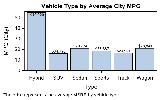
When creating bar charts, it is very common to display labels with the bars to make it easier to determine the bar values or to provide additional information in the chart. However, these labels can take away valuable data space, particularly if you generate a smaller-sized graph. As you see
What happens if you need to edit graph output files from SAS in a different application (for example, Microsoft Word)? It is not recommended that you edit your SAS graph output outside of SAS, but, if you must do so, you need to create your graphics output as EMF (Enhanced Metafile Format) graph output.
When you get something new, the hope is that it will be better than the old thing it's replacing. As I often do, I asked my Facebook friends to provide a random picture for my blog - in this case, a picture of one of their new/recent purchases. My friend
A few examples to demonstrate some of the common output-related problems with ODS Graphics Procedures. If your graphical output does not appear as you wanted, consider the options that you are using and make sure that you are using the correct option.
I met many SAS programmers at the 2019 SAS Global Forum who geocode addresses using ArcGIS. Did you know that street address locations and other things can be found using the SAS GEOCODE procedure? PROC GEOCODE gives you coordinates for address, ZIP codes, ZIP+4 codes and cities. You can even
In the previous Graphically Speaking blog for PROC SGMAP, you used PROC GPROJECT so map regions would match OpenStreetMap and Esri background images. This time, the same British Columbia shapefile is used with: PROC GREMOVE to remove unwanted boundary lines PROC GREDUCE to reduce map data PROC GPROJECT to zoom
Sometimes it is difficult to know what parameters to use when projecting map data onto Esri or OpenStreetMaps in PROC SGMAP. The shapefile .PRJ file contains everything you need to set these parameters in PROC GPROJECT. In a previous blog, you saw how to lookup projections at a web site,
As mentioned in other PROC SGMAP blogs, several SAS/GRAPH procedures have been moved to 9.4M6 Base SAS to be used with PROC SGMAP. You can use these to create PROC SGMAP output even when using the free SAS University edition. In this blog you will use the: IMPORT procedure for
After almost 32 years, I am retiring from SAS.
In August 2018, Hurricane Florence came on shore in North Carolina. Much of the damage was from flooding because the storm moved slowly over North and South Carolina. Parts of North Carolina had over 30 inches of rain from the storm, and this caused many of North Carolina’s rivers to
Starting with SAS 9.4M6, procedures that used to be provided with a SAS/GRAPH installation are now available with Base SAS. Using these procedures along with PROC SGMAP can help you create some very nice maps. This blog builds on previous posts and highlights the: MAPSSAS Data Sets GREMOVE procedure %CENTROID
Have you ever wanted to see examples of all of the output styles that SAS provides? You can run a program and look at the resulting file, styles.html. This post explains more about the styles that you will see including a discussion of attribute priority.
The ODS destination for PowerPoint uses table templates and style templates to display the tables, graphs, and other output produced by SAS procedures. You can customize the look of your presentation in a number of ways, including using custom style templates and images. Here we'll learn about using background images.
There were 97 e-posters in The Quad demo room at SAS Global Forum this year. And the one that caught my eye was Ted Conway's "Periodic Table of Introductory SAS ODS Graphics Examples." Here's a picture of Ted fielding some questions from an interested user... He created a nice/fun graphic,
PROC SGPLOT displays titles inside the graph. If you want to display a title inside the graph and a different title outside the graph, you can use the ODS LAYOUT or the GTL. The ODS LAYOUT gives you precise control over your output and enables you to display multiple graphs and tables in each page.
This post presents some basic aspects of ODS Graphics: enabling, selecting, and displaying graphs.
This post is from SAS Author Sanjay Matange. It's part of our SAS Author Tips series. Do you have a complex multi-cell graph created in ODS Graphics Designer that you’d like to reuse with different data? Ideally, you’d like to change the data without having to change the plots in each cell. The
SAS Community member @tc (a.k.a. Ted Conway) has found a new toy: ODS Graphics. Using PROC SGPLOT and GTL (Graph Template Language), along with some creative data prep steps, Ted has created several fun examples that show off what you can do with a bit of creativity, some math knowledge,
In this post, I will show you how to control the order of the entries in a legend and explicitly control the correspondence between groups and style elements in PROC SGPLOT. In many cases, the colors that are used to differentiate groups do not matter--the graph simply needs to display
There are many ways to use a heat map. For big data sets, heat maps provide a substitute for scatter plots. Heat maps can also be used to enhance small tables. Several of my colleagues (Sanjay Matange, Pratik Phadke, Rick Wicklin, Chris Hemedinger, and probably others) have posted about using
Rick Wicklin created a nice example of using the SURFACEPLOTPARM statement to create a surface plot in SAS. As I read it, the question that immediately came to mind was: can I use this to create the famous SAS cowboy hat? The "cowboy hat" is a highly distributed example of
In recent releases of SAS, you can use Output Delivery System graphics or 'ODS graphics on' to produce nice graphical output for most of the analytic procedures. These default graphs are nice, but when you want your graphs to look "a certain way" SAS also lets you create your own custom graphs!
SAS 9.4 was released a month ago, and we are excited about all the new features in SG Procedures, GTL and Designer. I wrote an article on SAS 9.4 graph features last month, and promised more to come. What then could be better than this Tech Talk video hosted by our
Last week, I presented some highlights of the new features for SG Procedures and GTL in SAS 9.4. Now, let us dig in a bit deeper. For a plot without a GROUP role, setting an attributes was always easy with SG procedures. All you need to do to set bar color
If you've watched any of the demos for SAS Visual Analytics (or even tried it yourself!), you have probably seen this nifty exploration of multiple measures. It's a way to look at how multiple measures are correlated with one another, using a diagonal heat map chart. The "stronger" the color
The 2013 SAS Global Forum is around the corner in San Francisco and the anticipation is building. Early indications are that attendee registration is up from last year, and we are looking forward to a great conference starting Sunday, April 28. It is great to see the large and diverse offering
ODS Graphics components like GTL and SG procedures are designed to work with Styles to create graphs that are effective in the delivery of information and aesthetically pleasing out of the box. You no longer have to tweak the colors to ensure a nice graph. The graph derives all the
At SAS Global Forum, and again at PharmaSUG, we had the pleasure of attending many papers and presentations on various topics that included graphs in the power point decks or in the papers. More often than not, the graphs exist along other text, and occupy a smaller part of the screen