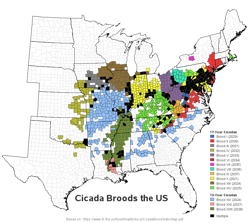
I hope you're all doing well, in this year of plagues and locusts! I'm sure I don't even need to mention which plague I'm talking about. But what about the locusts? Are you up on your entomological studies? Follow along, and see if you really know what locusts are... Locusts
Tag: gif animation
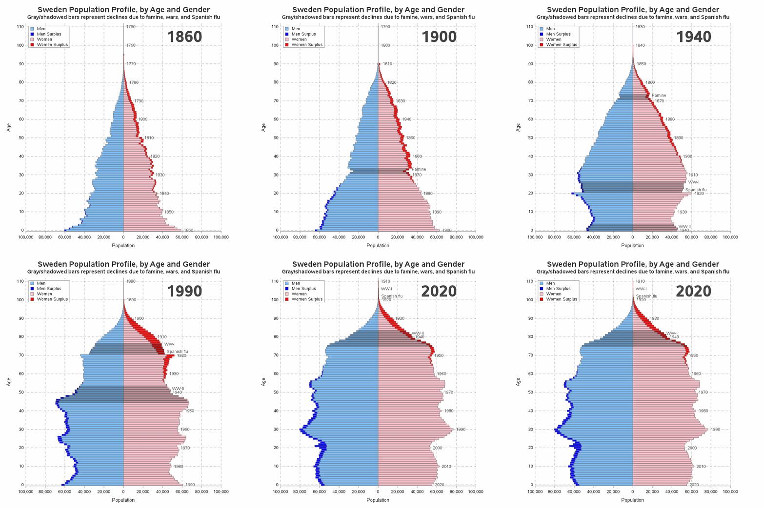
You've probably seen a population pyramid, such as this one I showed in a previous blog post. But let's scrutinize population pyramids a bit deeper, with an eye on special features that can make them even more useful! I was inspired to give population trees a second look by this
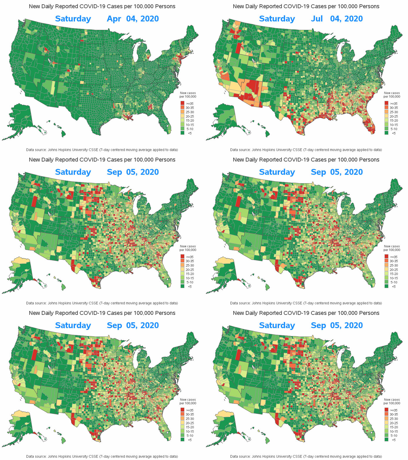
Now that we are many months into the COVID-19 pandemic, we can start to reexamine the data and look for trends. This time, I want to explore how COVID-19 has been spreading around the US. I do this by animating a county map over time. What is animation? Are you
We recently had some severe storms come through North Carolina, which even spawned a tornado in Wake county (the county where I live and work). This got me wondering when and where we've had tornadoes in NC in the past ... and, of course, I had to create a map!
I always recommend looking at data in several different ways to get a more complete mental picture. And when the data is changing over time, one great way to view it is using an animation. Follow along for some tips & tricks to animate your own data over time. I'll
As we're approaching the anniversary of Hans Rosling's passing, I fondly remember his spectacular graphical presentations comparing the wealth and health of nations around the world. He certainly raised the bar for data visualization, and his animated charts inspired me to work even harder to create similar visualizations! What better way
It might snow this weekend here at the SAS headquarters! This would be the first snow of the season for us, and it got me thinking about snow again (see some of my previous blog posts about snow). Apparently these thoughts have manifested themselves in my computer graphics work ...
Do you remember The Matrix movies, that started coming out in 1999? Hopefully this movie franchise didn't give you a fear of virtual reality and AI. The thing I remember most from the movie was the really cool slow-motion video effects (from multiple angles) in the fight scenes. And the
"We been through every kind of rain there is. Little bitty stingin' rain, and big ol' fat rain, rain that flew in sideways, and sometimes rain even seemed to come straight up from underneath." Was that a quote from the Forrest Gump movie, or something said regarding Hurricane Florence? Could be either one! Hurricane Florence recently came through
When I'm at a social gathering, someone always asks what type of work I do. I like to keep my social life separate from my work, therefore I usually give a vague answer such as "software" (and quickly change the topic). How vague or specific is your response? How vague
My buddy Rick Wicklin recently pointed me towards an animation of some opioid prescription rate data for Illinois. And, of course, I decided we needed a similar animation for North Carolina (with a few improvements...) Here's the original, and here are the problems that jump out at me: Counties with
The flu seems to be especially potent this year. "How potent is it," you might ask? ... Well, let's plot some data on a map to help find out! Here in the US, the Centers for Disease Control and Prevention (CDC) compiles data about diseases, and provides reports and graphs
This post shows you how to animate text to create a message that appears one character at a time.
Whether or not to legalize marijuana is a hotly debated topic these days. And no matter which side of the debate you're on, I think you will be interested in seeing several ways to visualize which states have legalized marijuana, and when ... Their Version Here's the original graph that
One of the great things about living in an area that has seasons is you get to see the leaves change colors in the fall. If you're a big fan of seeing the leaves at their peak, you could actually travel around the country and see the leaves at their
As a kid who grew up in the 60s & 70s, I was a big fan of the original Star Trek TV series. And in the years since, I have seen lots of the Star Trek “technology” become a reality: cellphones, portable tablet computers, talking computers (Alexa/Siri), etc. But I
The US unemployment rate was down to 4.4% in April, which is the lowest we've seen since before the big recession (about 10 years ago). But a single number seldom tells the whole story, so let's look at unemployment data in several different ways, to get a more complete picture...
Have you ever been bitten by a mosquito? What are the odds it carried the West Nile virus? ... Perhaps a lot higher than you thought! Here's a picture of a mosquito that kept 'bugging' me around my computer desk at home - good riddance, I say!
Smallpox was declared eradicated in 1979, after an extensive vaccination campaign in the 19th and 20th centuries. This blog post contains a visual analysis of the final years of this disease in the US ... In my previous blog post, I imitated and improved infectious disease graphs from a recent Wall
How does Santa keep track of everything on his big night? I can't confirm or deny that he uses SAS software -- but if he does, it would look a lot like this! ... A couple of years ago, I blogged about a prototype dashboard that I wrote for Santa. This
With tornadoes in the news lately, I wondered how I might could use SAS to analyze tornado data. How about animating 60 years of tornado path data? ... I was using Google to search for ways to analyze tornado data, and found an example on ustornadoes.com that animates the tornado
SAS has been used to track the spread of many things, such as wild animals, tornadoes, and money launderers -- but this time I'm using it to track the spread of Walmart stores across the U.S. over time! Since its start in the 1960s, Walmart has grown to be the largest
They say "Imitation is the most sincere form of flattery"... Therefore when I imitate Hans Rosling's famous world-data animation, it's not that I'm jealous, but that I'm paying homage to him! (OK, and maybe also a little bit jealous! LOL) Well, anyway, for those of you who haven't seen it,
Often we want to visualize the relationship between variables over time. The understanding of such data can be improved by viewing the animated graph over time. With SAS 9.4, you can create animated graphs using the new animation options on the OPTIONS statement and the PRINTER destination. A popular example an
Hopefully you know that a gif animation can be used for more than just showing a cartoon animal doing cute tricks! Being a savvy data-meister, I'm sure you are also aware that you can use gif animations to see how data changes over time. But perhaps you didn't know you could