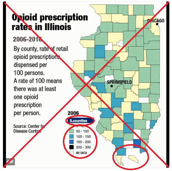
My buddy Rick Wicklin recently pointed me towards an animation of some opioid prescription rate data for Illinois. And, of course, I decided we needed a similar animation for North Carolina (with a few improvements...)
Here's the original, and here are the problems that jump out at me:
- Counties with no data are colored white, and have no border ... therefore they 'disappear' (especially when they're at the edge of the map, like some of the counties along the southern edge).
- "ILcounties" is not a good label for the legend.
- I prefer to sort the legend such that the highest values are at the top.
- And there was some mention in the Twitter comments that the location of Springfield had been incorrect in an earlier version (a fool-proof technique needs to be used, to locate cities on maps!)
I found the data on the Centers for Disease Control (CDC) page. There was an HTML table for each year, so I wrote some SAS code to scrape the data from the HTML code. I then wrapped my code in a SAS macro, and called the macro once for each year, and then used a data step to combine all the years into a single dataset. It's some pretty cool SAS data management code, and I invite you to have a look at it!
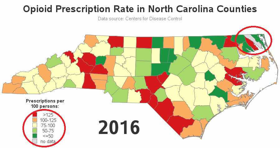
In my first pass at plotting the data, I made sure the counties with missing data showed up in the map (see Camden county along the east coast). I also sorted the legend such that the higher values were at the top, and used better labeling in the overall title and legend title. I think the map is looking much better already!
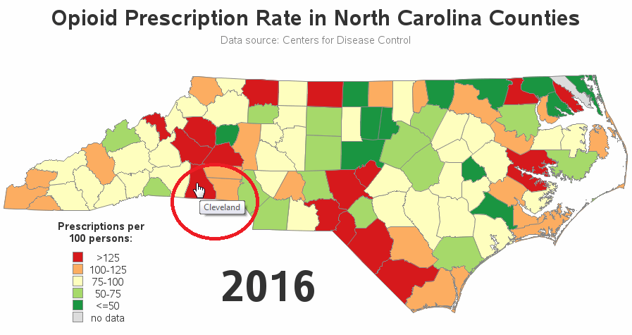
Just looking at the map above, I could definitely see some geographical trends. I first assumed that some of the red areas probably represented Charlotte, Fayetteville, Winston-Salem, and Greensboro. I added HTML mouse-over text to the counties so I could see the county names and help verify whether the red counties corresponded to the big cities ... but I soon realized that I didn't really know which cities were in which counties (it's been a long time since Junior High school! LOL)
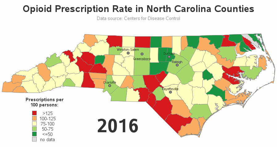
So I also annotated markers and labels for the major cities ... and to my surprise, none of the red counties housed a major city! (I love it when I add something to a map that provides more/better insight!) Note that I used Proc GProject's parmout=/parmin= options, so that I used the exact same parameters to project the city locations as I had used to project the map borders - this guarantees the cities will line up in the correct locations.
Once I had a map I liked, I added a 'by year' statement to produce the map for all years (2006-2016), and two more lines of code to package the images up into a GIF animation. Feel free to download my SAS code, and modify it to plot the data for your own US state!
Click any of the images above to see the full-size interactive version of the final animation (with mouse-over text showing the county names).
Now for the big questions ... why do some counties have a much higher opioid prescription rate than other counties? What other data might it be interesting to try to correlate this with?


8 Comments
You could add income levels to the data to see if more poverty plays a role in opioid use. Education level would give greater insight., Rent vs Own, family size, unemployment rate.
It would be interesting to see if any patients in the bordering counties are actually coming from another state. Not sure if you have that data. Also, do you have a diagnostic code? I would like to know what is the most common reason for the prescription.
Unfortunately, I don't have access to more detailed data!
Robert and BNL Consulting...fantastic work! Can't wait to see what you can collaborate on together! Thanks for making a difficult topic so easy to understand by providing the right visualization.
Is there a way to slow down the animation? Thanks!
No interactive way. You would have to change a parameter in the code, and re-run the code, and re-generate the animation.
We at BNL Consulting (a SAS partner) visualized the same dataset while contrasting it with CDC Overdose Death rates here: http://opioid.bnlconsulting.com. Would love to collaborate on some visuals with you if interested.
Sounds good!