When I'm at a social gathering, someone always asks what type of work I do. I like to keep my social life separate from my work, therefore I usually give a vague answer such as "software" (and quickly change the topic). How vague or specific is your response? How vague or specific is the data the US government keeps about jobs? And ... what are the most common occupations in each state?
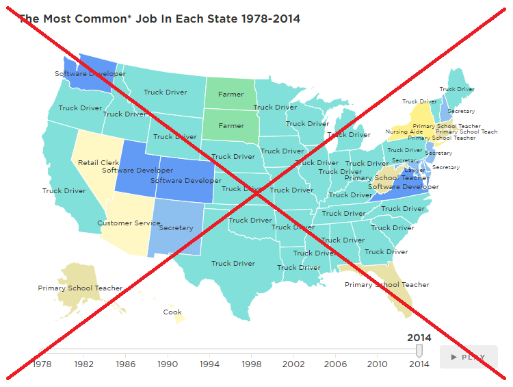
I recently saw an NPR article on this topic, and they had a neat map showing the most common job in each state. Their map had a slider you could move to change the year, and a 'play' button you could click to animate the map. Click the screen capture below, to see their interactive version:
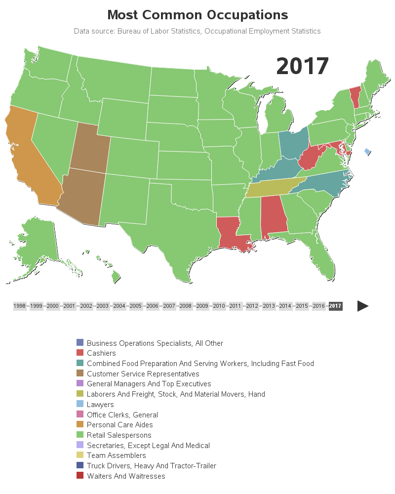
The NPR map was interesting, but of course I had a few changes I wanted to make. They didn't say exactly where they got their data, so I searched the web, and found something similar on the Bureau of Labor Statistics website. I downloaded 20 spreadsheets (for 20 years of data), imported them into SAS, and started experimenting. Here's what I came up with (click the image below to see the interactive version):
Here are some of the changes and features of my map:
- Rather than trying to squeeze the job titles as crowded labels on each state, I put the information in HTML mouse-over text. The mouse-over text shows the top 5 occupations in each state, which I think is more informative than just showing the #1 top occupation in a label.
- I moved Washington DC out to the side, and made it bigger, so it's easier to see. I think it's important to see DC, because it has different jobs than the rest of the US (mostly lawyers).
- Rather than just showing the selected year on the selector bar, I place a large year label above the Great Lakes, where it's more prominent.
- I show the specific data source below the title (and in the interactive map, you can click the data source label to go to the actual data download page).
- I used more recent data, up through year 2017.
- Click the years below the map to see that year's map.
- Click the 'play' button to animate the map (click your browser's back button, or click a specific year, when you've seen enough of the animation).
As I was working through this analysis, it occurred to me that a lot depended on how the jobs were grouped or split in the data. The NPR article even mentioned that they excluded the following two catch-all categories in their data: "managers not elsewhere classified" and "salespersons not elsewhere classified." I'm not sure that excluding these categories is the right thing to do - seems like that would bias the data quite a bit (at the very least, their map should be labeled to let people know those two categories were excluded).
Which occupations are the most popular in your state, and are there any somewhat 'unique' occupations in your state's top 5?
How'd He Do That?
And now a little something for you coding-geeks that are wondering how I created my map ... I could have used SAS Visual Analytics or JMP to create an animation with a slider-control along the bottom, similar to the NPR map, but I was wanting to use traditional SAS. Traditional SAS allows you to easily create GIF animations which you can view in a browser, but a GIF animation has some limitations:
- You can't pause & restart the GIF animation.
- You can't go backwards in a GIF animation.
- You can only have 1 mouse-over for each state in a GIF animation (you can't have a separate mouse-over for each year - it would show the same mouse-over for all the years).
So I decided to create a GIF animation (which you see when you click the arrow), and also fake a year slider/selector bar along the bottom. When you click the year in this selector bar, it shows you a totally different map for just that year. It does this by jumping to an HTML anchor for that year, which happens very quickly (hopefully instantaneous).
To create these separate maps, I could have repeated my GMap code 20 times (for the 20 years), but that would have been a lot of repetitive code to write and maintain. Or, I could have placed one copy of the GMap code in a SAS macro, and then called the macro 20 times (passing in the year each time).
But I chose to use 'by' processing instead, and ran my GMap 'by year'. You have to take great care in preparing your data and annotation to work with a by statement - but once you've got everything set up, this is a very code-efficient way to do it! Here's a bit of my code, showing several ways I took advantage of the by variable:
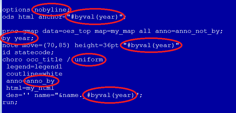
Here's an explanation for the bits of code circled above:
- I used the nobyline option to suppress the automatic titles which would have appeared in each map as year=2017, etc.
- I used a note to place the values of year above the great lakes, in a large font size.
- I used the value of the year as the html anchor, making it easy to programmatically set my HTML href= drill-down links to go to the desired anchor for each year (note this is functionality which will be released in SAS 9.4m6, probably shipping this fall).
- I used the uniform option, so the legend items and colors would be consistent across all the maps for all the years.
- For the year-specific annotations (such as the dark-colored year in the year selector bar), I placed them in the anno_by dataset, and I specified that in the anno= option after the choro statement. The 'by year' affects the anno= after the choro statement, but it does not affect the anno= specified in the proc gmap line.
- And I also used the by value in the name= option, so each map's png file would have the year as part of the file name (such as most_common_jobs_2017.png).
I hope you learned a few tricks here, and have been inspired to try the 'by statement' in your code. Feel free to share some ideas in the comments of how you use the 'by statement'!


2 Comments
I like the redo of the map, but I've two issues with it.
1) I'm viewing on a small-ish screen, and I have a hard time seeing the full map AND the legend at the same time making it hard to track which state has which top category. I don't know if a two-column legend would help or not, especially given the long category names.
2) The greens in particular are really hard to distinguish in the legend. I had a hard time figuring out from just the map and legend what the #1 was in the vast majority of the states without clicking through and getting the hovertext.
Always enjoy your blogs!
Those are two astute observations! I mentally struggled with these two things, and finally 'gave up'. The legend is so long (because of the long text), I figured I would just put it at the bottom, and most people would just let that scroll off the bottom of the screen (and use the hover-text). And per the colors - I'm using more colors/legend-items than is a "best practice" and it's difficult to pick that many unique distinguishable colors. I just took the SAS ods style default colors, assigned in the default order, but perhaps I should scrutinize what colors are on the screen at the same time, and and in close/distant proximity to each other, and manually pick some colors that work a little better. - Thanks for the feedback ... it has 'inspired' me to work even harder! :)