The US unemployment rate was down to 4.4% in April, which is the lowest we've seen since before the big recession (about 10 years ago). But a single number seldom tells the whole story, so let's look at unemployment data in several different ways, to get a more complete picture...
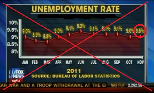
My quest for better unemployment graphs started back in 2011, when I saw the following graph in the news. I think it must have been created by an artist (rather than software), because there's no way the 8.6% (which I circled in red) would be lined up with the 9.0%:
I decided to create my own version of the graph using SAS software, so that the values would be accurately represented in their correct locations. Here's what I came up with - my version shows that the 8.6% should be far below the 9.0% when the axes are scaled this way:
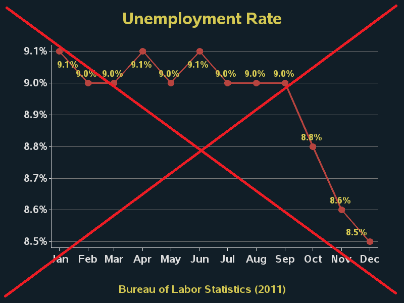
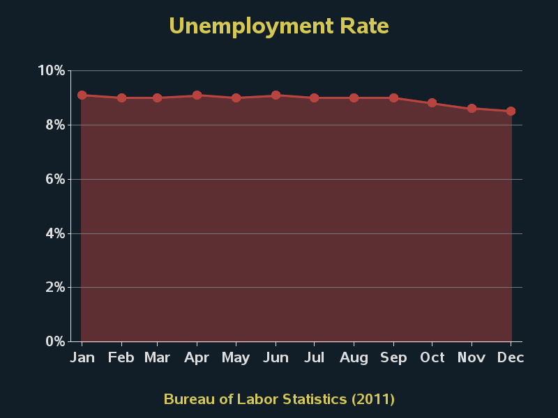
But you probably also noticed the big red 'X' through the graph (which is something I do to bad/misleading graphs in my blogs, so people don't mistakenly think they are good examples). The problem with this graph is that axes make it look like there was a huge drop ... when it wasn't really that huge in the grand scheme of things. Here's the same data plotted with the y-axis going to zero, which I think is what the news was trying to show in the first place:
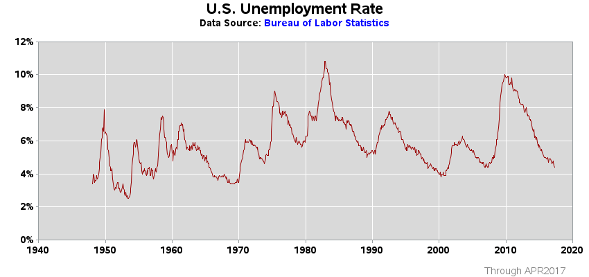
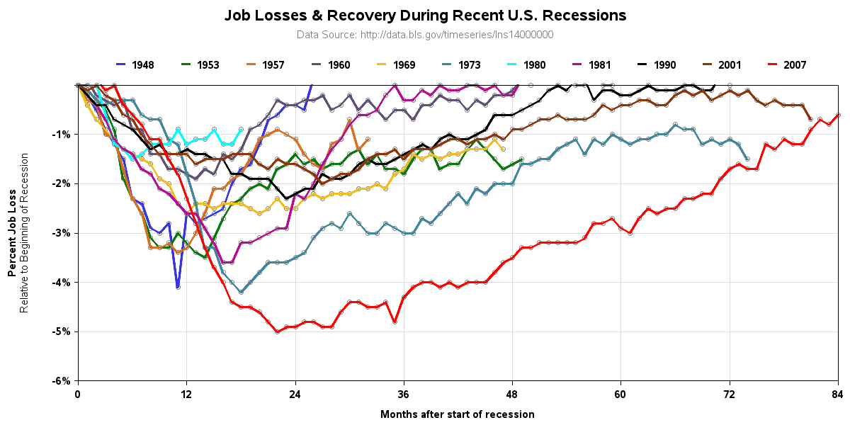
The graph above is a reasonable representation of the 2011 data, but why just show one year of data? Wouldn't it be even more interesting and informative to show lots of years of data - that way we can compare the current recession to previous ones, etc? I think a graph like the following is much more informative:
In the above graph, we can see that the unemployment rate at the beginning of various recessions was different. Therefore it's difficult to compare the recessions, and how long it took to recover back to the pre-recession unemployment rate. The following graph makes it easier to compare recessions, in that regard:
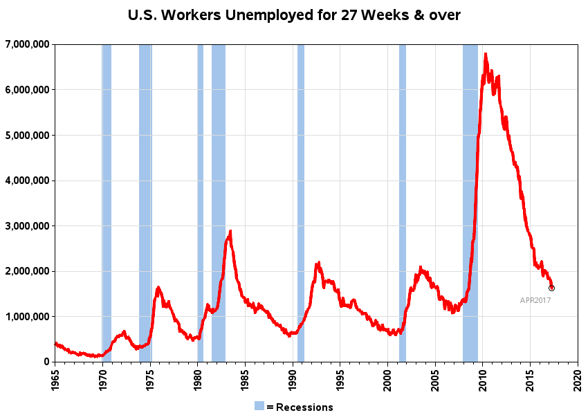
I had heard that the 2008 recession was different from previous recessions, because it took the unemployed people longer to find jobs. The following plot shows the number of people unemployed for 27 or more weeks:
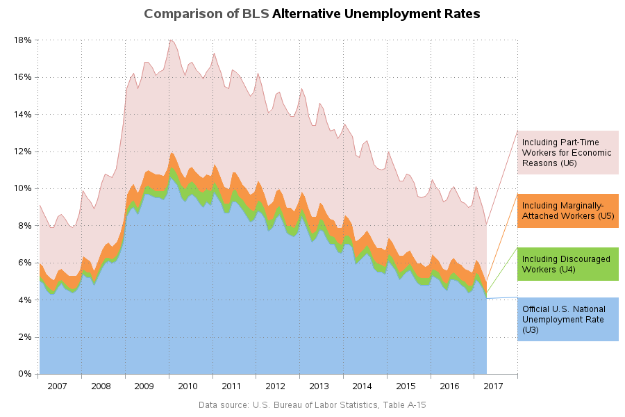
Some claim that the traditional unemployment number is lower than the true number of people who are unemployed. The Bureau of Labor Statistics has some "alternative unemployment rates" that might help with that claim. Looks like the number is indeed much larger if you include the unemployed part-time workers, for example:
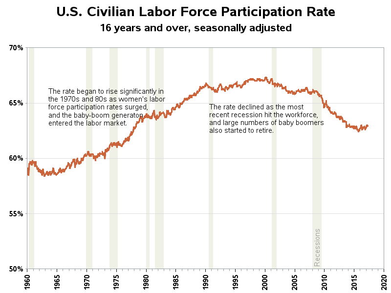
Another number you can look at, instead of just unemployment, is the civilian labor force participation rate. Some of the fluctuations in this number can be explained by women & baby boomers entering the work force, and recently the baby boomers starting to retire.
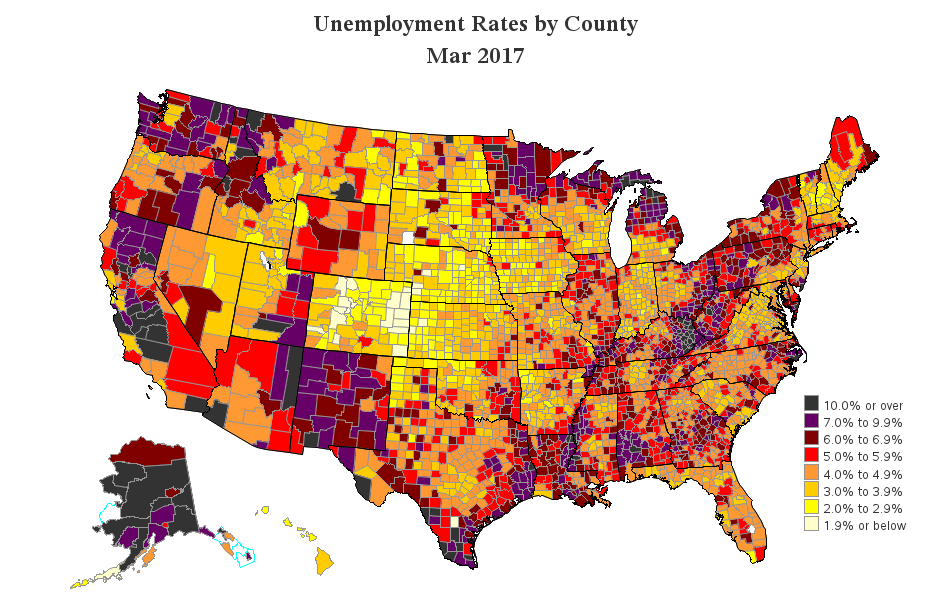
And possibly more important than how many people are unemployed, is where people are unemployed. This wouldn't be such an issue if the unemployment rate was fairly constant across the nation, but there are definitely some areas that have much higher rates than others. Here's a snapshot of the latest data, by county (you can also click this link to see the map animated over time).
What did I use to create all of the above graphs? ... You guessed it - SAS Software!
I know there are a lot of analysts out there with much more in-depth knowledge about unemployment data than me - do any of you have any special insight, or favorite ways to graph the data, that you'd like to share? Feel free to leave a comment.


3 Comments
The best presentation of the employment/unemployment data I have seen!
An outstanding collection of graphs. Curious why you did not start axis at zero for Labor Force Participation Rate. My only adverse usability experience stems from the tiny color samples for the Job Losses and Recovery Graph. Though the plot lines are thick enough to discern and distinguish the different colors, that's not true for the color samples. To distinguish colors reliably, plot lines, color samples, plot markers, and text must be big or thick enough. Regardless, I really like the graphs. I wish that you were the guy who prepares graphs for The Economist, while continuing to do your marvelous work at SAS Institute.
Good points (as always), LeRoy! On the Labor Force Participation Rate graph, I actually plotted it 3 different ways (you can click on it to see all three, or here's a link: http://robslink.com/SAS/democd71/labor_participation.htm ). In the 3rd variation, I plot the data on a 0 to 100% scale, which is probably the 'truest' representation of the data (albeit not as sexy/exciting looking).