Project status and optimization in SAS Viya: Here’s what you need to know

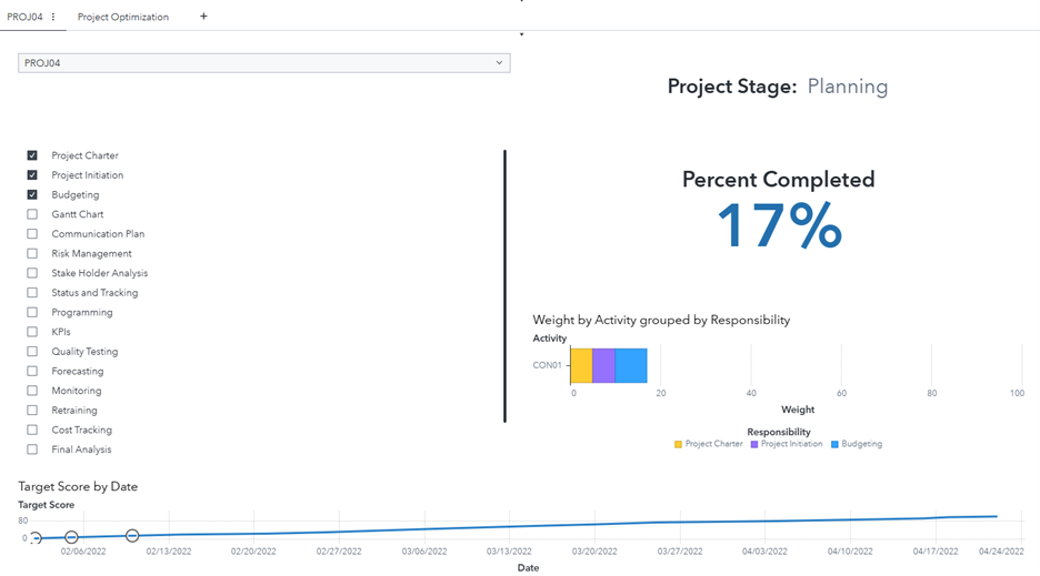
In SAS Viya, users can customize a project management environment by using a file that contains metadata about the organization’s project progress. This process allows the management team to track and interact with the project’s ongoing steps.