
The insurance Oppenheimer moment – climate risk calamity

The time is now for insurance companies to lead the way in addressing climate risk
The time is now for insurance companies to lead the way in addressing climate risk
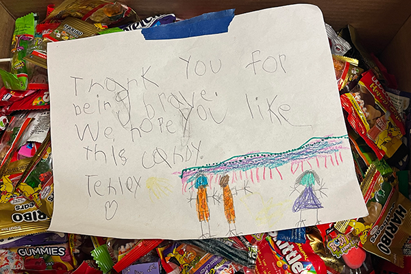
Since 2012, the SAS Health Center Center and VETS Employee Inclusion Group have been collecting and donating leftover and excess Halloween candy. This year marked the 12th annual candy drive, and SAS families showed up with their candy-coated generosity once again, tipping the scales at 400 pounds of candy.
Have you accomplished something amazing with SAS software? We want to hear about it! Brag about yourself by entering the SAS Customer Recognition Awards contest. The awards recognize our customers for their stand-out contributions and highlight how users are changing the world through analytics. Enter now through Friday, January 31,

