As a practitioner of visual analytics, I read the featured blog of ‘Visualizations: Comparing Tableau, SPSS, R, Excel, Matlab, JS, Python, SAS’ last year with great interest. In the post, the blogger Tim Matteson asked the readers to guess which software was used to create his 18 graphs. My buddy, Emily Gao, suggested that I should see how SAS VA does recreating these visualizations. I agreed.
SAS Visual Analytics (VA) is better known for its interactive visual analysis, and it’s also able to create nice visualizations. Users can easily create professional charts and visualizations without SAS coding. So what I am trying to do in this post, is to load the corresponding data to SAS VA environment, and use VA Explorer and Designer to mimic Matteson’s visualizations.
I want to specially thank Robert Allison for his valuable advices during the process of writing this post. Robert Allison is a SAS graph expert, and I learned a lot from his posts. I read his blog on creating 18 amazing graphs using purely SAS code, and I copied most data from his blog when doing these visualization, which saved me a lot time preparing data.
So, here’s my attempt at recreating Matteson’s 18 visualization using SAS Visual Analytics.
Chart 1
This visualization is created by using two customized bar charts in VA, and putting them together using precision layout so it looks like one chart. The customization of bar charts can be done by using the ‘Custom Graph Builder’ in SAS VA, which includes: set the reverse order for X axis, set the axes direction to horizontal, and don’t show axis label for X axis and Y axis, uncheck the ‘show tick marks’, etc. Comparing with Matteson’s visualization, my version has the tick values on X axis displayed as non-negative numbers, as people generally would expect positive value for the frequency.
Another thing is, I used the custom sort for the category to define the order of the items in the bar chart. This can be done by right click on the category and select ‘Edit Custom Sort…’ to get the desired order. You may also have noticed that the legend is a bit strange for the Neutral response, since it is split into Neutral_1stHalf and Neutral_2ndHalf, which I need to gracefully show the data symmetrically in the visualization in VA.
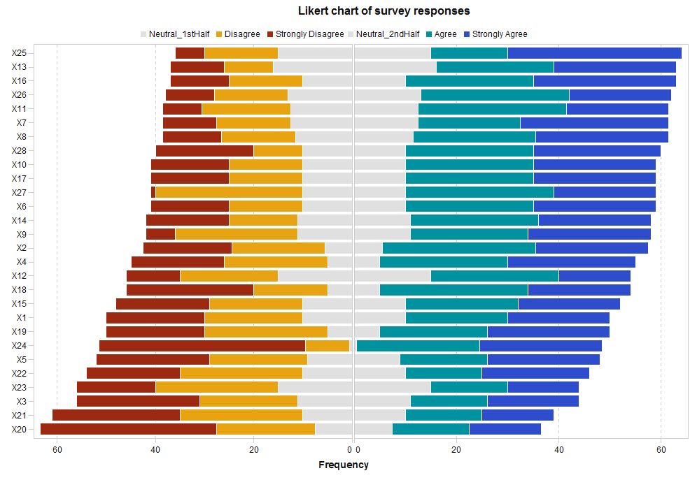
Chart 2
VA can create a grouped bar chart with desired sort order for the countries and the questions easily. However, we can only put the questions texts horizontally atop of each group bar in VA. VA uses vertical section bar instead, with its tooltip to show the whole question text when the mouse is hovered onto it. And we can see the value of each section in bar interactively in VA when hovering the mouse over.
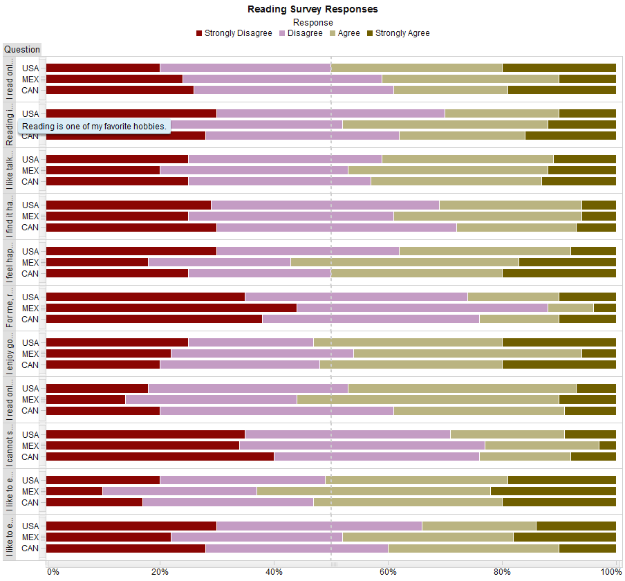
Chart 3
Matteson’s chart looks a bit scattered to me, while Robert’s chart is great at label text and markers for the scatterplot matrix. Here I use VA Explorer to create the scatterplot matrix for the data, which omitted the diagonal cells and its diagonal symmetrical part for easier data analysis purpose. It can then be exported to report, and change the color of data points.
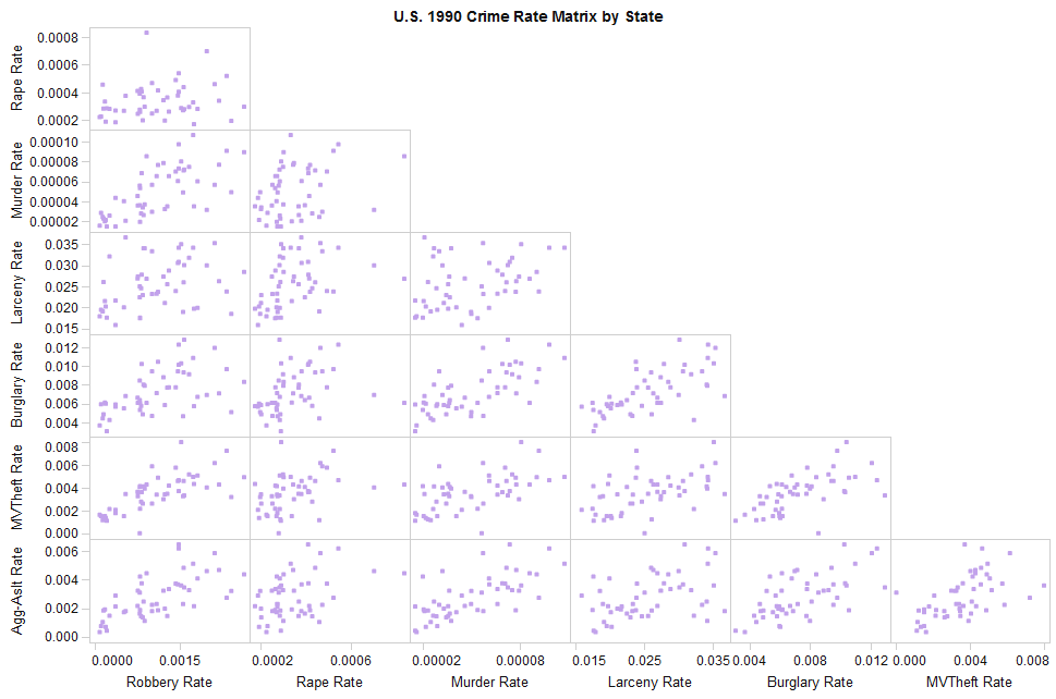
Chart 4
I used the ‘Numeric Series Plot’ to draw this chart of job losses in recession. It was straightforward. I just adjust some setting like checking the ‘Show markers’ in the Properties tab, unchecking the ‘Show label’ in X Axis and unchecking the ‘Use filled markers’, etc. To make refinement of X axis label of different fonts, I need to use the ‘Precision’ layout instead of the default ‘Tile’ layout. Then drag the ‘Text’ object to contain the wanted X axis label.
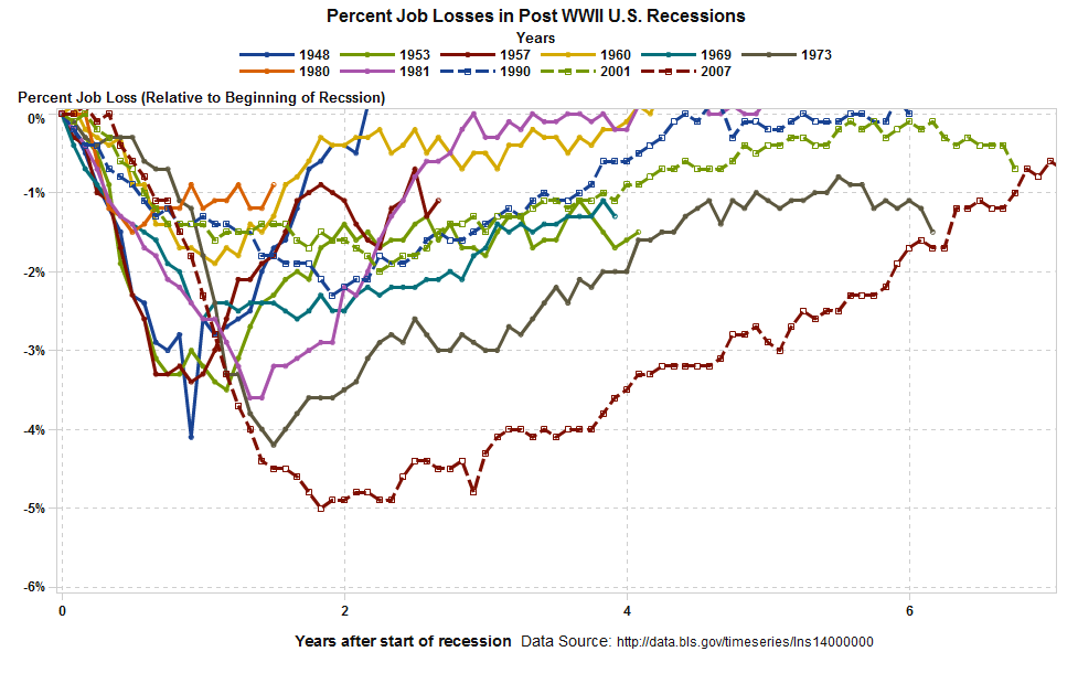
Chart 5
VA can easily draw the grouped bar charts automatically. Disable the X axis label, and set the grey color for the ‘Header background.’ What we need to do here, is to add some display rules for the mapping of color-value. For the formatted text at the bottom, use the ‘Text’ object. (Note: VA puts the Age_range values at the bottom of the chart.)
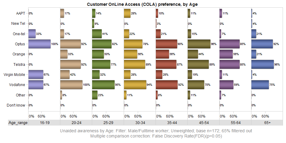
Chart 6
SAS VA does not support drawn 3D charts, so I could not make similar chart as Robert did with SAS codes. What I do for this visualization, is to create a network diagram using the Karate club dataset. The grouped detected communities (0, 1, 2, 3) are showing with different colors. The diagram can be exported as image in VAE.
***I use the following codes to generate the necessary data for the visualization:
/* Dataset of Zachary’s Karate Club data is from: http://support.sas.com/documentation/cdl/en/procgralg/68145/HTML/default/viewer.htm#procgralg_optgraph_examples07.htm This dataset describes social network friendships in karate club at a U.S. university. */ data LinkSetIn; input from to weight @@; datalines; 0 9 1 0 10 1 0 14 1 0 15 1 0 16 1 0 19 1 0 20 1 0 21 1 0 23 1 0 24 1 0 27 1 0 28 1 0 29 1 0 30 1 0 31 1 0 32 1 0 33 1 2 1 1 3 1 1 3 2 1 4 1 1 4 2 1 4 3 1 5 1 1 6 1 1 7 1 1 7 5 1 7 6 1 8 1 1 8 2 1 8 3 1 8 4 1 9 1 1 9 3 1 10 3 1 11 1 1 11 5 1 11 6 1 12 1 1 13 1 1 13 4 1 14 1 1 14 2 1 14 3 1 14 4 1 17 6 1 17 7 1 18 1 1 18 2 1 20 1 1 20 2 1 22 1 1 22 2 1 26 24 1 26 25 1 28 3 1 28 24 1 28 25 1 29 3 1 30 24 1 30 27 1 31 2 1 31 9 1 32 1 1 32 25 1 32 26 1 32 29 1 33 3 1 33 9 1 33 15 1 33 16 1 33 19 1 33 21 1 33 23 1 33 24 1 33 30 1 33 31 1 33 32 1 ; run; /* Perform the community detection using resolution levels (1, 0.5) on the Karate Club data. */ proc optgraph data_links = LinkSetIn out_nodes = NodeSetOut graph_internal_format = thin; community resolution_list = 1.0 0.5 out_level = CommLevelOut out_community = CommOut out_overlap = CommOverlapOut out_comm_links = CommLinksOut; run; /* Create the dataset of detected community (0, 1, 2, 3) for resolution level equals 1.0 */ proc sql; create table mylib.newlink as select a.from, a.to, b.community_1, c.nodes from LinkSetIn a, NodeSetOut b, CommOut c where a.from=b.node and b.community_1=c.community and c.resolution=1 ; quit; |
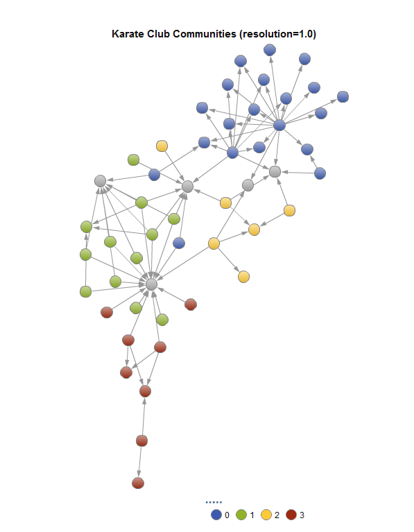
Chart 7
I created this map using the ‘Geo Coordinate Map’ in VA. I need to create a geography variable by right clicking on the ‘World-cities’ and selecting Geography->Custom…->, and set the Latitude to the ‘Unprojected degrees latitude,’ and Longitude to the ‘Unprojected degrees longitude.’ To get the black continents in the map, go to VA preferences, check the ‘Invert application colors’ under the Theme. Remember to set the ‘Marker size’ to 1, and change the first color of markers to black so that it will show in white when application color is inverted.
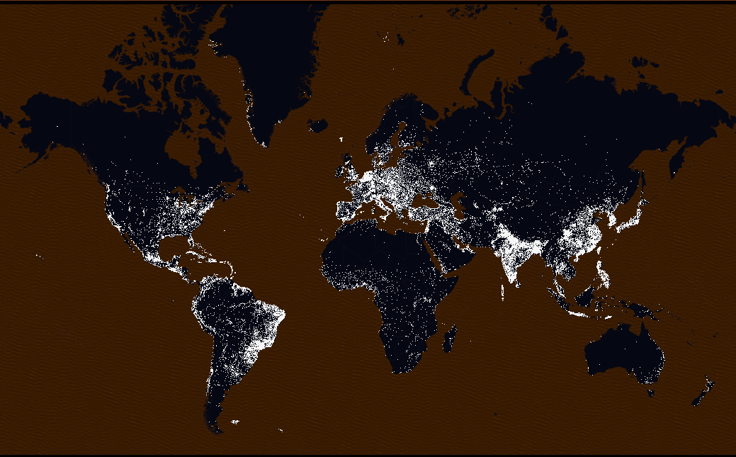
Chart 8
This is a very simple scatter chart in VA. I only set transparency in order to show the overlapping value. The blue text in left-upper corner is using a text object.
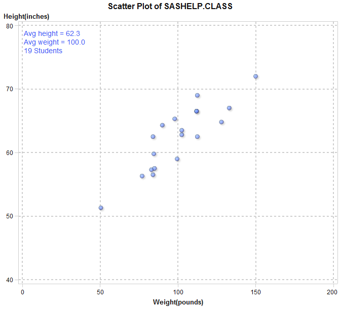
Chart 9
To get this black background graph, set the ‘Wall background’ color to black. Then change the ‘Line/Marker’ color in data colors section accordingly. I’ve also checked the ‘Show markers’ option and changed the marker size to bigger 6.
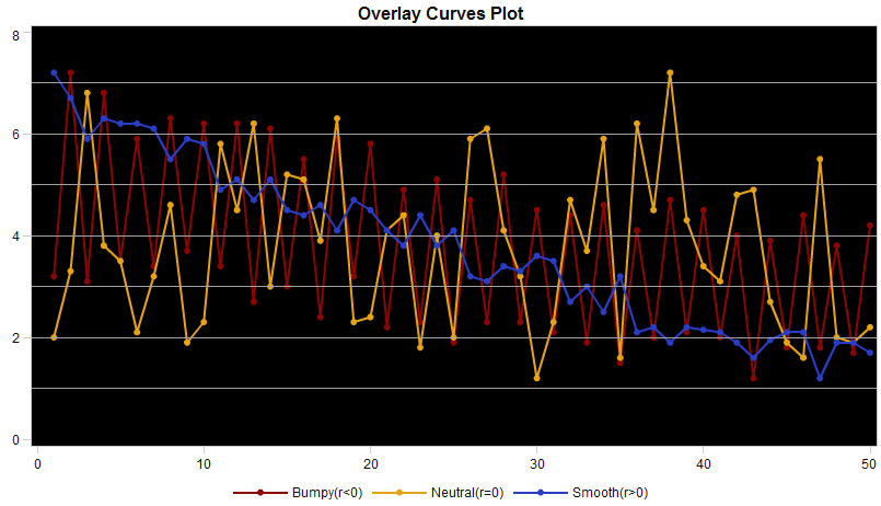
Chart 10
There is nothing special for creating this scatter plot in VA. I simply create several reference lines, and uncheck the ‘Use filled markers’ with smaller marker size. The transparency of the markers is set to 30%.
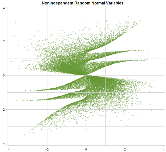
Chart 11
In VA’s current release, if we use a category variable for color, the marker will automatically change to different markers for different colors. So I create a customized scatterplot using VA Custom Graph Builder, to define the marker as always round. Nothing else, just set the transparency to clearly show the overlapping values. As always, we can add an image object in VA with precision layout.
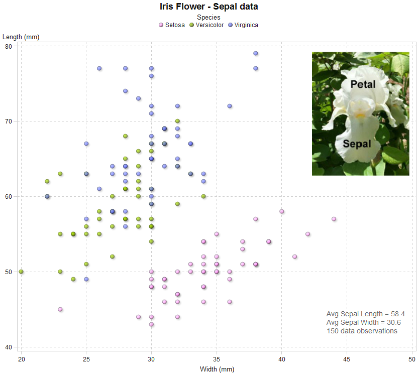
Chart 12
I used the GEO Bubble Map to create this visualization. I needed to create a custom Geography variable from the trap variable using ‘lat_deg’ and ‘lon_deg’ as latitude and longitude respectively. Then rename the NumMosquitos measure to ‘Total Mosquitos’ and use it for bubble size. To show the presence of west nile virus, I use the display rule in VA. I also create an image to show the meaning of the colored icons for display rule. The precision layout is enabled in order to have text and images added for this visualization.
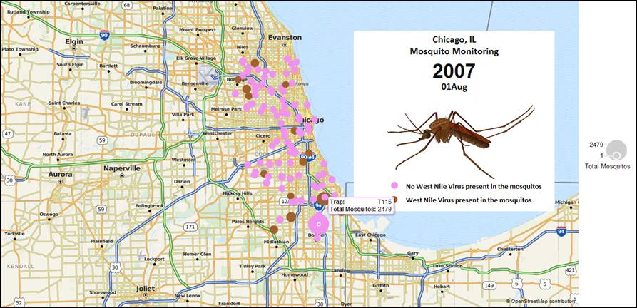
Chart 13
This visualization is also created with GEO bubble map in VA. First I did some data manipulation to make the magnitude squared just for the sake of the bubble size resolution, so it shows contrast in size. Then I create some display rules to show the significance of the earth quakes with different colors, and set the transparency of the bubble to 30% for clarity. I also created an image to show the meaning of the colored icons.
Be aware that some data manipulation is needed for original longitude data. Since the geographic coordinates will use the meridian as reference, if we want to show the data of American in the right part, we need to add 360 to the longitude, whose value is negative.
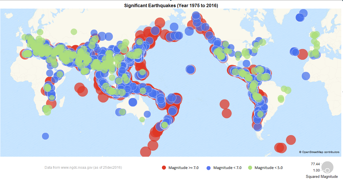
Chart 14
My understanding that one of the key points of this visualization Matteson made, is to show the control/interaction feature. Great thing is, VA has various control objects for interactive analysis. For the upper part in this visualization, I simply put a list table object. The trick here is how to use display rule to mimic the style. Before assigning any data to the list table in VA, I create a display rule with Expression, and at this moment we can specify the column with any measure value in an expression. (Otherwise, you need to define the display rule for each column with some expressions.) Just define ‘Any measure value’ is missing or greater than a value with proper filled color for cell. (VA doesn’t support filling the cell with certain pattern like Robert did for missing value. Therefore, I use grey for missing value to differentiate from 0 with a light color.)
For the lower part, I create a new dataset for interventions to hold the intervention items, and put it in the list control and a list table. The right horizontal bar chart is a target bar chart with the expected duration as the targeted value. The label on each bar shows the actual duration.
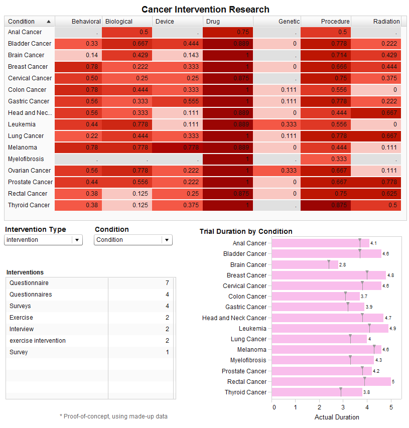
Chart 15
VA does not have solid-modeling animation like Matteson made in his original chart, yet VA has animation support for bubble plots in an interactive mode. So I made this visualization using Robert’s animation dataset, trying to make an imitation of the famous animation by the late Hans Rosling as a memorial. I set the dates for animation by creating the dates variable with the first day in each year (just for simplicity). One customization here is: I use the custom graph builder to add a new role so that it can display the data label in the bubble plot, and set the country name as the bubble label in VA Designer. Certainly, we can always filter the interested countries in VA for further analysis.
VA can’t show only a part of the bubble labels as Robert did using SAS codes. So in order to clearly show the labels of those interested countries, I made a rank of top 20 countries of average populations, and set a filter to show data between year 1950 to 2011. I use a capture screen tool to have the animation saved as a .gif file. Be sure to click the chart to see the animation.
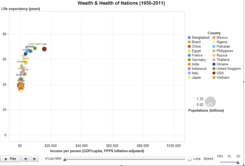
Chart 16
I think Matteson’s original chart is to show the overview axis in the line chart, since I don’t see specialty of the line chart otherwise. So I draw this time series plot with the overview axis enabled in VA using the SASHELP.STOCK dataset. It shows the date on X axis with tick marks splitting to months, which can be zoomed in to day level in VA interactively. The overview axis can do the zooming in and out, as well as movement of the focused period.
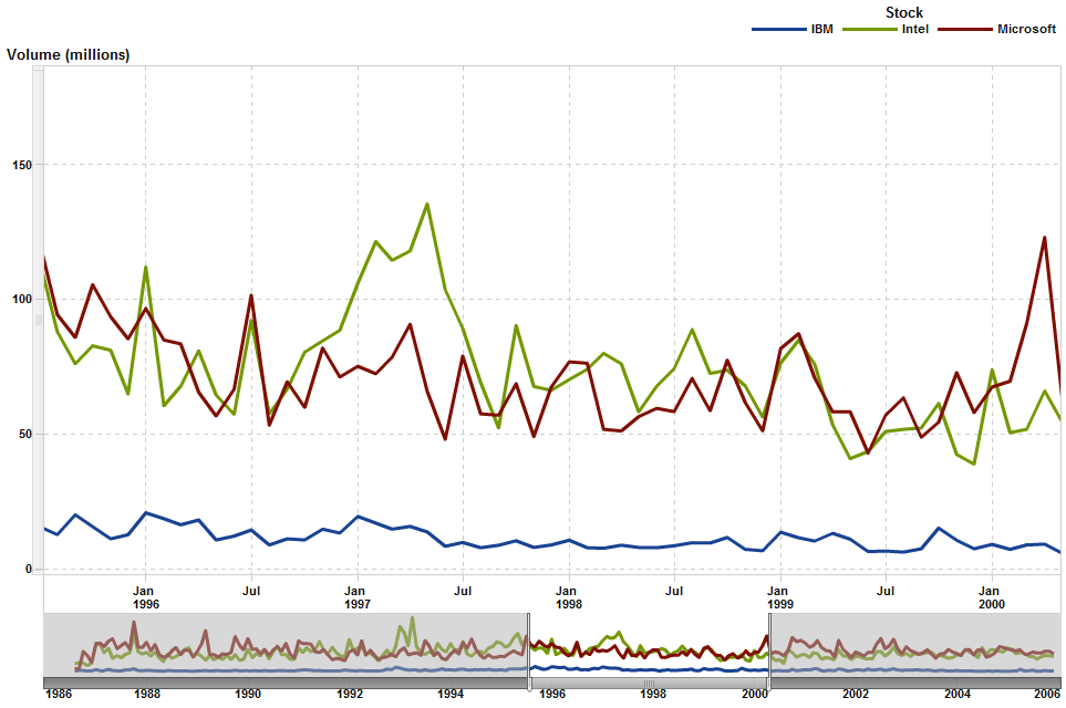
Chart 17
For this visualization, I use a customized bubble plot (in Custom Graph Builder, add a Data Label Role for Bubble Plot.) so it will have bubble labels displayed. I use one reference line with label of Gross Avg., and 2 reference lines for X and Y axis accordingly, thus it visually creats four quadrants. As usual, add 4 text objects to hold the labels at each corner in the precision layout.
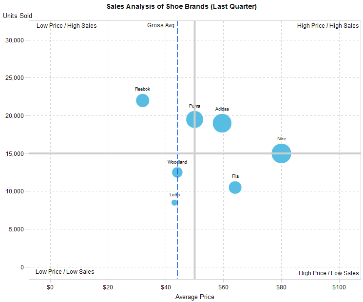
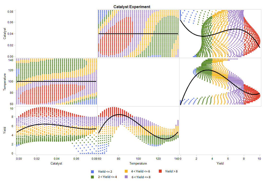
Chart 18
I think Matteson made an impressive 3D chart, and Robert recreated a very beautiful 3D chart with pure SAS codes. But VA does not have any 3D charts. So for this visualization, I simply load the data in VA, and drag them to have a visualization in VAE. Then choose the best fit from the fit line list, and export the visualization to report. Then, add display rules according to the value of Yield. Since VA shows the display rules at information panel, I create an image for colored markers to show them as legend in the visualization and put it in the precision layout.
There you have it. Matteson’s 18 visualizations recreated in VA.
How did I do?

19 Comments
Hi Cindy, can you share the SAS code for chart 17? Thanks!!
Hi there,
Below I paste the SAS code generating the dataset used in chart 17 for your reference. Thanks!
----
data bubbledata;
input brand $ 1-20 units_sold average_price;
size_var=units_sold*average_price;
datalines;
Reebok 22000 32.00
Lotto 8500 43.00
Woodland 12500 44.00
Puma 19500 50.00
Adidas 19000 59.50
Fila 10500 64.00
Nike 15000 80.00
;
run;
Hi Cindy,
Exactly Chart 17. I think I have the 7.5 Version. If you could make a video it would be amazing, I would appreciate that very much!
Hi Ricardo,
I tried it on VA 7.5, and I am afraid we can't make exactly the same chart 17 in VA7.5.
VA7.5 changed its UI implementation comparing with the version I had used. We can create bubble with label role in custom graph builder, but no reference line option available for it in VA 7.5.
Hello I need help. I can´t make the 4 quadrants for the bubble plot graph. Do you have a video in which you can explain this graph?
Thanks in advance.
Hi Ricardo,
Are you asking for the chart 17? Which version of VA are you using? The blog was posted 4 years ago and now VA versions changed a lot, detailed steps may need change as well.
I don't have a video explaining it at hand. But I think I can try to make one with the latest VA version if you are also using the version going with Viya.
Hi Cindy,
Exactly Chart 17. I think I have the 7.5 Version. If you could make a video it would be amazing, I would appreciate that very much!
Hi Cindy
Is it possible to create Shewhart-/control charts directly in VA?
Hi Eric,
So far, there is no Shewhart charts directly available in VA. But you can always customize some graph templates to meet your needs in SAS Graph Builder, and then use those templates in VA. It needs more efforts if you want to generate all the graphs as from the PROC SHEWHART.
Hi Cindi
I would to make a "vertical line Chart" with SAS Viya but, I can't found how to do this.
For example the line chart could be rotate of 90 degrees with line plotted in horizontal mode
Is there a possibility to make this
Thanks
SAS VA does not provide the capability of drawing vertical line chart so far. If you mean to ask if SAS Viya can draw a 'vertical line chart', you can always use PROC SGPLOT with hline statement.
Hi Cindy
I would like to make a "vertical line chart" but i can't find how to do this, is there a method to make it ?
plot the line chart in horizontal how to invert the axies
Thanks
Hi CIndy,
Can you please elaborate on CHART 17? Im trying to create something similar but not able to create/overlay multiple reference lines to create 4 quadrants.
Thanks
Hi Kiran,
To create 4 quadrants with multiple reference lines in the bubble plot, you may create a reference line firstly with X Axis. SAS VA will give a suggested value for the reference line with a value about to the average of variable assigned for X Axis. Increasing the width of the line and setting the line style if necessary, and click OK button to get first reference line created. Then similarly create the second reference line for Y Axis. After that, you will see the 4 quadrants in the bubble plot. ^_^
Feel free to contact me if you still see problem on this.
Hi Cindy,
Thanks for your quick reply. I had a different requirement wherein the reference line for X-Axis was fixed, however the reference line for Y-Axis needed to be dynamic (i.e. calculated Average needed). Hence the graph would look like a Quadrant chart. Using Custom graph builder, I was able to overlay Bubble Chart and Series plot. This led to further complications. The data set I had was huge, hence I used ranking to pick top 10% to be displayed on the bubble chart. But the average value(i.e. reference line on Y-axis), was being calculated for the whole data set and not on the ranked data set. I want the average to be calculated only on the "ranked" data set. Could you please let me know if this is achievable?
Cheers,
Kiran
Kiran, if you are using VA8.*, to get the average value of ranked data, you may try to make a calculated item using the AggregateTable operator. (It is not available in VA7.* version.)
I Like chart 15 🙂 definately going to use that in showing the development of portfolio over different observation periods!
Thank you for sharing
Nicely done!
Wonderful recreation and some handy SAS Visual Analytics tips too! Thanks Cindy