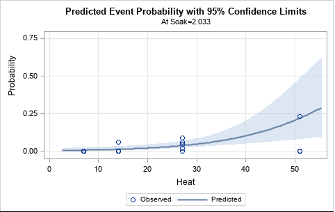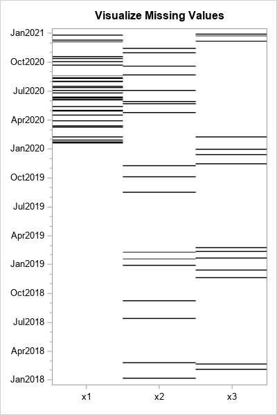
I've previously described how to overlay two or more density curves on a single plot. I've also written about how to use PROC SGPLOT to overlay custom curves on a graph. This article describes how to overlay a density curve on a histogram. For common distributions, you can overlay a
Uncategorized
Sometimes, it is good to start with a confession. I filed my taxes at the last minute. It was past time to get some money back from the IRS before they could waste $60,000 on another Star Trek spoof video. Normally I'm one of those people that files in February,
Even if you cannot attend SAS Global Forum next week, you can experience it virtually via the Livestream sessions. This year I will reprise my role as host of SAS Tech Talks, a pair of live webcasts that feature SAS R&D professionals and their latest technological wares. Click "play" on
I recently showed someone a trick to create a graph, and he was extremely pleased to learn it. The trick is well known to many SAS users, but I hope that this article will introduce it to even more SAS users. At issue is how to use the SGPLOT procedure
I often see variations of the following question posted on statistical discussion forums: I want to bin the X variable into a small number of values. For each bin, I want to draw the quartiles of the Y variable for that bin. Then I want to connect the corresponding quartile
In the SAS User Groups LinkedIn group, some generous "old timers" offer tips to the potentially shy newcomers for connecting with other SAS professionals at SAS Global Forum. Perhaps these folks remember their own introverted natures, and they want to encourage attendees to get the most out of their conference
Getting Started with SAS -- a free webinar for new SAS users -- is now available for on-demand viewing. During this SAS Talks session, Stacey Syphus and I review the basics of what SAS is, what people use it for, and what you can expect to see as a new
Welcome to Part 3 of the value-added Myth Busters blog series. I have heard a variation of this many times. “Why shouldn’t educators just use a simple gains approach or a pre- and post-test? They can trust simpler methodologies because they can replicate and understand them more easily.” Simple growth measures
In this International Year of Statistics, I'd like to describe the major role of statistics in public health advances. In our modern society, it is sometimes difficult to recall the huge advances in health and medicine in the 20th century. To name a few: penicillin was discovered in 1928, risk
This week Nate Silver, renowned election forecaster (fivethirtyeight blog) and top selling author (of the excellent The Signal and the Noise), spoke at an event here in my building on the SAS campus. Unfortunately, I wasn't considered a B enough of a FD to land an invite to Nate's presentation. However,
I haven't seen an official definition of 'infographic' that I really like ... but in my mind it's something 1/2 way between data visualization & artwork. It borrows elements from graphs & dashboards, and combines that with an artistic poster. If you perform a Google image search on infographic you'll see
A SAS customer asks: How do I use SAS to generate multiple samples of size N from a multivariate normal distribution? Suppose that you want to simulate k samples (each with N observations) from a multivariate normal distribution with a given mean vector and covariance matrix. Because all of the
ODS statements are global SAS statements. As such, you can put them anywhere in your SAS program. For maximum readability, many SAS programmers agree that most ODS statements should appear outside procedures in "open" SAS code. For example, most programmers agree that the following statements should appear outside of procedures:
I recently attended the O'Reilly Tools of Change for Publishing Conference in New York, and I have to confess, I had a Twitter eureka moment. I was sitting in a conference room, waiting for the next session to start and reading tweets from a publishing industry contact I've longtime admired
A few weeks ago I found myself in a room full of fellow transportation geeks (a term I use with great respect) at the annual American Association of State and Highway Transportation Officials (AASHTO) Washington Briefing. One panel in particular really got the room buzzing with talk about the transportation
I was recently asked how to compute the difference between two density estimates in SAS. The person who asked the question sent me a link to a paper from The Review of Economics and Statistics that contains several examples of this technique (for example, see Figure 3 on p. 16
Geht es Ihnen nicht auch so? Ich liebe Excel! Von „Mal schnell was ausrechnen…“ bis zur Gewinn- und Verlustrechnung für die Steuererklärung ein rundum gelungenes Programm, bei dem man komplexe Formeln direkt da hin schreiben kann, wo sie berechnet werden und man sogar noch genügend Formatierungsmöglichkeiten hat, um nachher was
In a previous article, I described how to use Windows PowerShell to connect to a remote SAS Workspace, run a SAS program, and retrieve the results. In that example, the only results I retrieved were the SAS log and SAS listing (text) output, if any. When you run a SAS
The one-number forecasting concept has been debated for years. Advocates argue that having different groups within the same organization working to different forecasts is insane. You can't have the supply chain building to X, the sales force selling to Y, and the financial folks counting on revenue of Z. This
Did you know that your ODS style might result in changing the color ramp for contour plots and heat maps? For example, the default style in SAS 9.3 is HTMLBlue. Let's create a contour plot in the HTML destination by running an example adapted from the documentation for the RSREG
This week's SAS tip is from Lauren Haworth, Cynthia L. Zender, and Michele Burlew's book Output Delivery System: The Basics and Beyond. This monumental guide is packed with a wide-array of techniques and examples. As SAS programmer Christine Iodice said, "This book is one-stop shopping for all your ODS needs!"
Don’t worry! This is not an excerpt from a romantic love letter. The title of this blog post is an allusion to my talk on "Missing Values", at the A2013 conference in June in London. There is not much time for emotions: dealing with missing values in analysis is not
Welcome to Part 2 of the value-added Myth Busters blog series…have you heard this one before? Educators serving high-achieving students are often concerned that their students’ entering achievement level makes it more difficult for them to show growth. “How can my students show growth if they are already earning high
In statistics, distances between observations are used to form clusters, to identify outliers, and to estimate distributions. Distances are used in spatial statistics and in other application areas. There are many ways to define the distance between observations. I have previously written an article that explains Mahalanobis distance, which is
“It’s not about how much money you make but to work on stuff that matters," according to Tim O’Reilly, founder of O'Reilly Media. At the recent Tools of Change conference, Tim O’Reilly mentioned during his keynote that writers tend to be motivated to work on “stuff that matters.” Through SAS
Are you a new SAS user who isn't sure where to begin? Have no fear, because you're not alone. Here at SAS, we often receive questions from people who need help getting started with the software. Getting Started with SAS is the topic of a SAS Talks session that I
It is easy to use the SGPLOT procedure in SAS to plot the graph of a well-behaved continuous function: just create a data set of the (x,y) values on some domain and use the SERIES statement to connect the points. However, to plot the graph of a discontinuous function correctly
Gestern erschienen bei Heise: Ein kontroverser Beitrag zum Thema Big Data. Auch das IT-Magazin Silicon findet 400 kritische Worte zum Phänomen. Beide Artikel sind lesenswert, aber die Darstellung ist in einigen Punkten nicht vollständig und gerne würde ich noch ein paar Punkte zur Betrachtung von Big Data ergänzen. Big Data
Revenge of the Nerds was so 1980s. Now it's a new world order: math geeks and athletes are working together. I'm not talking just about what happens when data nerds observe, analyze, and predict sports outcomes -- as they do in March Madness with their "bracketology". That's compelling, but your
A big part of "winning" these days (be it sports or a business) is performing analytics better than your competition. This is demonstrated in awe-inspiring fashion in the book (and movie) "Moneyball." And on that topic, I'd like to show you a few ways SAS can be used to analyze sports data