All Posts


This is my second blog on the topic of anonymization, which I’ve spent some time over the past several months researching. My first blog, Anonymization for data managers, focused on the technical process. Now let’s dive into the role for analysts, report designers and information owners. To analysts and reporting


As you travel around the world, do you know where English, French, Spanish, and Arabic are spoken? This blog will help you quickly answer that question, with some cool SAS maps! But first, here's a picture of my friend Joy posing beside an interesting sign during one of her international

Yes. But since this post needs to be more than a one-word answer to its title, allow me to elaborate. Data governance (DG) enters into the discussion of all enterprise information initiatives. Whether or not DG should be the opening salvo of these discussions is akin to asking whether the

What does the future of analytics look like in your organizations enterprise architecture? Does it include thinking about a two speed approach to analytics which includes both: An agile rapidly changing analytics platform for innovation (a lab) seperated from operations and broad enterprise audience usage A slowly moving systematic enterprise analytics platform (a factory)
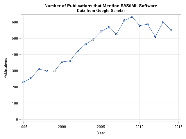

SAS/IML software is used by many SAS programmers, primarily for creating custom algorithms and macros that implement statistical analyses that are not built into any SAS procedure. I know that PROC IML is used regularly by pharmaceutical companies, by the financial and insurance industries, and by researchers in medical colleges


On May 7, 2015, Conservatives defied the polls and won the UK general election, handing Labour and Liberal Democrats a surprising defeat. Now, with Chancellor George Osborne presenting his budget in a few days' time (July 8), the new Conservative government is tackling how it will deliver on its campaign promises. That means
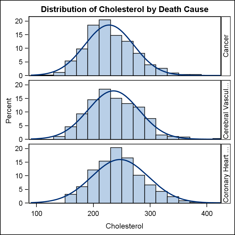

The SGPANEL procedure makes it easy to create graph panels that are classified by one or more classifiers. The "Panel" layout is the default and it places the classifier values in cell headers at the top of each cell. When using LAYOUT=Latice or RowLattice, the row headers are placed at

¿De qué nos sirve saber sobre analítica, si realmente no conocemos el valor e impacto que tiene en los negocios y en nuestra vida? Si usted es de los que se hace esta pregunta, es momento de tomar decisiones al respecto. Cuando hablamos de analítica empresarial, estamos hablando de una solución

If your organization is large enough, it probably has multiple data-related initiatives going on at any given time. Perhaps a new data warehouse is planned, an ERP upgrade is imminent or a data quality project is underway. Whatever the initiative, it may raise questions around data governance – closely followed by discussions about the

I’ve spent some time over the past couple of months learning more about anonymization. This began with an interest in the technical methods used to protect sensitive personally-identifiable information in a SAS data warehouse and analytics platform we delivered for a customer. But I learned that anonymization has two rather different meanings; one in the
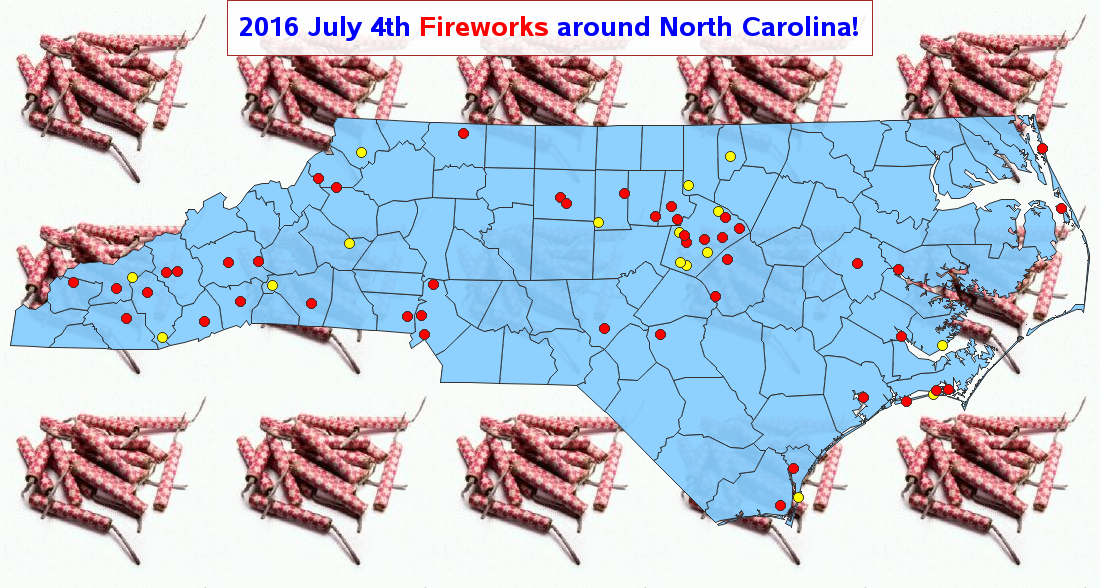
Update: This blog has been updated with the 2016 map. You can use SAS for just about anything - that includes finding a great fireworks show to watch during the US Independence Day holiday! Here's a fireworks-locator map I created using SAS (see technical details below). The red dots represent


Summertime has arrived! Here are some fun, serious and what some might think are absurd questions about water safety. Take the quiz and test your knowledge.

There is so much going on in our country right now socially, that I feel like someone has just placed a soapbox in front of me and dared me to climb up. Never one to resist, let's talk about parenting in shifting sands. Talking to your kids (of all ages) about


I’m not a big gambler, but there is something I would put my money on – analytics. Analytics is helping companies turn information into value. And yes, I mean money. If you want to learn about the latest analytics trends and get in on some of that “value” – attend

In recent years, we practitioners in the data management world have been pretty quick to conflate “data governance” with “data quality” and “metadata.” Many tools marketed under "data governance" have emerged – yet when you inspect their capabilities, you see that in many ways these tools largely encompass data validation and data standardization. Unfortunately, we