All Posts


Sólo podemos ver poco del futuro pero lo suficiente para darnos cuenta de que hay mucho por hacer...”. Alan Mathison Turing La nube se ha convertido en sinónimo de la forma en que las organizaciones pueden romper las barreras de IT para brindar agilidad, elasticidad y velocidad que tanto necesitan.


Comment parvenir à diminuer ses temps de réponse lorsque des situations imprévues surviennent ? Comment tenir compte des grandes étapes vécues par les clients, qu’ils soient particuliers ou entreprises ? En centralisant la donnée, en approfondissant sa connaissance client et en misant résolument sur le temps réel. Que ce soit lors
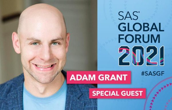

Organizational psychologist Adam Grant studies how we lead, work and live and his pioneering research has inspired people to question their assumptions about motivation, generosity and creativity. His unique and counterintuitive ideas are backed by data-driven science and case studies (he loves data just as much as I do!). Adam's
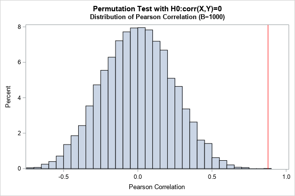

For many univariate statistics (mean, median, standard deviation, etc.), the order of the data is unimportant. If you sort univariate data, the mean and standard deviation do not change. However, you cannot sort an individual variable (independently) if you want to preserve its relationship with other variables. This statement is
SAS Global Forumオンデマンド配信の紹介 SAS Global Forumは、年に一度開催される世界最大級のアナリティクス・カンファレンスです。南北アメリカ、アジア太平洋地域、EMEAの3つの地域ごとにイベントは分かれており、アジア太平洋地域は5/19(水)~5/20(木)に開催されました。イベントの内容は2021年6月25日(金)までこちらより、オンデマンドで視聴可能です。 Forumでは、様々な分野のトップ企業、スピーカーの刺激的な講演を聞くだけでなく、トレーニングや技術セッションといった学習機会も提供されます。また優れたデータアナリティクスの成績・教育が認められた学生や教育者に対しては表彰が行われました。ここでは一人の受賞者のセッションを紹介します。 Do Americans trust scientific experts? このセッションはタイトルにもあるように、医者・環境学者・栄養士など“科学に関連する専門家”に対するアメリカ人の不信について取り扱っています。この話題は幅広く活用が期待でき、多くの人々に関連する事柄であるという背景があり、今回の講演のテーマとして設定されています。 使用されたデータは、科学者に対する人々の全体的な意見や個人の科学にまつわる知識などを調査して収集されています。収集したデータを用いて、記述統計による考察やディシジョンツリーをはじめとしたモデルによる分類の結果から、次のようなフィードバックを共有しています。 各専門家に対する肯定的/否定的な意見の割合は、医者が最も肯定的な割合が高く、その中でも人々と対面する機会が多い開業医に対する肯定的な意見が多い。 人々の政治的傾向に基づいて専門家への信頼度に差が出ている 科学知識が前提にある人の方が専門家への信頼を示している スピーカーはこの結果をもとに、ワクチン接種の促進が可能になるのではないかという活用例を話しています。それは市民に専門への信頼に関する質問に答えてもらい、信頼の低い地域の人々に対してワクチン情報について教育・説得することでワクチン接種を増やすという仕組みです。 またスピーカーは私たちと同じ大学の学生で、コロナ禍に抱える問題も絡ませたセッションになっており、私たちにとても身近な内容になっています。 繰り返しになりますが、SAS Global Forum2021はより優れたキャリアにつなげる大きなチャンスであり、各セッションの様子はオンデマンドで視聴可能です。ぜひ自らの成長のために登録、ご覧ください。


La pandemia fue un detonador clave del avance del comercio electrónico en México. Para muestra, la Asociación Mexicana de Ventas Online (AMVO), concluye en su Estudio de Venta Online 2021 que este medio de compra alcanzó un valor de $316,000 millones de pesos a lo largo de 2020, lo que


Our traditional assumptions about data are evolving, and so is our understanding of data literacy. Data is more than numbers, charts and graphs. And data literacy is not just for data scientists. “If you’re talking with people who aren’t already data fluent, you have to make them aware that data is


Aimez-vous rêver ? Moi oui et, pour être honnête, je rêve assez souvent. Aujourd'hui je vais vous parler de la banque de mes rêves. Je sais que le sujet est étrange mais pourquoi pas. Alors, à quoi ressembleraient les interactions quotidiennes avec la banque de mes rêves ? Le matin,

AutoML은 최근 몇 년간 가장 빠르게 진화하는 AI기술중 하나입니다. AutoML은 시티즌 데이터 사이언티스트는 물론 데이터 사이언티스트도 더 빨리 더 많은 모델을 구축하고, 모델의 정확도를 개선하여 보다 생산적인 과제에 집중할 수 있게 합니다. 이를 통해 기업은 조직 전반에 업무 효율성과 전문성을 강화할 수 있습니다. SAS AutoML 플랫폼의 핵심은 분석 라이프사이클 프로세스


Recently, we’ve released a new feature in ASTORE: score with multiple analytic stores. In the process, we may create multiple analytic stores with dependencies among them (the output of some analytic stores is an input to others). This feature streamlines the scoring process of multiple analytic stores. It enables the


We’ve all experienced the value that innovation has brought to our lives. The cloud, enormous data sets and more accurate AI modeling have enabled many organizations to bring new products and services to market in ways we could not have imagined 20 years ago. The health care and life sciences
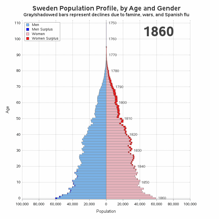

You've probably seen a population pyramid, such as this one I showed in a previous blog post. But let's scrutinize population pyramids a bit deeper, with an eye on special features that can make them even more useful! I was inspired to give population trees a second look by this


While live advisors sleep, this friendly, sophisticated chatbot is there to help victims of identity fraud.
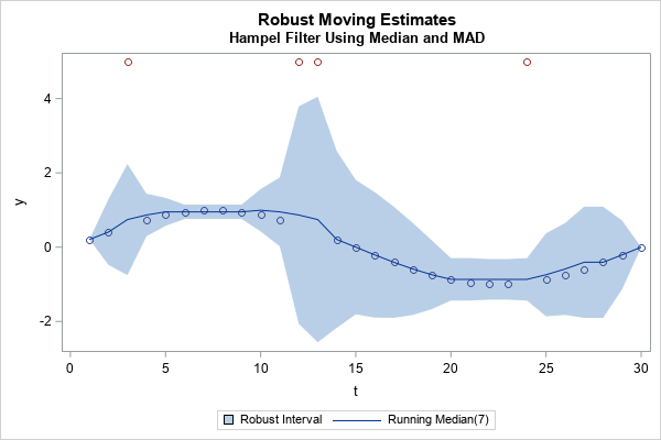
It is well known that classical estimates of location and scale (for example, the mean and standard deviation) are influenced by outliers. In the 1960s, '70s, and '80s, researchers such as Tukey, Huber, Hampel, and Rousseeuw advocated analyzing data by using robust statistical estimates such as the median and the


Minnesota's longitudinal data system integrates early childhood education, K-12, postsecondary and workforce data to create a panoramic view of education outcomes. The merging of systems results in data linking and improves the overall data quality and performance of the P-20 Statewide Longitudinal Education Data System (SLEDS) and Early Childhood Longitudinal