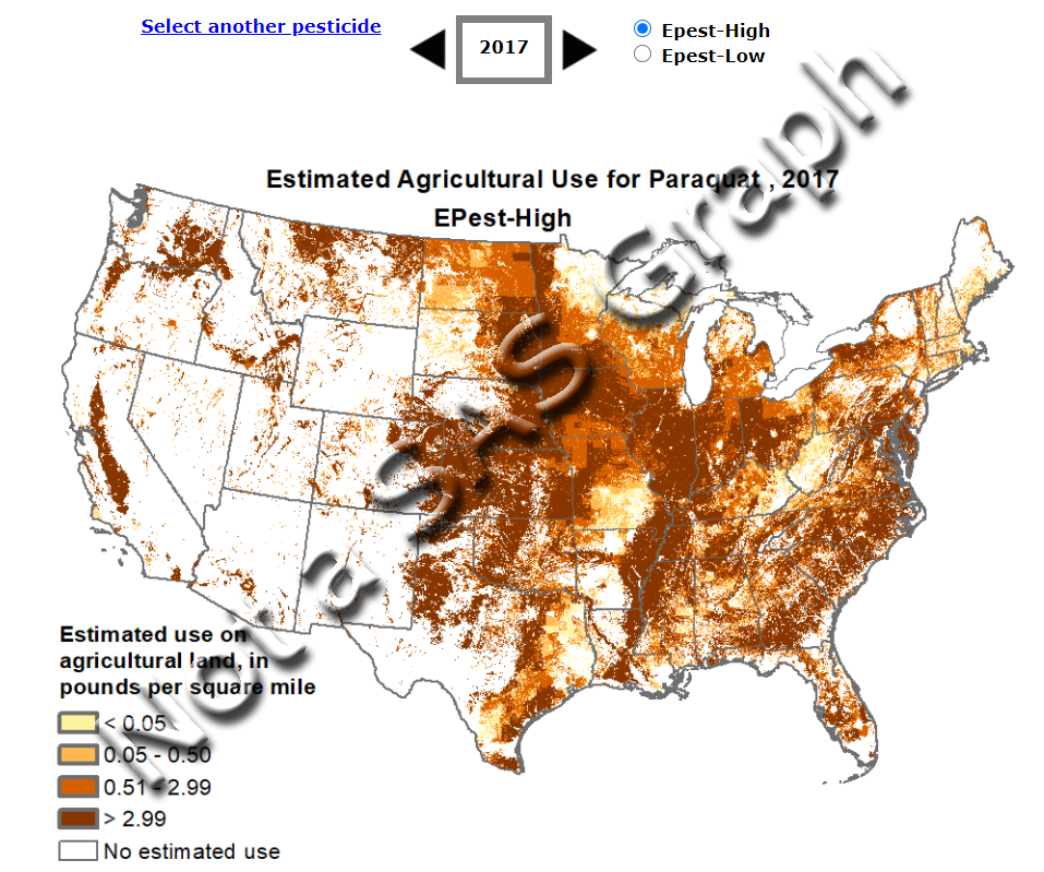
I think one of the great uses of analytics and graphics is to show things like cancer clusters on a map. There are many factors that can lead to a higher incidence of diseases in geographical areas, and chemicals are often the culprit. For example, paraquat has been potentially linked to Parkinson's Disease (paraquat is a powerful weed killer used in agriculture - so powerful, you must have a license to use it). In this example, I create a map showing where paraquat was most heavily used in the United States ... and therefore where farm workers are most likely to have been exposed to it.
How did I get pick this topic?...
I first became aware of this topic when I saw the following small ad in the sidebar of Facebook, with a tiny 'thumbnail' map that caught my attention. At the time, I didn't know what paraquat was ... but I knew that Parkinson's Disease was a bad thing, and I was curious about the map.

I decided to dig in and see if I could find the data, and create my own version of the map!
Where Did Their Map Come From?
I saved the small thumbnail image of the map from the Facebook ad, and did a Google Image Search. Google found many variations of similar maps. I clicked several of them, looking for clues to the source data. One of them was a link to the UC Weed Science page, and it had a link to the a very helpful page created by the USGS National Water-Quality Assessment Program. That page lets you select a chemical, and see maps & data about it. I selected the Paraquat link, and found a map very similar to the one in the Facebook ad!
The Data
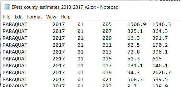
Best of all, there was a Data link on their page, to download data! I clicked the 2013-2017 link, and then the link for EPest_county_estimates_2013_2017_v2.txt. The text data file looks something like this, with the year, state & county fips, and low & high estimate in kg:
Default SAS Map
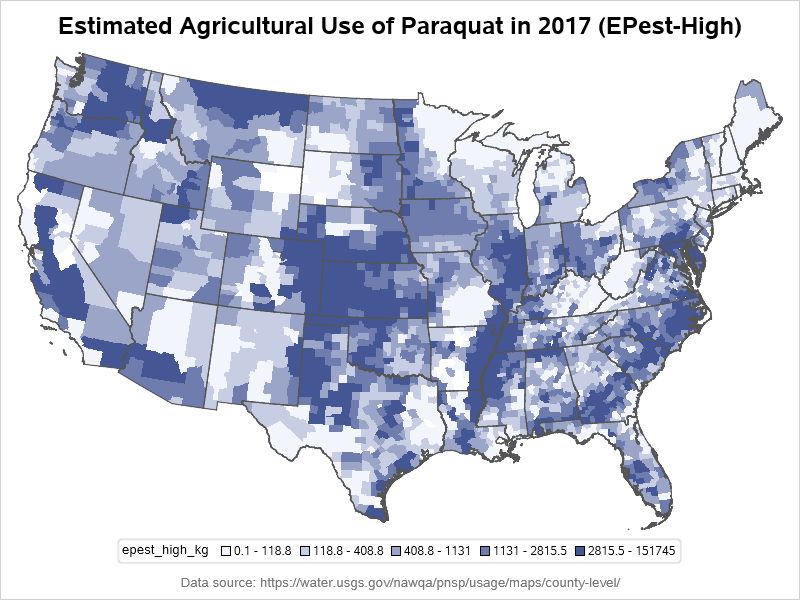
I imported the text data into SAS, and created a combined id containing both the state and county (for example, state=01 and county=005 became id=US-01005), so that I could easily plot the data on the county map we ship with SAS using minimal code. This allowed me to see if I was on the right track.
proc sgmap maprespdata=my_data mapdata=my_map;
choromap epest_high_kg / numlevels=5 mapid=id id=id;
run;
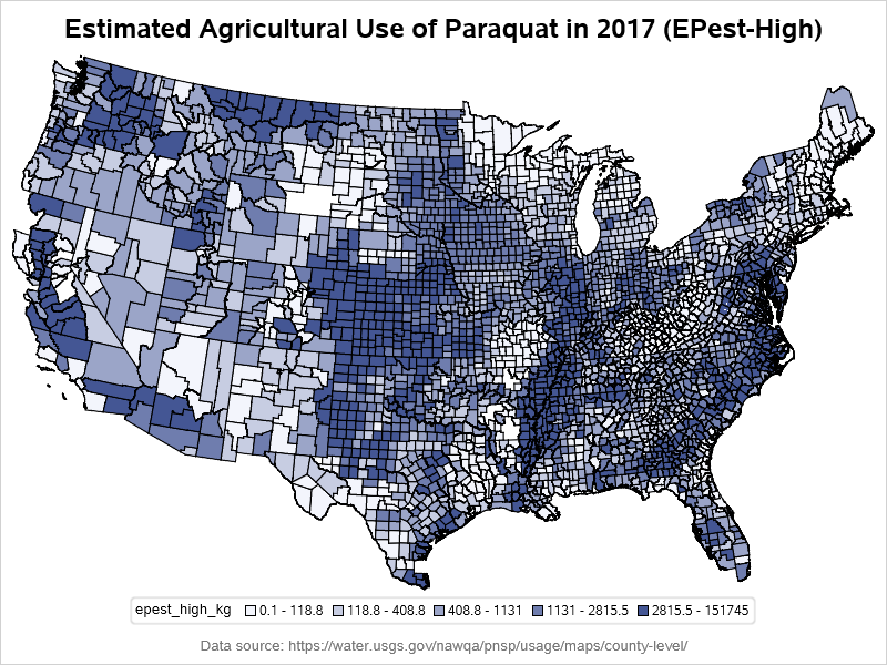
The default map is quick & easy, and you can see that this data has similar geographical trends to the original. One difference I noticed though, is that the original maps had more granularity (perhaps they used the data at the individual farm level, or used dithering to distribute dots around the counties?) But the data they allow users to download is county-level, therefore I decided to stick with that level of granularity in my map.
Improving my SAS Map
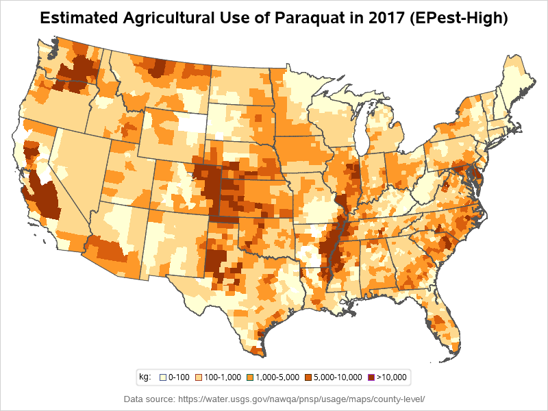
The default SAS county map has borders around each county, and all those border lines were visually overpowering the data. I tried making them a lighter gray, but there was still just too much 'ink' dedicated to the borders, compared to the data colors inside the borders. Therefore I removed the county borders altogether, using lineattrs=(thickness=0).
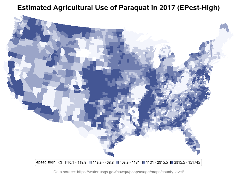
Now my data shows up better (with no county borders competing for my visual attention), but I've also lost a lot of my geospatial reference points - for example, it's difficult to tell whether a county is in North or South Carolina. Although I don't want all those thousands of county borders, I'd like to have the 50 state borders, similar to the original map. There's no simple option to turn on a 2nd level (in this case, state) border in Proc SGmap, but I used Proc Gremove to create a second dataset with state outlines (having the internal county borders removed within each state), and then overlaid it on the county map using a series plot.
proc sgmap maprespdata=my_data mapdata=my_map plotdata=state_outlines;
choromap epest_high_kg / numlevels=5 mapid=id id=id lineattrs=(thickness=0);
series x=x y=y / lineattrs=(color=gray55);
run;
Now my map is starting to take shape! Also, instead of using the default legend ranges and colors, I wanted to create some custom ranges and use colors similar to the original map. I used a data step and if/else statements to place the data into five custom range bins (1-5), and I created a user-defined-format so that those bin numbers (1-5) would print as my desired text in the legend (such as '0-100'). I used the recently-added SGmap styleattrs statement to specify the 5 colors for the 5 bins:
proc format;
value kg_fmt
1='0-100'
2='100-1,000'
3='1,000-5,000'
4='5,000-10,000'
5='>10,000'
;
run;
data my_data; set my_data;
label bucket='kg:';
format bucket kg_fmt.;
if epest_high_kg<=100 then bucket=1;
else if epest_high_kg<=1000 then bucket=2;
else if epest_high_kg<=5000 then bucket=3;
else if epest_high_kg<=10000 then bucket=4;
else if epest_high_kg>10000 then bucket=5;
run;
proc sgmap maprespdata=my_data mapdata=my_map plotdata=state_outlines;
styleattrs datacolors=(cxffffd4 cxfed98e cxfe9929 cxd95f0e cx993404);
choromap bucket / discrete mapid=id id=id lineattrs=(thickness=0);
series x=x y=y / lineattrs=(color=gray55);
run;
With those two customizations, I now have my final map, which I think does a really nice job showing the data:
Further Enhancements?
No map is ever really perfect - there's always room for improvement. How might I improve this map?
- I could find the area (square miles) of each county, and then calculate the amount of paraquat per square mile (this would help eliminate the "area size bias" the physically larger counties might have over the smaller counties).
- I could also add mouse-over text for each county, and let users click each county to see the time-series data.
What other enhancements do you think might be useful? (feel free to discuss in the comments section)
Code
Here's a link to the complete SAS code, if you'd like to experiment with it.

4 Comments
I can't get your SAS code when I click on it.
Sorry about that! - I had accidentally put a link to the .htm output, instead of the .sas job. Thanks for letting me know! (The link is fixed now.)
I feel like a missing piece is the population of each area as well as the amount of pesticides. If there's 0 population in an area, it's still bad - but maybe less bad than a really dense area population wise. I'm not sure how that could be represented - heat map with dot density overlay?
Also, how long does the pesticide persist? Imagine how awful it would be if the pesticide persists for 50 years. If you mapped by when pesticides were applied (probably pretty constant) with how long the land would be polluted - that would surely open some eyes.
Hi Robert, nice map, The question lingering with me is what is the main agricultural produce in the high paraquat areas. There seems to be some patterns in the usage combined to produce. This require some overlay or heavy use of drilldowns. And of course a lot of data and information finding work.