Every 10 years the United States conducts a Census where we count all the people. This week the 2020 Census population totals for each state were released. And how might these numbers affect you? ...
One thing the Census numbers are used for is to determine how many of the 435 voting seats each state has in the House of Representatives. Each state is guaranteed at least one seat, and beyond that the seats are apportioned to the states based on population, using the Huntington-Hill method of apportionment.
The Raw Data
The Census provides a web page where you can view the Apportionment data, and download it as an Excel spreadsheet:
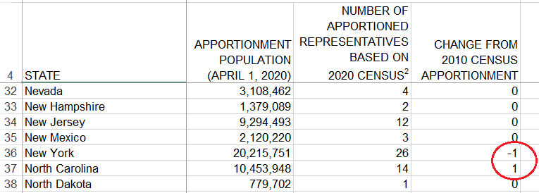
Here's a screen capture of the spreadsheet. If you look closely, you can see that some states have a non-zero number in the "Change from 2010 Census Apportionment" column - these are the interesting ones. Being a Graph Guy, I thought to myself "This data would be so much easier to study in graphical form!"
Poor Visualizations
After the Census numbers came out, I soon saw various visualizations pop up on social media, news sites, etc. Many of the visualizations were OK, but some made the user work way too hard to understand the data. Here are a few examples of bad maps I saw.
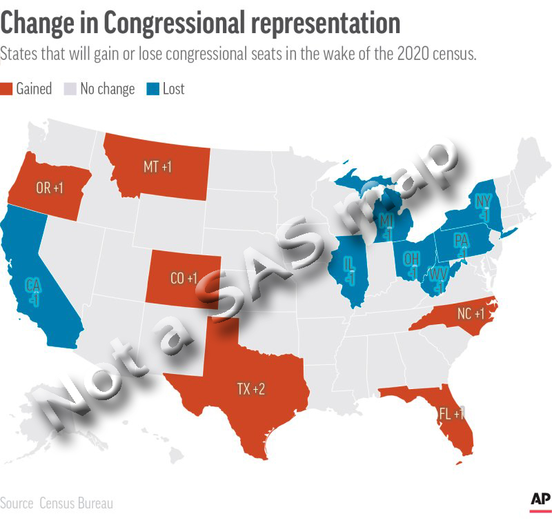
Two Maps (bad)
One article made the user look at two separate maps to see all the changes. The user also figure out which label in the ocean went with which state. And the map only occupies about 1/2 of the page (the other half of the available space is taken up by text and white space (which is blue, in this case). We even get to see a picture of the person who is talking about the map (that adds a lot of value, eh!?!)
Poor Color Choice (Bad)
In this next map (from a time.com article), they show both the loss & gain on one map, and let the map occupy much more of the available space (which is an improvement over the previous map) ... but they use red and blue colors, which I think could be misleading. In their map red & blue represent gained & lost seats. But these colors are traditionally used to represent Republican- and Democrat-controlled states in political maps. And since congressional seats are related to politics, this color choice might cause some confusion. The text labels on the states are also a bit difficult to read (especially on the blue states).
Non-Geographical Map (bad)
I saw this next map in a nytimes.com article. I'm assuming they are representing each seat as a square, and arranging the squares to (try to) look like the states ... and then arranging the states into their somewhat correct geographical position(?) I found that I was spending more time focusing on the 'odd' shapes of the states than the actual data, therefore I think this is a bad way to visualize the data.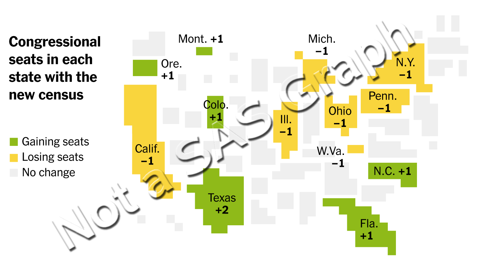
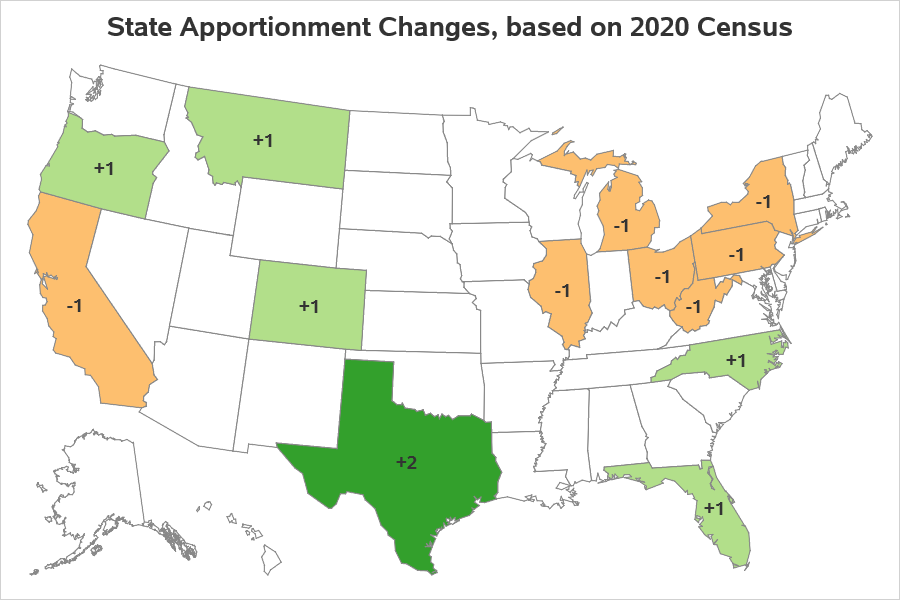
My Map (hopefully good!)
Here are my goals for the map:
- Keep it simple!
- Use a standard geographical map, that people are accustomed to seeing.
- Don't use red & blue colors that might be confused with political parties.
- Make the information easy to read.
- Don't try to include too much information on the map.
- Keep it simple!
Here is my map. I almost added state abbreviations ... but I think anyone interested in this topic probably already knows which state is which (if they paid attention in Junior High School).
Technical/Coding Details
I used SAS' Proc SGmap to create this choropleth map and color the states. I used the mapsgfk.us map polygons, which are pre-projected, and also has Alaska and Hawaii moved/resized to fit in the bottom/left corner. I then used SGmap's text statement to overlay the apportionment change numbers at the centroid of each state (getting the projected x/y centroids that match-up to this map from mapsgfk.uscenter). Rather than just using the numeric apportionment values, I created a text variable so that I could prepend the '+' character in front of the positive numbers.
Here's a link to the complete SAS code, if you'd like to have a closer look.

2 Comments
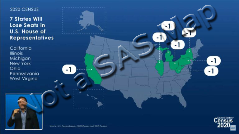
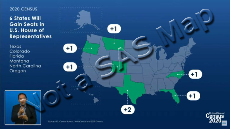
The Floridian article has 2 screen grabs from the press conference where the apportionment numbers were announced The speaker in the corner is the ASL interpreter. Looks like the first screen grab is from around the 43:07 mark of the video posted at https://www.census.gov/newsroom/press-kits/2021/2020-census-apportionment-counts.html, while the second screen grab is from around the 42:49 mark.
Ahh! - Good "detective" work!