All Posts


Em painel de encerramento no evento, os executivos Paulo Sérgio Silva, fundador e diretor-executivo da Rock On Advisors; Marcos Hamsi, vice-presidente de TI da Martin-Brower, e Marcos Peron, head de TI da AMPM/Ipiranga, discutiram sobre o futuro do setor varejista frente às novas tecnologias e a transformação digital, com moderação


Com metáforas interessantes, comparando dados e tecnologia com fazendas e foguetes, Kendji Wolf se orgulha dos algoritmos e das conquistas na Via Varejo. Atualmente a companhia conta com a Via Hubby, que administra toda parte tecnológica da empresa, como sistemas, arquitetura e dados. O executivo abre um parênteses para reflexão:

Vitor Vicente, head de vendas para telecom e varejo do SAS, e Eduardo Yamashita, diretor de operações do Ecossistema Gouvêa, abrem o SAS Retail Summit Brasil falando sobre as tendências para o setor de varejo. Vicente explica que a visão do SAS permeia a estratégia da digitalização em três grandes


The convergence of digitalization, AI and machine learning that has been integrated into wearable devices has become a boon for many industries, particularly health care. When Fitbit launched its first wearable device in 2009, it clipped on a user’s clothing and utilized an internal motion detector to track the wearer’s


Halloween, and the copious amounts of candy that comes with it, marks the beginning of a continuous stream of tempting foods from October to January. For the 9th year, the SAS Healthcare Center will be gathering excess Halloween candy to donate to NC Packs 4 Patriots, an organization that supports
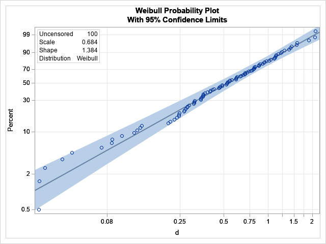

It can be frustrating when the same probability distribution has two different parameterizations, but such is the life of a statistical programmer. I previously wrote an article about the gamma distribution, which has two common parameterizations: one that uses a scale parameter (β) and another that uses a rate parameter

Nilton Mayrink, CIO e head de vendas B2B/BSC no Martins Atacadista, iniciou sua apresentação no SAS Retail Summit 2021 trazendo uma contextualização dos desafios do setor varejista no País. Responsável pela área de tecnologia e vendas digitais da empresa, o especialista trouxe dados relevantes relacionados à dimensão do Brasil no
Ana Szasz, diretora de Data & Insights do Rappi, iniciou sua apresentação abordando a ascensão dos superapps, como são conhecidos os aplicativos que atuam como um “centro comercial projetado dentro de uma plataforma digital”, como explicado pela executiva, durante o cenário pandêmico em que o mundo se encontra há quase


SAS' Rajesh Selukar introduces you to a new scoring feature.

Mejorar la vida de las personas gracias a los datos es uno de nuestros propósitos en SAS. Por eso, una de las categorías de los premios Curiosity Data Science Iberian Awards, que hemos organizado este año por primera vez junto a SPAIN AI y la Asociación Portuguesa de Ciencia de


Que alce la mano el líder, la empresa o la organización que no esté presionado en estos momentos por reducir sus gastos y costos de operación. Hemos hablado en varias oportunidades del impacto y el alcance que tiene la alianza establecida por SAS y Microsoft para llevar la analítica a


If my experience is anything to go by, there’s a sizeable number of customers that still have SAS workloads running on IBM mainframes. Now I have tremendous respect for S/390 (I can still navigate TSO/ISPF et al. and started my IT career programming in PL/AS on MVS and VM), but

“En la era digital, la economía de los datos se está convirtiendo en el nuevo ´oro negro´ que aceita el motor del crecimiento económico. Los datos, masivos y abiertos, son esenciales para mejorar la confianza de los ciudadanos en sus estados y hacerles partícipes de la acción pública, facilitando el


With the steep rise of artificial intelligence (AI) adoption across all facets of society, ethics is proving to be the new frontier of technology. Public awareness, press scrutiny and upcoming regulations are forcing organizations and the data science community to consider the ethical implications of using AI. The need for


Eu sou Professor de Data Science já há alguns anos, e não é incomum, entre alunos e colegas termos ricas conversas e debates sobre o tema Inteligência Artificial e Machine Learning. Me lembro de uma aula onde os alunos colocaram questões tão interessantes que as respostas direcionaram aquela aula e